Installation
Follow the steps below to setup your site template:
- Unzip the downloaded package and open the /HTML folder to find all the template files. You will need to upload these files to your hosting web server using FTP in order to use it on your website.
- Below is the folder structure and needs to be uploaded to your website root directory:
HTML/src/css- Stylesheet filesHTML/src/fonts– Icon font filesHTML/src/images- Image filesHTML/src/js- Javacript filesHTML/src/revolution– Revolution Slider files
- You should upload all or specific HTML files as per your need.
- You're now good to go..! Start adding your content/images and generate your beautiful brand new website for your awesome users.
- You should have to run code from Apache or IIS server, Otherwise you will get errors.
- If you want to make any changes on .scss file then you have to install and run npm on directory of this project and install gulp file because code is build in Bootstrap 4. For more details you can visit https://coursetro.com/posts/code/130/Learn-Bootstrap-4-Final-in-2018-with-our-Free-Crash-Course article.
HTML Structure
Earthyellow follows a simple and easy to customize coding structure. Here is the sample for your reference:
<!doctype html>
<html class="no-js" lang="en">
    <head>
        <!-- title -->
        <meta charset="utf-8">
        <!-- description -->
        <meta name="description" content="">
        <!-- keywords -->
        <meta name="keywords" content="">
        <!-- favicon -->
        <!-- style -->
    </head>
    <body>
        <!-- start header -->
        <header>
            <!-- start navigation -->
            <nav class="navbar navbar-default bootsnav">
                ...
            </nav>
            <!-- end navigation -->
        </header>
        <!-- end header -->
        <!-- start sections -->
        <div class="main_section">
			<section>
				...
			</section>
		</div>
        <!-- end sections -->
        <!-- start footer -->
        <footer>
            <div class="container">
                ...
            </div>
        </footer>
        <!-- end footer -->
        <!-- javascript libraries -->
    </body>
</html>
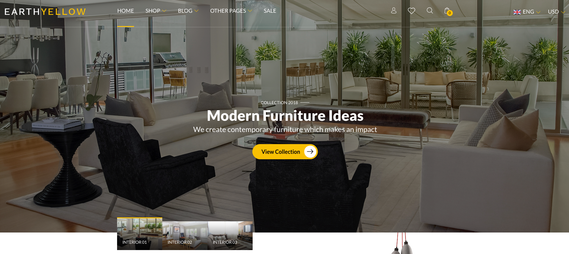
Logo Settings
The Logo Container can be found in the Header Container - .header_logo

<!-- start logo -->
<div class="header_logo col_4 visible-lg d-none">
	<a href="index.html"> <img src="src/images/logo.png" class="img-fluid" alt="logo" /> </a>
</div>
<!-- end logo -->
Image & Favicon Settings
Image Settings
Earthyellow download package does not contain images which are there in our online demo. We are using placeholder images instead of real images. You will see the image code as mentioned below. You can replace placeholder image url with your image url like src/images/yourimage.jpg
<img src="image path" alt="image alt text">
Favicon Settings
To change the favicon image of your site, you need to load a new ICO image in a site root or to point out a new address of the image.
<!-- favicon -->
<link rel="shortcut icon" href="images/favicon.png">
<link rel="apple-touch-icon" href="images/apple-touch-icon-57x57.png">
<link rel="apple-touch-icon" sizes="72x72" href="images/apple-touch-icon-72x72.png">
<link rel="apple-touch-icon" sizes="114x114" href="images/apple-touch-icon-114x114.png">
Changing Fonts
Earthyellow uses only one font: Work Sans from the Google Fonts Library. You can change the fonts from src/css/style.scss file in below lines. If you want to use self hosted fonts other than Google fonts then here is an example of self hosted fonts. In this case you need to remove below lines and change font names in /src/css/style.scss file as per your fonts used.
<!-- Google font -->
@import url("https://fonts.googleapis.com/css?family=Work+Sans:400,500,600,700");
Header
- Header Type 1
- Header Type 2
- Header Type 3
- Header Type 4
- Header Type 5
- Header Type 6
- Header Type 7
- Header Type 8
- Header Type 9
<!-- start navigation -->

<header>
	<div class="header_logo col_4 visible-lg d-none">

	</div>
	<div class="col_6 visible-lg d-none">
		<nav class="navbar-dark navbar-expand-lg navbar">

		</nav>
	</div>
	<div class="col_3 visible-lg d-none">

	</div>
	<div class="header_currency col_4 text-right visible-lg d-none">

	</div>
	<div class="header_mobile hidden-lg d-block">
		<div class="social_icons_content">

		</div>
		<div class="header_logo col_4">

		</div>
		<nav class="navbar-dark navbar-expand-lg navbar">

		</nav>
	</div>
</header>
<!-- end navigation -->
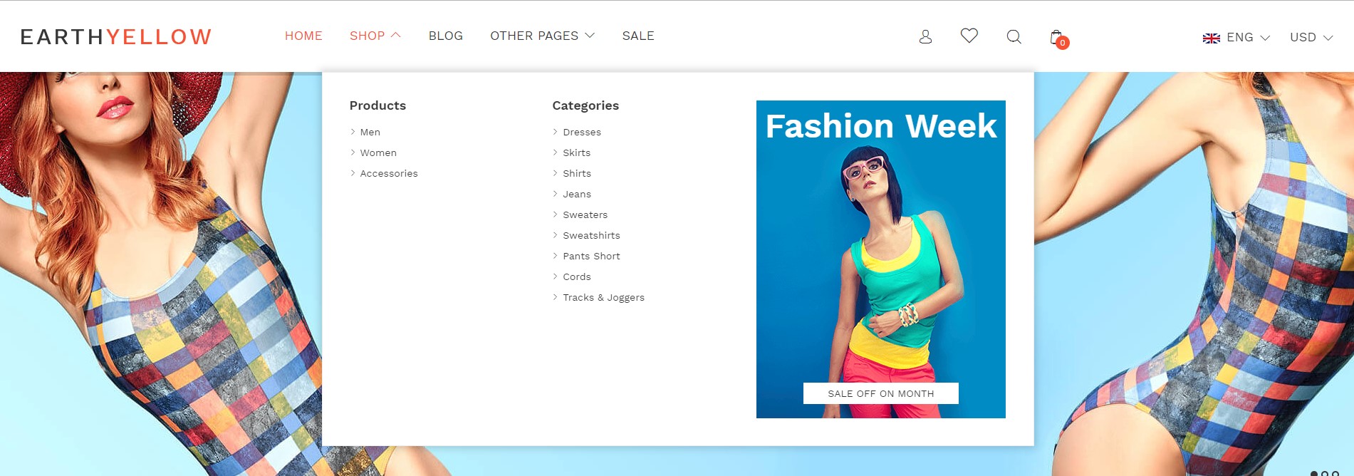
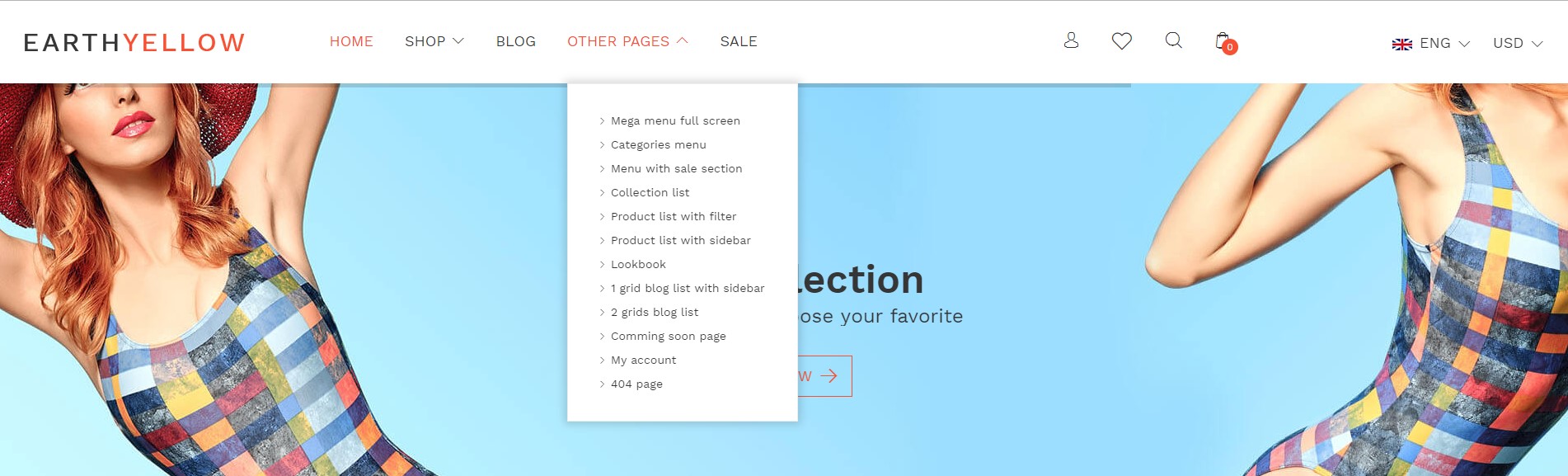
Mega Menus
You can start using the mega menu in 2, 3 & 4 columns. Try using the following code with below explanation:
- For 2 column menu there should be 2 LI items with
col-lg-6class - For 3 column menu there should be 3 LI items with
col-lg-4class - For 4 column menu there should be 4 LI items with
col-lg-3class
<!-- start navigation -->
<div class="col_6 visible-lg d-none">
	<nav class="navbar-dark navbar-expand-lg navbar">
		 <!-- Navigation menu container -->
		<div class="navbar-collapse collapse" id="collapseNavbar">
			 <!-- Navigation links -->
			<ul class="navbar-nav">
				<li class="nav-item dropdown mega-dropdown">
					<a class="nav-link text-uppercase dropdown-toggle" href="javascript:void(0);">...</a>
					<span class="menu_arrow flaticon-down-arrow-1"> </span>
					<ul class="dropdown-menu megamenu_full_screen">
						<li class="w-100 text-capitalize">
							<div class="container">
								<div class="row">
									 <!-- start sub menu column  -->
									<div class="col-lg-4">
										<ul>
											...
										</ul>
									</div>
									 <!-- end sub menu column  -->
									 <!-- start sub menu column  -->
									<div class="col-lg-4">
										<ul>
											...
										</ul>
									</div>
									 <!-- end sub menu column  -->
									 <!-- start sub menu column  -->
									<div class="col-lg-4">
										<ul>
											...
										</ul>
									</div>
									 <!-- end sub menu column  -->
								</div>
							</div>
						</li>
					</ul>
				</li>
			</ul>
		</div>
	</nav>
</div>
<!-- end navigation -->
Note You can find this mega menu demo in index.html page for your reference.
Mega Menus with Category Image
You can start using mega menu with image using below code.
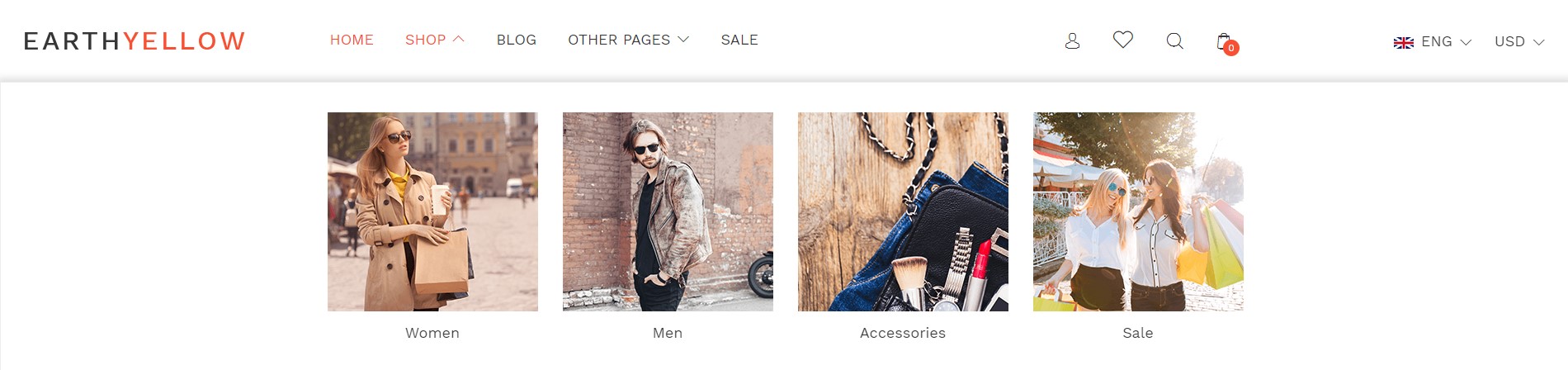
<!-- start navigation -->
<div class="col_6 visible-lg d-none">
	<nav class="navbar-dark navbar-expand-lg navbar">
		 <!-- Navigation menu container -->
		<div class="navbar-collapse collapse" id="collapseNavbar">
			 <!-- Navigation links -->
			<ul class="navbar-nav">
				<li class="nav-item dropdown mega-dropdown">
					<a class="nav-link text-uppercase dropdown-toggle" href="javascript:void(0);">...</a>
					<span class="menu_arrow flaticon-down-arrow-1"> </span>
					<ul class="dropdown-menu categories_menu mega_menu3">
						<li class="w-100 text-capitalize">
							<div class="container">
								<ul>
									<div class="row">
										<li class="col-lg-3 text-center">
											...
										</li>
										<li class="col-lg-3 text-center">
											...
										</li>
										<li class="col-lg-3 text-center">
											...
										</li>
										<li class="col-lg-3 text-center">
											...
										</li>
									</div>
								</ul>
							</div>
						</li>
					</ul>
				</li>
			</ul>
		</div>
	</nav>
</div>
<!-- end navigation -->
Note You can find this mega menus with image demo in transparent-header.html page for your reference.
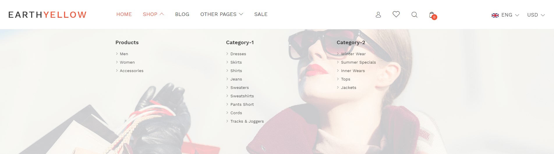
Mega Menus with Sale Section
You can start using mega menu with image using below code.
<!-- start navigation -->
<div class="col_6 visible-lg d-none">
  <nav class="navbar-dark navbar-expand-lg navbar">
	 <!-- Navigation menu container -->
  	<div class="navbar-collapse collapse" id="collapseNavbar">
	 <!-- Navigation links -->
	  <ul class="navbar-nav">
		<li class="nav-item dropdown mega-dropdown">
		  <a class="nav-link text-uppercase dropdown-toggle" href="javascript:void(0);">...</a>
			  <span class="menu_arrow flaticon-down-arrow-1"> </span>
		      <ul class="dropdown-menu  menu_with_sale_section">
				<li class="w-100 text-capitalize">
				  <div class="container">
					<div class="row  justify-content-lg-center"">
						<div class="col-lg-10 mega_menu2_content">
							<div class="row">
								<div class="col-lg-4">
									<ul>
										<li class="title_h5 w-100"> Name of column </li>
										<li class="w-100" data-img="yourimage.jpg" data-title="Men">
											...
										</li>
										<li class="w-100" data-img="yourimage.jpg" data-title="Women">
											...
										</li>
										<li class="w-100" data-img="yourimage.jpg" data-title="Accessories">
											...
										</li>
									</ul>
								</div>
								<div class="col-lg-3">
									<ul>
										<li class="title_h5 w-100"> Name of column </li>
										<li class="w-100" data-img="yourimage.jpg" data-title="Dresses">
											...
										</li>
										<li class="w-100"  data-img="yourimage.jpg" data-title="Skirts">
											...
										</li>
										<li class="w-100" data-img="yourimage.jpg" data-title="shirts">
											...
										</li>
										<li class="w-100" data-img="yourimage.jpg" data-title="jeans">
											...
										</li>
									</ul>
								</div>
								<div class="col-lg-5">
								  <div class="menu_imgs">
									<h2 class="title_h2 text-center w-100 drop_title">
											...
									</h2>
								  <img src="yourimage.jpg" alt="menu_fashion" class="img-fluid vertical_middle drop_img"/>
							  	  <a href="javascript:void(0);" class="menu_btn text-center text-uppercase"> ... </a>
								</div>
							  </div>
							</div>
						</div>
					</div>
				</div>
			</li>
		</ul>
		</li>
	</ul>
  </div>
  </nav>
</div>
<!-- end navigation -->
Note You can find this mega menus with image demo in menu_with_sale_section.html page for your reference.
Simple Dropdown Menu
You can use an additional sub menu on any page for sub navigation purpose.
<!-- start navigation -->
<div class="col_6 visible-lg d-none">
	<nav class="navbar-dark navbar-expand-lg navbar">
		<!-- Navigation menu container --">
		<div class="navbar-collapse collapse" id="collapseNavbar">
			<!-- Navigation links --">
			<ul class="navbar-nav">
				<li class="nav-item dropdown mega-dropdown">
					<a class="nav-link text-uppercase  dropdown-toggle" href="javascript:void(0);">Main item</a>
					<span class="menu_arrow flaticon-down-arrow-1"></span>
					<ul class="dropdown-menu mega-dropdown-menu">
						<li class="w-100">
							...
						</li>
						<li class="w-100">
							...
						</li>
						<li class="w-100">
							...
						</li>
						<li class="w-100">
							...
						</li>
						<li class="w-100">
							...
						</li>
						<li class="w-100">
							...
						</li>
					</ul>
				</li>
			</ul>
		</div>
	</nav>
</div>
<!-- end navigation -->
Note You can find this simple dropdown menu demo in all pages for your reference.
Simple Menu
You can get simple menu code from any of our page demos or you can use below code directly:
<!-- start navigation -->
<div class="col_6 visible-lg d-none">
	<nav class="navbar-dark navbar-expand-lg navbar">
		<!-- Navigation menu container --">
		<div class="navbar-collapse collapse" id="collapseNavbar">
			<!-- Navigation links --">
			<ul class="navbar-nav">
				<li class="nav-item">
					<a class="nav-link text-uppercase  dropdown-toggle" href="javascript:void(0);">Main item</a>

				</li>
				<li class="nav-item">
					<a class="nav-link text-uppercase  dropdown-toggle" href="javascript:void(0);">Main item</a>

				</li>
				<li class="nav-item">
					<a class="nav-link text-uppercase  dropdown-toggle" href="javascript:void(0);">Main item</a>

				</li>
				<li class="nav-item">
					<a class="nav-link text-uppercase  dropdown-toggle" href="javascript:void(0);">Main item</a>

				</li>
				<li class="nav-item">
					<a class="nav-link text-uppercase  dropdown-toggle" href="javascript:void(0);">Main item</a>

				</li>
			</ul>
		</div>
	</nav>
</div>
<!-- end navigation -->
We are providing designing of the landing pages in thirteen different categories.
- Bag
- Watch
- Shoes
- Furniture
- Electronics
- Baby
- Eye Glasses
- Jewellery
- Beauty
- Cosmetic
- Handcraft
- Speaker
- Groccery
Bag
Note To see the landing page of "Bag" Please click here.Banner
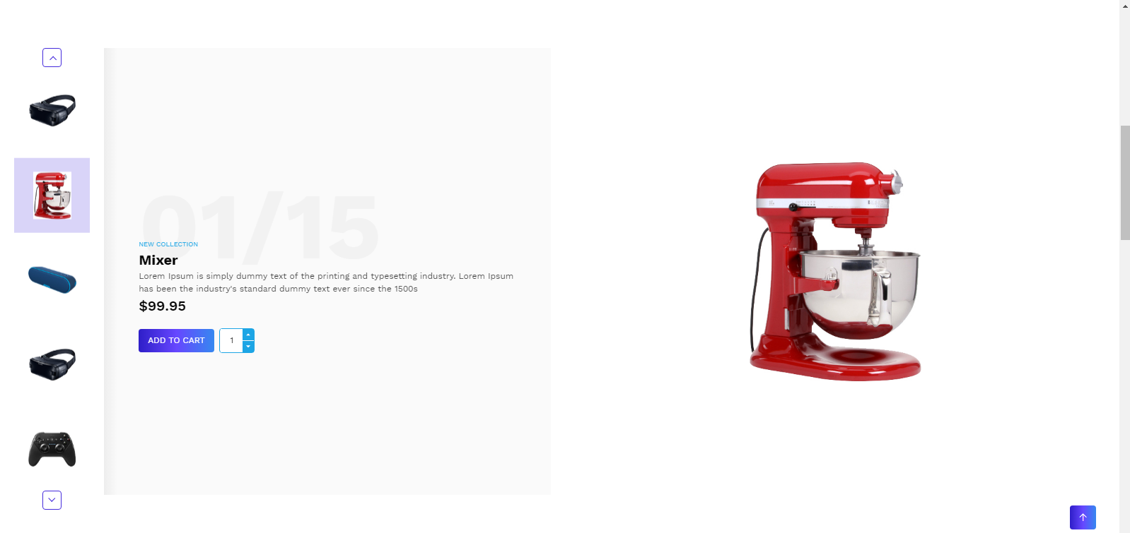
<!-- start Banner Section -->
<div class=" banner_slider_section bag_banner_slider_section position-relative">
                <div class="rev_slider_wrapper fullwidthbanner-container">
                    <!-- the ID here will be used in the JavaScript below to initialize the slider -->
                    <div id="rev_slider_3" class="rev_slider fullwidthabanner" data-version="5.4.5" style="display:none;">
                        <!-- BEGIN MAIN SLIDE LIST -->
                        <ul>
                            <!-- MINIMUM SLIDE STRUCTURE -->
                            <li data-transition="fade">
                             <!-- SLIDE'S MAIN BACKGROUND IMAGE -->
                                <img src="your image" alt="" class="rev-slidebg img-fluid">
                                <!-- LAYER NR. 1 -->
                                <div class="container">
                                    <div class="tp-caption Restaurant-Display   tp-resizeme"
                                         id="slide-3010-layer-1"
                                         data-x="['left','left','left','left']" data-hoffset="['-78','0','0','0']"
                                         data-y="['top','middle','middle','middle']" data-voffset="['211','0','0','0']"
                                         data-type="text"
                                         data-responsive_offset="on"
                                         data-frames='[{"from":"y:[100%];z:0;rX:0deg;rY:0;rZ:0;sX:1;sY:1;skX:0;skY:0;","mask":"x:0px;y:0px;s:inherit;e:inherit;","speed":1500,"to":"o:1;","delay":500,"ease":"Power3.easeInOut"},{"delay":"wait","speed":1000,"to":"opacity:0;","ease":"nothing"}]'
                                         data-textAlign="['left','left','left','left']"
                                         data-paddingtop="[0,0,0,0]"
                                         data-paddingright="[0,0,0,0]"
                                         data-paddingbottom="[0,0,0,0]"
                                         data-paddingleft="[0,0,0,0]"
                                         style="z-index: 5;font-size:48px;line-height: 48px;color:#000;text-transform: uppercase;font-family: 'Dosis-Bold';"></div>
                                    <!-- LAYER NR. 2 -->
                                    <div class="tp-caption Restaurant-Cursive   tp-resizeme"
                                         id="slide-3010-layer-2"
                                         data-x="['left','left','left','left']" data-hoffset="['-77','0','0','0']"
                                         data-y="['top','middle','middle','middle']" data-voffset="['275','0','0','0']"
                                         data-type="text"
                                         data-responsive_offset="on"
                                         data-frames='[{"from":"y:[-100%];z:0;rX:0deg;rY:0;rZ:0;sX:1;sY:1;skX:0;skY:0;","mask":"x:0px;y:0px;s:inherit;e:inherit;","speed":1500,"to":"o:1;","delay":700,"ease":"Power3.easeInOut"},{"delay":"wait","speed":1000,"to":"opacity:0;","ease":"nothing"}]'
                                         data-textAlign="['left','left','left','left']"
                                         data-paddingtop="[0,0,0,0]"
                                         data-paddingright="[0,0,0,0]"
                                         data-paddingbottom="[0,0,0,0]"
                                         data-paddingleft="[0,0,0,0]"
                                         style="z-index: 6;font-size:24px;line-height:36px;color:#000;letter-spacing: 0;font-family: 'Dosis-Regular';"></div>

                                    <!-- LAYER NR. 3 -->
                                    <div class="tp-caption Restaurant-Cursive   tp-resizeme"
                                         id="slide-3010-layer-3"
                                         data-x="['left','left','left','left']" data-hoffset="['-75','0','0','0']"
                                         data-y="['top','middle','middle','middle']" data-voffset="['332','0','0','0']"
                                         data-type="text"
                                         data-responsive_offset="off"
                                         data-frames='[{"from":"y:[-100%];z:0;rX:0deg;rY:0;rZ:0;sX:1;sY:1;skX:0;skY:0;","mask":"x:0px;y:0px;s:inherit;e:inherit;","speed":1500,"to":"o:1;","delay":700,"ease":"Power3.easeInOut"},{"delay":"wait","speed":1000,"to":"opacity:0;","ease":"nothing"}]'
                                         data-textAlign="['left','left','left','left']"
                                         data-paddingtop="[0,0,0,0]"
                                         data-paddingright="[0,0,0,0]"
                                         data-paddingbottom="[0,0,0,0]"
                                         data-paddingleft="[0,0,0,0]"
                                         style="z-index: 7;font-size:18px;line-height:18px;font-family: 'Dosis-Regular';">
                                        <a href="product_list_with_sidebar.html" class="background-btn text-uppercase"> <i class="flaticon-arrows-4"></i>  </a>
                                    </div>
                                </div>
                            </li>
                        </ul>
                        <!-- END MAIN SLIDE LIST -->
                    </div>
                </div>
            </div>
<!-- end Banner Section -->
Collection
<!-- start Collection Section -->
<div class="home_collection_section bag_collection_section  wow fadeIn" >
                <div class="container">
                    <div class="row no-gutters">
                        <div class="col-sm-4 wow fadeInLeft" >
                            <div class="home_collection_content  position-relative">
                                <img src="your image" alt="" class="img-fluid">
                                <div class="bag_collection_content">
                                    ...
                                </div>
                            </div>
                        </div>
                        <div class="col-sm-8 wow fadeInRight" >
                            <div class="home_collection_content position-relative">
                                <img src="your image" alt="" class="img-fluid">
                                <div class="bag_collection_content">
                                    ...
                                </div>
                            </div>
                        </div>
                    </div>
                </div>
            </div>
                                         <!-- end Collection Section -->
Product
<!-- start Product Section -->
<section class=" padding-top-text-60 bag_product_slider_section bag_product_section featured_section">
                <div class="container">
                    <h3 class="text-center text-uppercase">Title</h3>
                    <div class="owl-carousel owl-theme" id="bag_product_slider">
                        <div class="item">
                            <div class="featured_content mb-0">
                                Product Grid
                            </div>
                        </div>
                    </div>
                </div>
            </section>
<!-- end Product Section -->
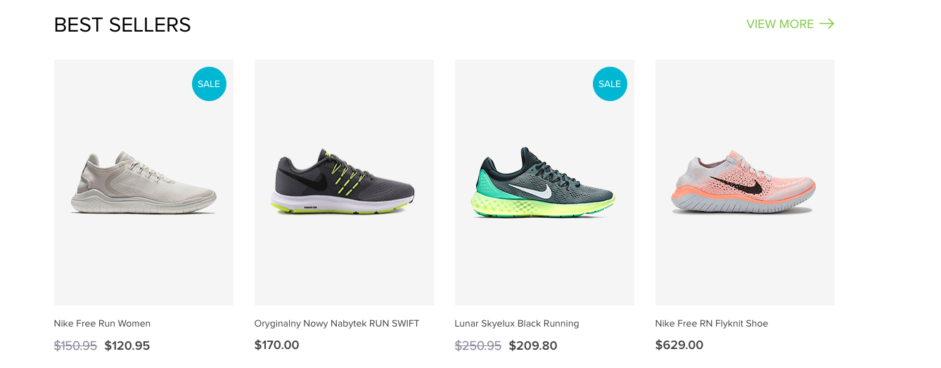
Best seller
<!-- start Best seller Section -->
<section class="bag_product_section padding-top-text-60 featured_section  wow fadeIn" style="visibility: visible; animation-name: fadeIn;">
                <div class="container-md-fluid container">
                    <div class="row  flex-row-reverse">
                        <div class="col-md-5">
                            <div class="bag_best_collection position-relative">
                                <img src="your image" class="img-fluid" alt="">
                                <div class="bag_best_collection_content position-absolute">
                                    <h3 class="title_h3 text-uppercase text-white">Title</h3>
                                    <a href="product_list_with_sidebar.html" class="text-uppercase text-white">View more <i class="flaticon-arrows-4"></i></a>
                                </div>
                            </div>
                        </div>
                        <div class="col-md-7">
                            <div class="row">
                                <div class="col-lg-3 col-md-4 col-6 ">
                                    <div class="featured_content">
                                        Product Grid
                                    </div>
                                </div>
                            </div>
                        </div>
                    </div>
                </div>
            </section>
<!-- end Best seller Section -->
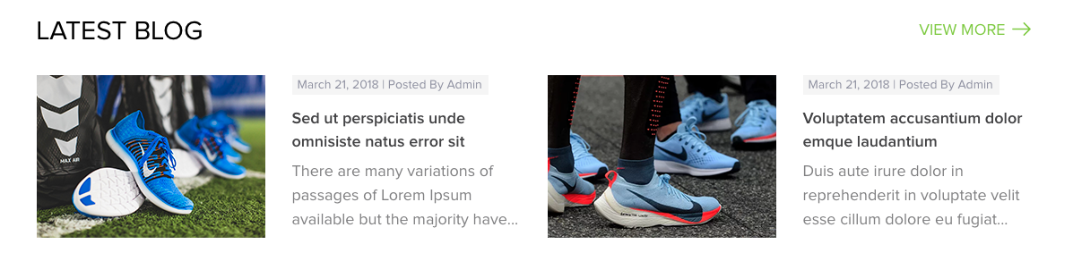
Blog
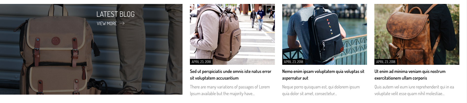
<!-- start Blog Section -->
<section class="blog_section bag_blog_section padding-top-text-60 wow fadeIn" style="visibility: visible; animation-name: fadeIn;">
                <div class="container-md-fluid container">
                    <div class="row">
                        <div class="col-md-5">
                            <div class="bag_best_collection position-relative">
                                <img src="your image" class="img-fluid" alt="">
                                <div class="bag_best_collection_content position-absolute">
                                    <h3 class="title_h3 text-uppercase text-white">Title</h3>
                                    <a href="grids_blog_list.html" class="text-uppercase text-white">View more <i class="flaticon-arrows-4"></i></a>
                                </div>
                            </div>
                        </div>
                        <div class="col-md-7">
                            <div class="row">
                                <div class="col-md-4 col-sm-6">
                                    <div class="blog_content mt-0">
                                       Blog Content
                                    </div>
                                </div>
                            </div>
                        </div>
                    </div>
                </div>
            </section>
<!-- end Blog Section -->
Brand

<!-- start Brand Section -->
<section class="padding-top-60 brand_logo_section bag_brand_logo_section wow fadeIn">
                <div class="container">
                    <div id="brand_slider" class="owl-carousel">
                        <div class="item">
                            <div class="brand_logo_img text-center position-relative">
                                 <img src="your image" alt="" class="img-fluid vertical_middle"/>
                            </div>
                        </div>
                    </div>
                </div>
            </section>
<!-- end Brand Section -->
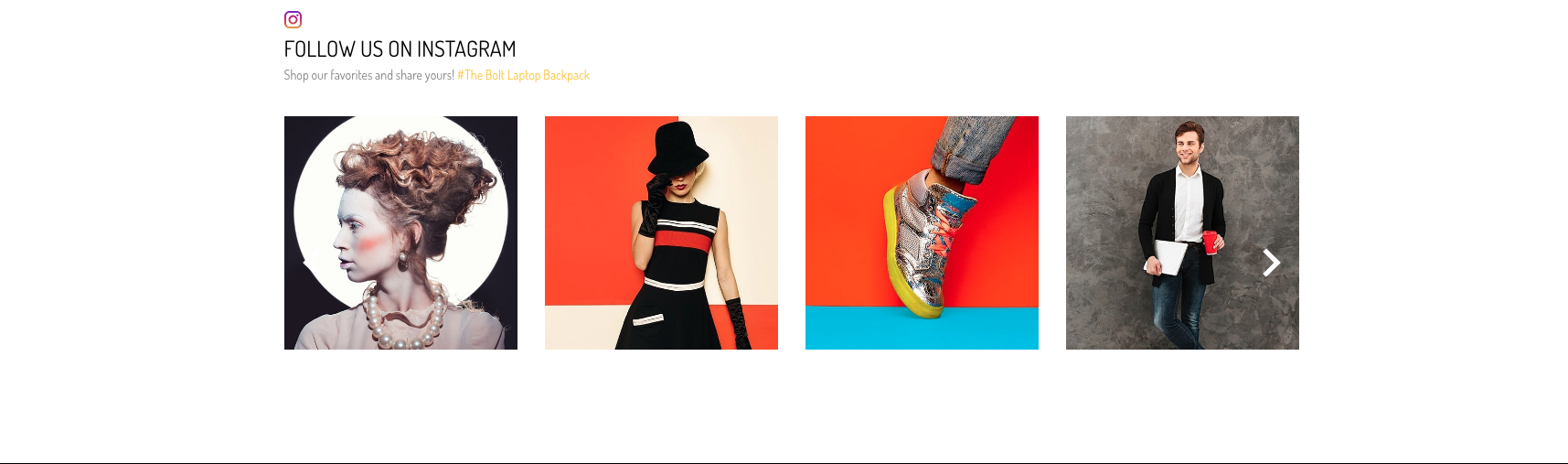
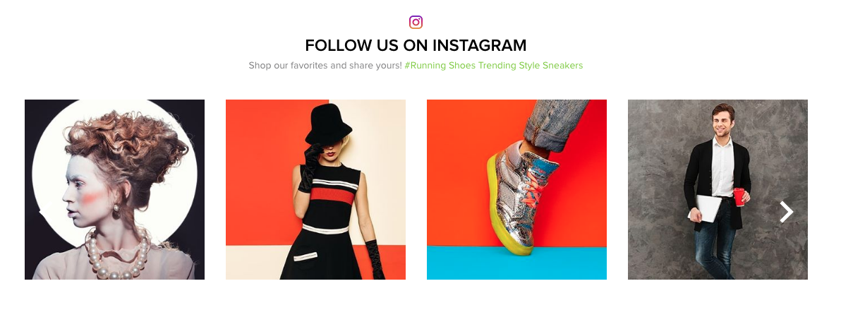
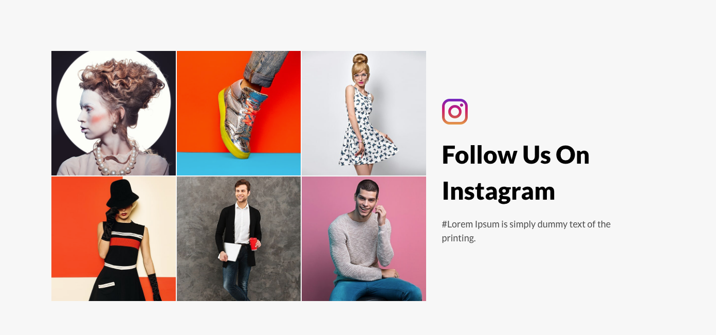
<!-- start Instagram Section -->
<section class="padding-top-60 padding-bottom-60 instagram_section bag_instagram_section   wow animated">
                <div class="container">
                    <div class="row">
                        <div class="col-md-12 wow fadeInLeft" data-wow-duration="1300ms">
                            <div class="instagram_title">
                                <img src="your image" alt=""/>
                                <h4 class="title_h4  text-uppercase"> Instagram Title </h4>
                                <p> ... <span>yellow text</span></p>
                            </div>
                        </div>
                        <div class="col-md-12 wow fadeInRight" data-wow-duration="1300ms" data-wow-delay="0.2s">
                            <div class="owl-carousel owl-theme instagram_slider" id="bag_instafeed"></div>
                        </div>
                    </div>
                </div>
            </section>
<!-- end Instagram Section -->
Watch
Note To see the landing page of "Bag" Please click here.Banner
<!-- start Banner Section -->
<div class="banner_slider_section watch_banner_slider">
                <div class="rev_slider_wrapper fullwidthbanner-container">
                     <!-- the ID here will be used in the JavaScript below to initialize the slider -->
                    <div id="rev_slider_2" class="rev_slider fullwidthabanner" data-version="5.4.5" style="display:none;">
                     <!-- BEGIN MAIN SLIDE LIST -->
                        <ul>
                       <!-- MINIMUM SLIDE STRUCTURE -->
                            <li data-transition="fade">
                          <!-- SLIDE'S MAIN BACKGROUND IMAGE -->
                                <img src="your image" alt="" class="rev-slidebg">
                                 <!-- LAYER NR. 1 -->
                                <div class="tp-caption Restaurant-Display   tp-resizeme"
                                    id="slide-3010-layer-1"
                                    data-x="['center','center','center','center']" data-hoffset="['0','0','0','0']"
                                    data-y="['top','middle','middle','middle']" data-voffset="['320','0','0','0']"
                                    data-type="text"
                                    data-responsive_offset="on"
                                    data-frames='[{"from":"y:[100%];z:0;rX:0deg;rY:0;rZ:0;sX:1;sY:1;skX:0;skY:0;","mask":"x:0px;y:0px;s:inherit;e:inherit;","speed":1500,"to":"o:1;","delay":500,"ease":"Power3.easeInOut"},{"delay":"wait","speed":1000,"to":"opacity:0;","ease":"nothing"}]'
                                    data-textAlign="['left','left','left','left']"
                                    data-paddingtop="[0,0,0,0]"
                                    data-paddingright="[0,0,0,0]"
                                    data-paddingbottom="[0,0,0,0]"
                                    data-paddingleft="[0,0,0,0]"
                                style="z-index: 5;font-size:48px;line-height: 48px;color:#e7b696;text-transform: uppercase;font-family: 'ProximaNova-Semibold';"> </div>
                                 <!-- LAYER NR. 2 -->
                                <div class="tp-caption Restaurant-Cursive   tp-resizeme"
                                    id="slide-3010-layer-2"
                                    data-x="['center','center','center','center']" data-hoffset="['0','0','0','0']"
                                    data-y="['top','middle','middle','middle']" data-voffset="['386','0','0','0']"
                                    data-type="text"
                                    data-responsive_offset="on"
                                    data-frames='[{"from":"y:[-100%];z:0;rX:0deg;rY:0;rZ:0;sX:1;sY:1;skX:0;skY:0;","mask":"x:0px;y:0px;s:inherit;e:inherit;","speed":1500,"to":"o:1;","delay":700,"ease":"Power3.easeInOut"},{"delay":"wait","speed":1000,"to":"opacity:0;","ease":"nothing"}]'
                                    data-textAlign="['left','left','left','left']"
                                    data-paddingtop="[0,0,0,0]"
                                    data-paddingright="[0,0,0,0]"
                                    data-paddingbottom="[0,0,0,0]"
                                    data-paddingleft="[0,0,0,0]"
                                style="z-index: 6;font-size:24px;line-height: 24px;color:#e7b696;letter-spacing: 0;font-family: 'ProximaNova-Regular';"></div>
                                <!-- LAYER NR. 3 -->
                                <div class="tp-caption  "
                                    id="slide-3010-layer-3"
                                    data-x="['center','center','center','center']" data-hoffset="['0','0','0','0']"
                                    data-y="['top','middle','middle','middle']" data-voffset="['449','0','0','0']"
                                    data-type="button"
                                    data-basealign="slide"
                                    data-responsive_offset="off"
                                    data-responsive="on"
                                    data-frames='[{"from":"y:50px;opacity:0;","speed":1500,"to":"o:1;","delay":1500,"ease":"Power3.easeInOut"},{"delay":"wait","speed":1000,"to":"y:50px;opacity:0;","ease":"nothing"}]'
                                    data-textAlign="['left','left','left','left']"
                                    data-paddingtop="[0,0,0,0]"
                                    data-paddingright="[0,0,0,0]"
                                    data-paddingbottom="[0,0,0,0]"
                                    data-paddingleft="[0,0,0,0]"
                                    style="z-index: 7; font-size: 18px;line-height: 18px;">
                                    <a href="product_list_with_sidebar.html" class="border-btn text-uppercase"><i class="flaticon-arrows vertical_middle"></i>  </a>
                                </div>
                            </li>
                            </ul>
                             <!-- END MAIN SLIDE LIST -->
                    </div>
                </div>
            </div>
                                            <!-- end Banner Section -->
Collection
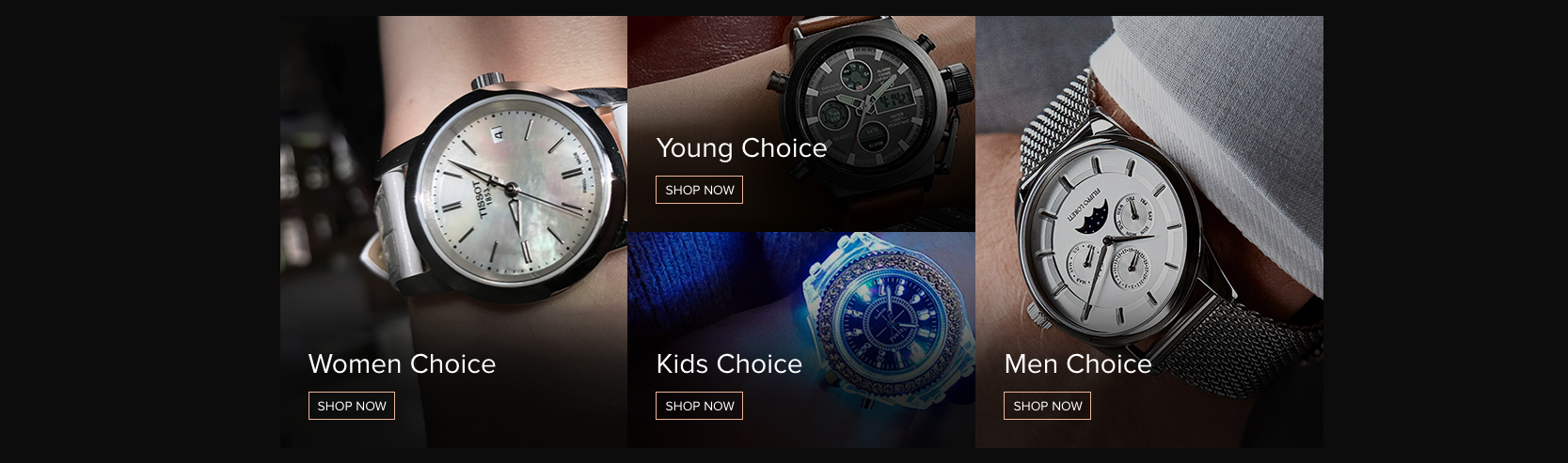
<!-- start Collection Section -->
<div class="home_collection_section watch_collection_section padding-top-60 wow fadeIn" >
                    <div class="container">
                        <div class="row no-gutters">
                            <div class="col-sm-4 wow fadeInLeft" >
                                <div class="home_collection_content  position-relative">
                                    <img src="your image" alt="" class="img-fluid">
                                    <div class="watch_collection_content">
                                    <h3 class="title_h3 text-capitalize"></h3>
                                    <a href="product_list_with_sidebar.html" class="border-btn text-uppercase"></a>
                                    </div>
                                </div>
                            </div>
                            <div class="col-sm-4 wow fadeInDown" >
                                <div class="home_collection_content position-relative">
                                    <img src="your image" alt="" class="img-fluid">
                                    <div class="watch_collection_content">
                                    <h3 class="title_h3 text-capitalize"></h3>
                                    <a href="product_list_with_sidebar.html" class="border-btn text-uppercase"></a>
                                    </div>
                                </div>
                                <div class="home_collection_content position-relative">
                                    <img src="your image" alt="" class="img-fluid">
                                    <div class="watch_collection_content">
                                    <h3 class="title_h3 text-capitalize"></h3>
                                    <a href="product_list_with_sidebar.html" class="border-btn text-uppercase">shop now</a>
                                    </div>
                                </div>
                            </div>
                            <div class="col-sm-4 wow fadeInRight" >
                                <div class="home_collection_content position-relative">
                                    <img src="your image" alt="p" class="img-fluid">
                                    <div class="watch_collection_content">
                                     <h3 class="title_h3 text-capitalize"></h3>
                                    <a href="product_list_with_sidebar.html" class="border-btn text-uppercase"></a>
                                    </div>
                                </div>
                            </div>
                        </div>
                    </div>
                </div>
                                            <!-- end Collection Section -->
Product
<!-- start Product Section -->
<section class="padding-top-text-60 featured_section watch_featured_section wow fadeIn ">
                    <div class="container">
                        <h3 class="title_h3  text-uppercase home_title_h3 text-center">Title</h3>
                        <div class="row">
                            <div class="col-lg-3 col-md-4 col-6 wow fadeInLeft animated" data-wow-duration="1300ms">
                                <div class="featured_content">
                                   Product grid
                                </div>
                            </div>
                        </div>
                    </div>
                </section>
                                            <!-- end Product Section -->
Promotion
<!-- start Promotion Section -->
<section class="padding-top-60 wow fadeIn" >
                    <div class="container">
                        <div class="summer_collection_section watch_promo_collection_section  wow fadeInUp">
                            <div class="row">
                                <div class="col-6 offset-6">
                            <h2 class="title_h2 text-uppercase"></h2>
                            <a href="product_list_with_sidebar.html" class="border-btn text-uppercase">SHOP NOW
                                <i class="flaticon-arrows-4"></i>
                            </a>
                                </div>
                            </div>
                        </div>
                    </div>
                </section>
                                            <!-- end Promotion Section -->
Blog
<!-- start Blog Section -->
<section class="blog_section watch_blog_section padding-top-text-60 wow fadeIn">
                    <div class="container">
                        <h3 class="title_h3  text-uppercase home_title_h3 text-center">Title</h3>
                        <div class="row">
                            <div class="col-sm-6 col-lg-4 wow fadeInLeft" data-wow-duration="1300ms">
                                <div class="blog_content">
                                      Blog Content
                                </div>
                            </div>
                        </div>
                    </div>
                </section>
                                            <!-- end Blog Section -->
Brand

<!-- start Brand Section -->
<section class="padding-top-60 brand_logo_section watch_brand_logo_section wow fadeIn">
                    <div class="container">
                        <h3 class="title_h3  text-uppercase home_title_h3 text-center wow fadeInDown">Our Brands</h3>
                        <div id="brand_slider" class="owl-carousel">
                            <div class="item">
                                <div class="brand_logo_img text-center position-relative">
                                    <img src="your image" alt="" class="img-fluid vertical_middle"/>
                                </div>
                            </div>
                        </div>
                    </div>
                </section>
                                            <!-- end Brand Section -->
<!-- start Instagram Section -->
 <section class="padding-top-60 instagram_section watch_instagram_section  wow animated">
                            <div class=" wow fadeInUp position-relative" data-wow-duration="1300ms" data-wow-delay="0.2s">
                                <div class="owl-carousel owl-theme instagram_slider" id="watch_instafeed"></div>
                                <div class="instagram_title text-center rounded-circle vertical_middle p-0 position-absolute">
                                    <i class="flaticon-instagram-logo"></i>
                                    <h4 class="title_h4  text-uppercase mb-0">Title</h4>
                                </div>
                            </div>
                </section>
                                            <!-- end Instagram Section -->
Shoes
Note To see the landing page of "Bag" Please click here.Banner
<!-- start Product Section -->
<div class=" shoes_banner_slider_section position-relative">
                <div class="rev_slider_wrapper fullwidthbanner-container">
                    <!-- the ID here will be used in the JavaScript below to initialize the slider --> ;
                    <div id="rev_slider_2" class="rev_slider fullwidthabanner" data-version="5.4.5" style="display:none;">
                       <!-- BEGIN MAIN SLIDE LIST --> ;
                        <ul>
                           <!-- MINIMUM SLIDE STRUCTURE --> ;
                            <li data-transition="fade">
                             <!-- SLIDE'S MAIN BACKGROUND IMAGE --> ;
                                <img src="your image" alt="" class="rev-slidebg img-fluid">
                                <!-- LAYER NR. 1 --> ;
                                <div class="">
                                    <div class="tp-caption Restaurant-Display   tp-resizeme"
                                         id="slide-3010-layer-1"
                                         data-x="['left','left','left','left']" data-hoffset="['-78','0','0','0']"
                                         data-y="['top','middle','middle','middle']" data-voffset="['300','0','0','0']"
                                         data-type="text"
                                         data-responsive_offset="on"
                                         data-frames='[{"from":"y:[100%];z:0;rX:0deg;rY:0;rZ:0;sX:1;sY:1;skX:0;skY:0;","mask":"x:0px;y:0px;s:inherit;e:inherit;","speed":1500,"to":"o:1;","delay":500,"ease":"Power3.easeInOut"},{"delay":"wait","speed":1000,"to":"opacity:0;","ease":"nothing"}]'
                                         data-textAlign="['left','left','left','left']"
                                         data-paddingtop="[0,0,0,0]"
                                         data-paddingright="[0,0,0,0]"
                                         data-paddingbottom="[0,0,0,0]"
                                         data-paddingleft="[0,0,0,0]"
                                         style="z-index: 5;font-size:48px;line-height: 48px;color:#000;text-transform: uppercase;font-family: 'ProximaNova-Semibold';"></div>
                                    <!-- LAYER NR. 2 --> </span> ;
                                    <div class="tp-caption Restaurant-Cursive   tp-resizeme"
                                         id="slide-3010-layer-2"
                                         data-x="['left','left','left','left']" data-hoffset="['-77','0','0','0']"
                                         data-y="['top','middle','middle','middle']" data-voffset="['359','0','0','0']"
                                         data-type="text"
                                         data-responsive_offset="on"
                                         data-frames='[{"from":"y:[-100%];z:0;rX:0deg;rY:0;rZ:0;sX:1;sY:1;skX:0;skY:0;","mask":"x:0px;y:0px;s:inherit;e:inherit;","speed":1500,"to":"o:1;","delay":700,"ease":"Power3.easeInOut"},{"delay":"wait","speed":1000,"to":"opacity:0;","ease":"nothing"}]'
                                         data-textAlign="['left','left','left','left']"
                                         data-paddingtop="[0,0,0,0]"
                                         data-paddingright="[0,0,0,0]"
                                         data-paddingbottom="[0,0,0,0]"
                                         data-paddingleft="[0,0,0,0]"
                                         style="z-index: 6;font-size:24px;line-height:36px;color:#000;letter-spacing: 0;font-family: 'ProximaNova-Regular';text-transform: uppercase;"></div>
                                         <!-- LAYER NR. 3 -->
                                         <div class="tp-caption Restaurant-Cursive   tp-resizeme"
                                         id="slide-3010-layer-3"
                                         data-x="['left','left','left','left']" data-hoffset="['-75','0','0','0']"
                                         data-y="['top','middle','middle','middle']" data-voffset="['450','0','0','0']"
                                         data-type="text"
                                         data-responsive_offset="off"
                                         data-frames='[{"from":"y:[-100%];z:0;rX:0deg;rY:0;rZ:0;sX:1;sY:1;skX:0;skY:0;","mask":"x:0px;y:0px;s:inherit;e:inherit;","speed":1500,"to":"o:1;","delay":700,"ease":"Power3.easeInOut"},{"delay":"wait","speed":1000,"to":"opacity:0;","ease":"nothing"}]'
                                         data-textAlign="['left','left','left','left']"
                                         data-paddingtop="[0,0,0,0]"
                                         data-paddingright="[0,0,0,0]"
                                         data-paddingbottom="[0,0,0,0]"
                                         data-paddingleft="[0,0,0,0]"
                                         style="z-index: 7;font-size:18px;line-height:18px;">
                                             <a href="product_list_with_sidebar.html" class="background-btn text-uppercase"><i class="flaticon-arrows-4"></i>  </a>
                                         </div>
                                </div>
                            </li>
                        </ul>
                       <!-- END MAIN SLIDE LIST -->;
                    </div>
                </div>
            </div>
                                            <!-- end Product Section -->
Collection
<!-- start Collection Section -->
<div class="shoes_collection_section padding-top-60 wow fadeIn">
                <div class="container">
                    <div class="row">
                        <div class="col-md-8 col-sm-8 wow fadeInLeft animated">
                            <div class="home_collection_content  position-relative">
                                <img src="your image" alt="" class="img-fluid"/>
                                <div class="shoes_collection_content">
                                    ...
                                </div>
                            </div>
                        </div>
                        <div class="col-md-4 col-sm-4 wow fadeInDown animated">
                            <div class="home_collection_content position-relative">
                                <img src="your image" alt="" class="img-fluid"/>
                                <div class="shoes_collection_content">
                                     ...
                                </div>
                            </div>
                            <div class="home_collection_content position-relative">
                                <img src="your image" alt="prducts" class="img-fluid"/>
                                <div class="shoes_collection_content">
                                    ...
                                </div>
                            </div>
                        </div>
                    </div>
                </div>
            </div>
                                            <!-- end Collection Section -->
Product
<!-- start Product Section -->
<section class="padding-top-text-60 arrival_featured_section wow fadeIn">
                <div class="container">
                    <div class="row">
                        <div class="col-lg-3 col-md-4 col-6">
                            <div class="arrival_collection_content position-relative">
                                <img src="your image" alt="" class="img-fluid"/>
                                <div class="arrival_collection_text ">
                                   ...
                                </div>
                            </div>
                        </div>
                        <div class="col-lg-9 col-md-8 col-6">
                            <div id="arrival_slider" class="owl-carousel">
                                <div class="item">
                                    <div class="featured_content">
                                        Product  grid
                                    </div>
                                </div>
                            </div>
                        </div>
                    </div>
                </div>
            </section>
                                            <!-- end Product Section -->
Promotion
<!-- start Promotion Section -->
<section class="padding-top-60 wow fadeIn">
                <div class="container">
                    <div class="promoton_collection_section text-center wow fadeInUp position-relative" >
                        Promotion Content
                    </div>
                </div>
            </section>
                                            <!-- end Promotion Section -->
Best Seller
<!-- start Best Seller Section -->
<section class="padding-top-text-60 arrival_featured_section wow fadeIn">
                <div class="container">
                    <div class="shoes_featured_title">
                        <h3 class="title_h3 text-uppercase">Title</h3>
                        <p class="shoes_featured_title_link mb-0">
                            <a href="product_list_detail.html" class="text-uppercase">View More<i class="flaticon-arrows-4"></i></a>
                        </p>
                    </div>
                    <div class="row">
                        <div class="col-lg-3 col-md-4 col-6 wow fadeInLeft animated" data-wow-duration="1300ms">
                            <div class="featured_content">
                                product grid
                            </div>
                        </div>
                    </div>
                </div>
            </section>
                                            <!-- end Best Seller Section -->
Blog
<!-- start Blog Section -->
<section class="padding-top-text-60 wow fadeIn blog_section shoes_blog_section">
                <div class="container">
                    <div class="shoes_featured_title">
                        <h3 class="title_h3 text-uppercase">Blog Title</h3>
                        <p class="shoes_featured_title_link mb-0">
                            <a href="grid_blog_list_with_sidebar.html" class="text-uppercase"><i class="flaticon-arrows-4"></i></a>
                        </p>
                    </div>
                    <div class="row">
                        <div class="col-md-6 wow fadeInLeft" data-wow-duration="1300ms">
                            <div class="blog_content">
                                <div class="row">
                                    <div class="col-lg-6">
                                        <a href="blog_list_detail.html"><img src="your image" alt="" class="img-fluid"></a>
                                    </div>
                                    <div class="col-lg-6">
                                        Blog Content
                                    </div>
                                </div>
                            </div>
                        </div>
                    </div>
            </section>
                                            <!-- end Blog Section -->
Brand

<!-- start Brand Section -->
 <section class="padding-top-60 brand_logo_section shoes_brand_logo_section wow fadeIn">
                <div class="container">
                    <div id="brand_slider" class="owl-carousel">
                            <div class="item">
                                <div class="brand_logo_img text-center position-relative">
                                    <img src="your image" alt="" class="img-fluid vertical_middle"/>
                                </div>
                            </div>
                        </div>
                </div>
            </section>
                                            <!-- end Brand Section -->
<!-- start Instagram Section -->
<section class="padding-top-60 padding-bottom-60 instagram_section shoes_instagram_section  wow animated">
                <div class="container">
                    <div class="row">
                        <div class="col-md-12 wow fadeInLeft" data-wow-duration="1300ms">
                            <div class="instagram_title text-center">
                                <img src="your image" alt=""/>
                                <h4 class="title_h4  text-uppercase"> </h4>
                                <p>Shop <span> green text</span></p>
                            </div>
                        </div>
                        <div class="col-md-12 wow fadeInRight" data-wow-duration="1300ms" data-wow-delay="0.2s">
                            <div class="owl-carousel owl-theme instagram_slider" id="shoes_instafeed"></div>
                        </div>
                    </div>
                </div>
            </section>
                                            <!-- end Instagram Section -->
Furniture
Note To see the landing page of "Furniture" Please click here.Banner
<!-- start Banner Section -->
<div class="furniture_banner_slider_section banner_slider_section">
                <div class="rev_slider_wrapper fullwidthbanner-container">
                    <!-- the ID here will be used in the JavaScript below to initialize the slider -->
                    <div id="rev_slider_4" class="rev_slider fullwidthabanner" data-version="5.4.5" style="display:none;">
                        <!-- BEGIN MAIN SLIDE LIST -->
                        <ul>
                            <!-- MINIMUM SLIDE STRUCTURE -->
                            <li data-transition="fade"  data-title="interior 01" data-thumb="src/images/furniture_banner1.jpg" >
                                <!-- SLIDE'S MAIN BACKGROUND IMAGE -->
                                <img src="your image" alt="img" class="rev-slidebg">
                                <!-- LAYER NR. 1 -->
                                <div class="tp-caption Restaurant-Cursive   tp-resizeme"
                                     id="slide-3010-layer-1"
                                     data-x="['center','center','center','center']" data-hoffset="['0','0','0','0']"
                                     data-y="['top','middle','middle','middle']" data-voffset="['345','0','0','0']"
                                     data-type="text"
                                     data-responsive_offset="on"
                                     data-frames='[{"from":"y:[-100%];z:0;rX:0deg;rY:0;rZ:0;sX:1;sY:1;skX:0;skY:0;","mask":"x:0px;y:0px;s:inherit;e:inherit;","speed":1500,"to":"o:1;","delay":700,"ease":"Power3.easeInOut"},{"delay":"wait","speed":1000,"to":"opacity:0;","ease":"nothing"}]'
                                     data-textAlign="['left','left','left','left']"
                                     data-paddingtop="[0,0,0,0]"
                                     data-paddingright="[0,0,0,0]"
                                     data-paddingbottom="[0,0,0,0]"
                                     data-paddingleft="[0,0,0,0]"
                                     style="text-transform: uppercase; z-index: 6;font-size:14px;line-height: 14px;color:#fff;letter-spacing: 0;font-family: 'Lato';font-weight: 400;">   </div>
                                <!-- LAYER NR. 2 -->
                                <div class="tp-caption Restaurant-Display   tp-resizeme"
                                     id="slide-3010-layer-2"
                                     data-x="['center','center','center','center']" data-hoffset="['0','0','0','0']"
                                     data-y="['top','middle','middle','middle']" data-voffset="['370','0','0','0']"
                                     data-type="text"
                                     data-responsive_offset="on"
                                     data-frames='[{"from":"y:[100%];z:0;rX:0deg;rY:0;rZ:0;sX:1;sY:1;skX:0;skY:0;","mask":"x:0px;y:0px;s:inherit;e:inherit;","speed":1500,"to":"o:1;","delay":500,"ease":"Power3.easeInOut"},{"delay":"wait","speed":1000,"to":"opacity:0;","ease":"nothing"}]'
                                     data-textAlign="['left','left','left','left']"
                                     data-paddingtop="[0,0,0,0]"
                                     data-paddingright="[0,0,0,0]"
                                     data-paddingbottom="[0,0,0,0]"
                                     data-paddingleft="[0,0,0,0]"
                                     style="z-index: 5;font-size:48px;line-height: 48px;color:#fff;text-transform: capitalize;font-family: 'Lato';font-weight: 900;"> </div>
                                <!-- LAYER NR. 3 -->
                                <div class="tp-caption Restaurant-Cursive   tp-resizeme"
                                     id="slide-3010-layer-3"
                                     data-x="['center','center','center','center']" data-hoffset="['0','0','0','0']"
                                     data-y="['top','middle','middle','middle']" data-voffset="['428','0','0','0']"
                                     data-type="text"
                                     data-responsive_offset="on"
                                     data-frames='[{"from":"y:[-100%];z:0;rX:0deg;rY:0;rZ:0;sX:1;sY:1;skX:0;skY:0;","mask":"x:0px;y:0px;s:inherit;e:inherit;","speed":1500,"to":"o:1;","delay":700,"ease":"Power3.easeInOut"},{"delay":"wait","speed":1000,"to":"opacity:0;","ease":"nothing"}]'
                                     data-textAlign="['left','left','left','left']"
                                     data-paddingtop="[0,0,0,0]"
                                     data-paddingright="[0,0,0,0]"
                                     data-paddingbottom="[0,0,0,0]"
                                     data-paddingleft="[0,0,0,0]"
                                     style="z-index: 6;font-size:24px;line-height: 24px;color:#fff;letter-spacing: 0;font-family: 'Lato';font-weight: 400;">We create contemporary furniture which makes an impact </div>
                                <!-- LAYER NR. 4 -->
                                <div class="tp-caption  "
                                     id="slide-3010-layer-4"
                                     data-x="['center','center','center','center']" data-hoffset="['0','0','0','0']"
                                     data-y="['top','middle','middle','middle']" data-voffset="['505','0','0','0']"
                                     data-type="button"
                                     data-basealign="slide"
                                     data-responsive_offset="on"
                                     data-responsive="on"
                                     data-frames='[{"from":"y:50px;opacity:0;","speed":1500,"to":"o:1;","delay":1500,"ease":"Power3.easeInOut"},{"delay":"wait","speed":1000,"to":"y:50px;opacity:0;","ease":"nothing"}]'
                                     data-textAlign="['left','left','left','left']"
                                     data-paddingtop="[0,0,0,0]"
                                     data-paddingright="[0,0,0,0]"
                                     data-paddingbottom="[0,0,0,0]"
                                     data-paddingleft="[0,0,0,0]"
                                     style="z-index: 7; font-size: 18px;line-height: 18px;">
                                    <a href="product_list_with_sidebar.html" class="background-btn text-capitalize"><span> </span> <i class="flaticon-arrows-4"></i>  </a>
                                </div>
                            </li>
                        </ul>
                        <!-- END MAIN SLIDE LIST -->
                    </div>
                </div>
            </div>
<!-- end Banner Section -->
Product
<!-- start Product Section -->
<section class="padding-bottom-60 furniture_featured_section featured_section wow fadeIn">
                <div class="container">
                    <div id="fur_product_slider" class="owl-carousel">
                        <div class="item">
                            <div class="featured_content mt-0 text-center">
                                <div class="featured_img_content">
                                    <img src="your image" alt="" class="img-fluid">
                                </div>
                                <div class="featured_detail_content">
                                    <a href="product_list_detail.html"><p class="featured_title  text-capitalize  text-center">Product title</p></a>
                                    <p class="featured_price title_h5  text-center"><span>product price</span></p>
                                    <div class="featured_variyant  text-center">
                                        <div class="radio text-uppercase  text-center">
                                            <input type="radio" id="radio1" name="size">
                                            <label for="radio1" class="color1"></label>
                                        </div>
                                        <div class="radio text-uppercase  text-center">
                                            <input type="radio" id="radio2" name="size">
                                            <label for="radio2" class="color2"></label>
                                        </div>
                                    </div>
                                    <div class="featured_btn d-table m-auto">
                                        <a href="cart.html" class="background-btn text-capitalize d-flex w-auto ">
                                            <span> </span><i class="plus_icon"></i>
                                        </a>
                                    </div>
                                </div>
                            </div>
                        </div>
                    </div>
                </div>
            </section>
<!-- end Product Section -->
Collection
<!-- start Collection Section -->
<section class="padding-bottom-60 furniture_collection_section wow fadeIn">
                <div class="container-md-fluid container">
                    <div class="row row-flex">
                        <div class="col-lg-6 pl-lg-0">
                            <div class="position-relative furniture_collection_content h-md-100">
                                <img src="your image" class="img-fluid" alt=""/>
                                <span class="c_date_top position-absolute text-uppercase"> collection text</span>
                                <h2 class="position-absolute text-white title_h2 c_title_bottom mb-0">
                                    <span class="d-block text-uppercase">collection products</span>
                                    <a href="product_list_with_filter.html" class="text-white">collection title</a>
                                </h2>

                            </div>
                        </div>
                        <div class="col-lg-6 pr-lg-0">
                            <div class="position-relative furniture_collection_content">
                                <img src="your image" class="img-fluid" alt=""/>
                                <span class="c_date_top position-absolute text-uppercase"> collection text</span>
                                <h2 class="position-absolute text-white title_h2 c_title_bottom mb-0">
                                    <span class="d-block text-uppercase">collection products</span>
                                    <a href="product_list_with_filter.html" class="text-white">collection title</a>
                                </h2>
                            </div>
                        </div>
                    </div>
                </div>
            </section>
<!-- end Collection Section -->
Best Selling Products
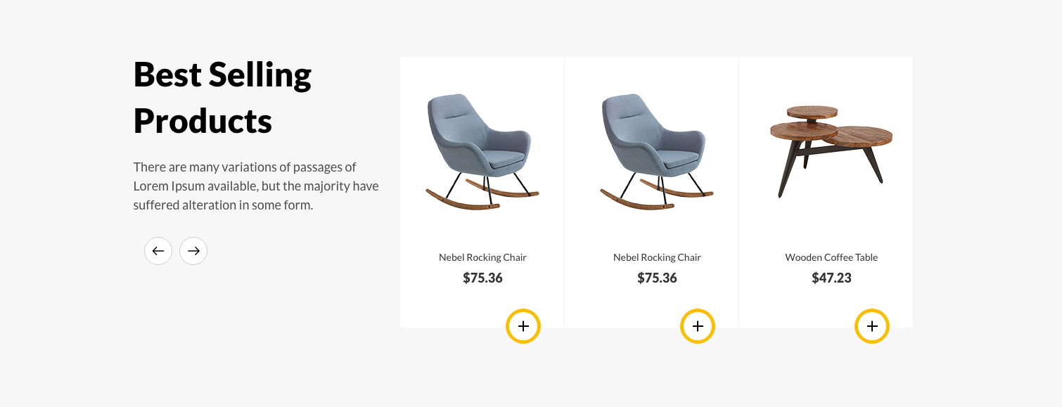
<!-- start Best Selling Products Section -->
<section class="padding-bottom-60 furniture_sell_product_section furniture_featured_section featured_section wow fadeIn">
                <div class="container">
                    <div class="row ">
                        <div class="col-md-4">
                            <div class="furniture_sell_content">
                                <h2 class="title_h2">Title</h2>
                                <p>Description</p>
                            </div>
                        </div>
                        <div class="col-md-8">
                            <div id="fur_sell_product_slider" class="owl-carousel">
                                <div class="item">
                                    <div class="featured_content mt-0 text-center">
                                        <div class="featured_img_content">
                                            <img src="your image" alt="" class="img-fluid">
                                        </div>
                                        <div class="featured_detail_content">
                                            <a href="product_list_detail.html"><p class="featured_title  text-capitalize  text-center">Product title</p></a>
                                            <p class="featured_price title_h5  text-center"><span>product price</span></p>
                                            <div class="featured_btn d-table m-auto">
                                                <a href="cart.html" class="background-btn text-capitalize d-flex w-auto ">
                                                    <span> </span><i class="plus_icon"></i>
                                                </a>
                                            </div>
                                        </div>
                                    </div>
                                </div>
                            </div>
                        </div>
                    </div>
                </div>
            </section>
<!-- end Best Selling Products Section -->
Planner
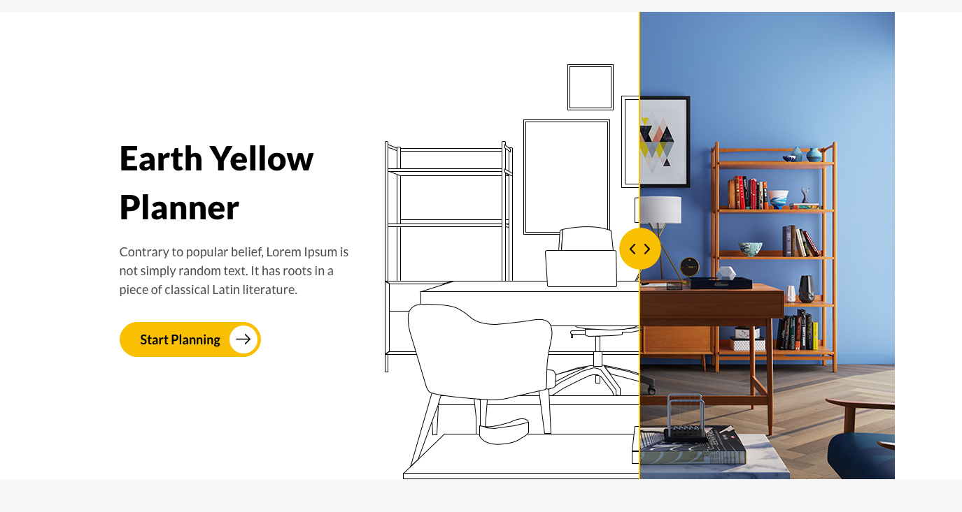
<!-- start Planner Section -->
<section class="furniture_planner_section  wow fadeIn">
                <div class="container">
                    <div class="row align-items-center">
                        <div class="col-md-4">
                            <div class="furniture_client_title">
                                <h2 class="title_h2">Planner Title</h2>
                                <p>Description</p>
                                <div class="position-relative d-inline-block">
                                    <a href="javascript:void(0);" class="background-btn w-auto text-capitalize"><span>Start Planning </span><i class="flaticon-arrows-4"></i></a>
                                </div>
                            </div>
                        </div>
                        <div class="col-md-8">
                            <figure class="cd-image-container mb-0 position-relative">
                                <img src="your image 1" alt="" class="img-fluid"/<
                                <span class="cd-image-label position-absolute" data-type="original">Original</span>
                                <div class="cd-resize-img">
                                    <img src="syour image gray" alt="" class="img-fluid"/>
                                    <span class="cd-image-label position-absolute" data-type="modified">Modified</span>
                                </div>
                                <span class="cd-handle"></span>
                            </figure>
                        </div>
                    </div>
                </div>
            </section>
<!-- end Planner Section -->
<!-- start Instagram Section -->
 <section class="padding-top-60 padding-bottom-60 instagram_section furniture_instagram_section ">
                <div class="container">
                    <div class="row flex-row-reverse align-items-center">
                        <div class="col-md-4">
                            <img src=""your image" alt=""/>
                            <h2 class="title_h2  text-capitalize"></h2>
                            <p></p>
                        </div>
                        <div class="col-md-8">
                            <div class="owl-carousel owl-theme instagram_slider w-auto row fur_instafeed" id="fur_instafeed">
                            </div>
                        </div>
                    </div>
                </div>
            </section>
<!-- end Instagram Section -->
What Our Clients Say
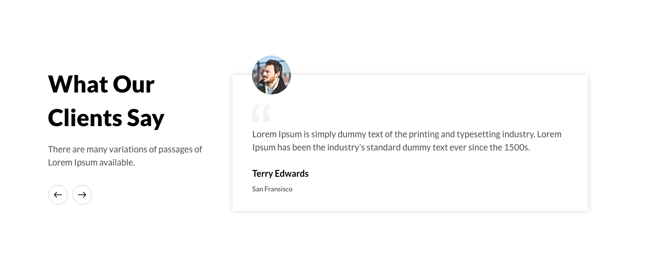
<!-- start Clients Section -->
<section class="furniture_clients_section  wow fadeIn">
                <div class="container">
                    <div class="row ">
                        <div class="col-md-4">
                            <div class="furniture_client_title">
                                <h2 class="title_h2">Clients title</h2>
                                <p>Description</p>
                            </div>
                        </div>
                        <div class="col-md-8">
                            <div id="fur_blog_slider" class="owl-carousel w-auto">
                                <div class="item">
                                    <div class="furniture_client_content ">
                                        <div class="rounded-circle position-absolute client_img ">
                                            <img src="your image" alt="" class="img-fluid position-absolute"/>
                                        </div>
                                        <span class="quote d-block"><img src="your image" alt=""/></span>
                                        <p>Description</p>
                                        <h5 class="title_h5">user name</h5>
                                        <span></span>
                                    </div>
                                </div>
                            </div>
                        </div>
                    </div>
                </div>
            </section>
<!-- end Clients Section -->
Electronics
Note To see the landing page of "Electronics" Please click here.Banner
<!-- start Banner section -->
<div class=" banner_slider_section electronics_banner_slider_section position-relative">
                <div id="rev_slider_16_1" class="rev_slider fullscreenbanner" style="display:none;" data-version="5.4.1">
                    <ul>
                      <!-- SLIDE  -->
                        <li data-index="rs-34" data-transition="fade" data-slotamount="default" data-hideafterloop="0" data-hideslideonmobile="off"  data-easein="default" data-easeout="default" data-masterspeed="300"  data-rotate="0"  data-saveperformance="off"  data-title="Slide" data-param1="" data-param2="" data-param3="" data-param4="" data-param5="" data-param6="" data-param7="" data-param8="" data-param9="" data-param10="" data-description="">
                            <!-- MAIN IMAGE -->
                            <img src="banner image"  alt="banner"  data-bgposition="center center" data-bgfit="cover" data-bgrepeat="no-repeat" data-bgparallax="off" class="rev-slidebg" data-no-retina>
                            <!-- LAYERS -->
                            <!-- LAYER NR. 1 -->
                            <div class="tp-caption   tp-resizeme  tp-imgopacity rs-parallaxlevel-1"
                                 id="slide-34-layer-3"
                                 data-x="['center','center','center','center']" data-hoffset="['0','0','0','0']"
                                 data-y="['middle','middle','middle','middle']" data-voffset="['0','0','0','0']"
                                 data-width="full-proportional"
                                 data-height="full-proportional"
                                 data-whitespace="nowrap"

                                 data-type="image"
                                 data-basealign="slide"
                                 data-responsive_offset="on"

                                 data-frames='[{"delay":200,"speed":2000,"frame":"0","from":"sX:1;sY:1;opacity:0;fb:10px;","to":"o:1;fb:0px;","ease":"Power3.easeInOut"},{"delay":"wait","speed":300,"frame":"999","to":"opacity:0;fb:0;","ease":"Power3.easeInOut"}]'
                                 data-textAlign="['inherit','inherit','inherit','inherit']"
                                 data-paddingtop="[0,0,0,0]"
                                 data-paddingright="[0,0,0,0]"
                                 data-paddingbottom="[0,0,0,0]"
                                 data-paddingleft="[0,0,0,0]"

                                 style="z-index: 5;opacity:0.5 !important;">
                                <div class="rs-looped rs-slideloop"  data-easing="Power1.easeInOut" data-speed="1" data-xs="-5" data-xe="5" data-ys="0" data-ye="0"><img src="banner image" alt="" data-ww="['full-proportional','full-proportional','full-proportional','full-proportional']" data-hh="['full-proportional','full-proportional','full-proportional','full-proportional']" width="1920" height="680" data-no-retina> </div>
                            </div>

                            <!-- LAYER NR. 2 -->
                            <div class="tp-caption   tp-resizeme  tp-imgopacity rs-parallaxlevel-2"
                                 id="slide-34-layer-5"
                                 data-x="['center','center','center','center']" data-hoffset="['0','0','0','0']"
                                 data-y="['middle','middle','middle','middle']" data-voffset="['0','0','0','0']"
                                 data-width="full-proportional"
                                 data-height="full-proportional"
                                 data-whitespace="nowrap"

                                 data-type="image"
                                 data-basealign="slide"
                                 data-responsive_offset="on"

                                 data-frames='[{"delay":300,"speed":2000,"frame":"0","from":"sX:1;sY:1;opacity:0;fb:10px;","to":"o:1;fb:0px;","ease":"Power3.easeInOut"},{"delay":"wait","speed":300,"frame":"999","to":"opacity:0;fb:0;","ease":"Power3.easeInOut"}]'
                                 data-textAlign="['inherit','inherit','inherit','inherit']"
                                 data-paddingtop="[0,0,0,0]"
                                 data-paddingright="[0,0,0,0]"
                                 data-paddingbottom="[0,0,0,0]"
                                 data-paddingleft="[0,0,0,0]"
                                 style="z-index: 6;opacity:0.5 !important;">
                                <div class="rs-looped rs-slideloop"  data-easing="Power1.easeInOut" data-speed="1" data-xs="0" data-xe="0" data-ys="-5" data-ye="5"><img src="banner image" alt="" data-ww="['full-proportional','full-proportional','full-proportional','full-proportional']" data-hh="['full-proportional','full-proportional','full-proportional','full-proportional']" width="1920" height="680" data-no-retina> </div>
                            </div>

                            <!-- LAYER NR. 3 -->
                            <div class="tp-caption   tp-resizeme  tp-imgopacity rs-parallaxlevel-3"
                                 id="slide-34-layer-7"
                                 data-x="['center','center','center','center']" data-hoffset="['0','0','0','0']"
                                 data-y="['middle','middle','middle','middle']" data-voffset="['0','0','0','0']"
                                 data-width="full-proportional"
                                 data-height="full-proportional"
                                 data-whitespace="nowrap"

                                 data-type="image"
                                 data-basealign="slide"
                                 data-responsive_offset="on"

                                 data-frames='[{"delay":400,"speed":2000,"frame":"0","from":"sX:1;sY:1;opacity:0;fb:10px;","to":"o:1;fb:0px;","ease":"Power3.easeInOut"},{"delay":"wait","speed":300,"frame":"999","to":"opacity:0;fb:0;","ease":"Power3.easeInOut"}]'
                                 data-textAlign="['inherit','inherit','inherit','inherit']"
                                 data-paddingtop="[0,0,0,0]"
                                 data-paddingright="[0,0,0,0]"
                                 data-paddingbottom="[0,0,0,0]"
                                 data-paddingleft="[0,0,0,0]"

                                 style="z-index: 7;opacity:0.5 !important;">
                                <div class="rs-looped rs-wave"  data-speed="10" data-angle="0" data-radius="15px" data-origin="50% 50%"><img src="banner image" alt="" data-ww="['full-proportional','full-proportional','full-proportional','full-proportional']" data-hh="['full-proportional','full-proportional','full-proportional','full-proportional']" width="1920" height="680" data-no-retina> </div>
                            </div>

                           <!-- LAYER NR. 4 -->
                            <div class="tp-caption   rs-parallaxlevel-1"
                                 id="slide-34-layer-2"
                                 data-x="['left','left','left','left']" data-hoffset="['-156','0','0','0']"
                                 data-y="['top','top','top','top']" data-voffset="['28','0','0','0']"
                                 data-type="text"
                                 data-responsive_offset="off"
                                 data-responsive="off"
                                 data-frames='[{"delay":500,"speed":2000,"frame":"0","from":"sX:2;opacity:0;fb:20px;","to":"o:1;fb:0;","ease":"Power3.easeInOut"},{"delay":"wait","speed":300,"frame":"999","to":"opacity:0;fb:0;","ease":"Power3.easeInOut"}]'
                                 data-textAlign="['inherit','inherit','inherit','inherit']"
                                 data-paddingtop="[0,0,0,0]"
                                 data-paddingright="[0,0,0,0]"
                                 data-paddingbottom="[0,0,0,0]"
                                 data-paddingleft="[0,0,0,0]"
                                 style="z-index: 7;font-size:18px;">
                                <img src="your image" alt="img" class=" img-fluid d-inline-block">
                                <div class="ele_banner_content d-inline-block align-middle">
                                    <h3 class="title_h3 text-white" style="font-weight: 600;"></h3>
                                    <a href="product_list_with_filter.html" class="text-white text-uppercase"> <span class="menu_arrow flaticon-down-arrow-1"></span></a>
                                </div>
                            </div>

                            <!-- LAYER NR. 5 -->
                            <div class="tp-caption   rs-parallaxlevel-1"
                                 id="slide-34-layer-4"
                                 data-x="['left','left','left','left']" data-hoffset="['296','0','0','0']"
                                 data-y="['top','top','top','top']" data-voffset="['305','0','0','0']"
                                 data-type="text"
                                 data-responsive_offset="off"
                                 data-responsive="off"
                                 data-frames='[{"delay":900,"speed":2000,"frame":"0","from":"sX:2;opacity:0;fb:20px;","to":"o:1;fb:0;","ease":"Power3.easeInOut"},{"delay":"wait","speed":300,"frame":"999","to":"opacity:0;fb:0;","ease":"Power3.easeInOut"}]'
                                 data-textAlign="['inherit','inherit','inherit','inherit']"
                                 data-paddingtop="[0,0,0,0]"
                                 data-paddingright="[0,0,0,0]"
                                 data-paddingbottom="[0,0,0,0]"
                                 data-paddingleft="[0,0,0,0]"
                                style="z-index: 7;font-size:18px;">
                                        <img src="your image" alt="img" class=" img-fluid d-inline-block">
                                        <div class="ele_banner_content d-inline-block align-middle">
                                            <h3 class="title_h3 text-white" style="font-weight: 600;"></h3>
                                            <a href="product_list_with_filter.html" class="text-white text-uppercase"><span class="menu_arrow flaticon-down-arrow-1"></span></a>
                                        </div>
                            </div>
                            <!-- LAYER NR. 6 -->
                            <div class="tp-caption   rs-parallaxlevel-1"
                                 id="slide-34-layer-6"
                                 data-x="['right','right','right','right']" data-hoffset="['-248','0','0','0']"
                                 data-y="['top','top','top','top']" data-voffset="['29','0','0','0']"
                                 data-type="text"
                                 data-responsive_offset="off"
                                 data-responsive="off"
                                 data-frames='[{"delay":1000,"speed":2000,"frame":"0","from":"y:50px;opacity:0;fb:20px;","to":"o:1;fb:0;","ease":"Power3.easeInOut"},{"delay":"wait","speed":300,"frame":"999","to":"opacity:0;fb:0;","ease":"Power3.easeInOut"}]'
                                 data-textAlign="['inherit','inherit','inherit','inherit']"
                                 data-paddingtop="[0,0,0,0]"
                                 data-paddingright="[0,0,0,0]"
                                 data-paddingbottom="[0,0,0,0]"
                                 data-paddingleft="[0,0,0,0]"
                                 style="z-index: 7;font-size:18px;">
                                        <img src="your image" alt="img" class=" img-fluid d-inline-block align-middle">
                                        <div class="ele_banner_content d-inline-block align-middle">
                                            <h3 class="title_h3 text-white" style="font-weight: 600;"></h3>
                                            <a href="product_list_with_filter.html" class="text-white text-uppercase"><span class="menu_arrow flaticon-down-arrow-1"></span></a>
                                        </div>
                        </div>
                        </li>
                    </ul>
            </div><!-- END REVOLUTION SLIDER -->
            </div>
<!-- end Banner section -->
Collections
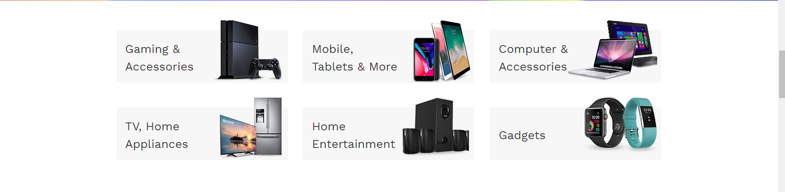
<!-- start Collections  section -->
<div class="home_collection_section electronics_collection_section  wow fadeIn padding-top-60">
                <div class="container">
                    <div class="row">
                        <div class="col-sm-6 col-lg-4 wow fadeInLeft animated">
                            <a href="product_list_with_filter.html" class="d-table w-100 h-100">
                                <div class="home_collection_content  position-relative d-table-cell align-middle">
                                    <p class=" mb-0 d-inline-block"></p>
                                    <img src="collection image" alt="ele_collection" class="img-fluid"/>
                                </div>
                            </a>
                        </div>
                    </div>
                </div>
            </div>
<!-- end Collections  section -->
Product
<!-- start Product section -->
<section class="padding-top-text-60  electronics_product_section wow fadeIn ">
                 <div class="container container-md-fluid">
                     <div class="row m-0">
                     <div class="electronics_product_section_left d-inline-block h-100">
                         <div class="slider-nav">
                             <div><img src="Product image" alt="alt" class="img-fluid vertical_middle m-auto"/></div>
                         </div>
                     </div>
                     <div class="electronics_product_section_right  d-inline-block h-100 ">
                         <div class="slider-for h-100">
                             <div class="h-100">
                                 <div class="electronics_product_section_img  float-lg-left d-inline-block h-100">
                                    <img src="Product image" alt="img" class="img-fluid"/>
                                </div>
                                <div class="electronics_product_section_dec float-left d-inline-block h-100">
                                    Product Description
                                </div>
                             </div>
                         </div>
                     </div>
                     </div>
                 </div>
             </section>
<!-- end Product section -->
Collections 2
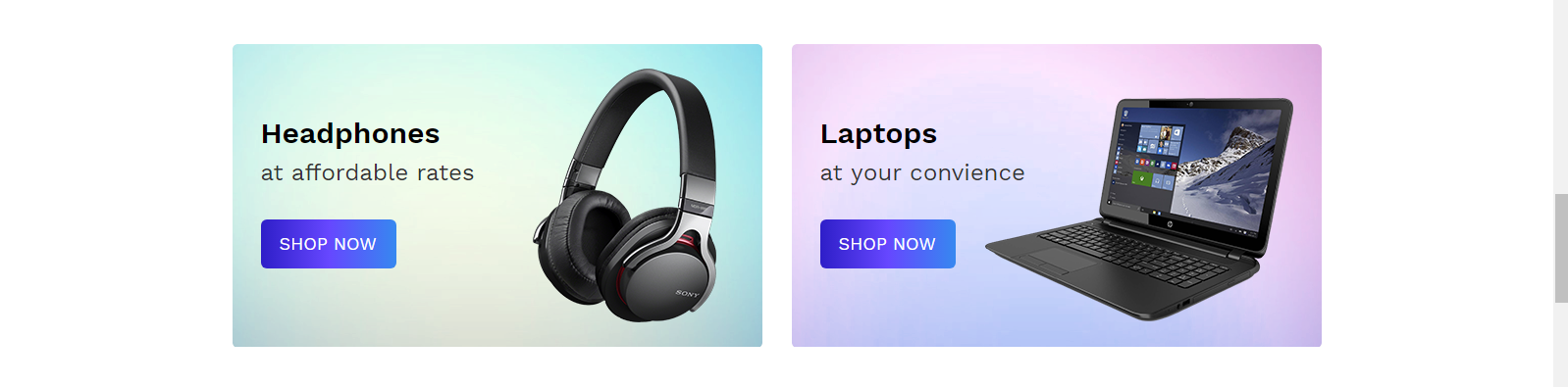
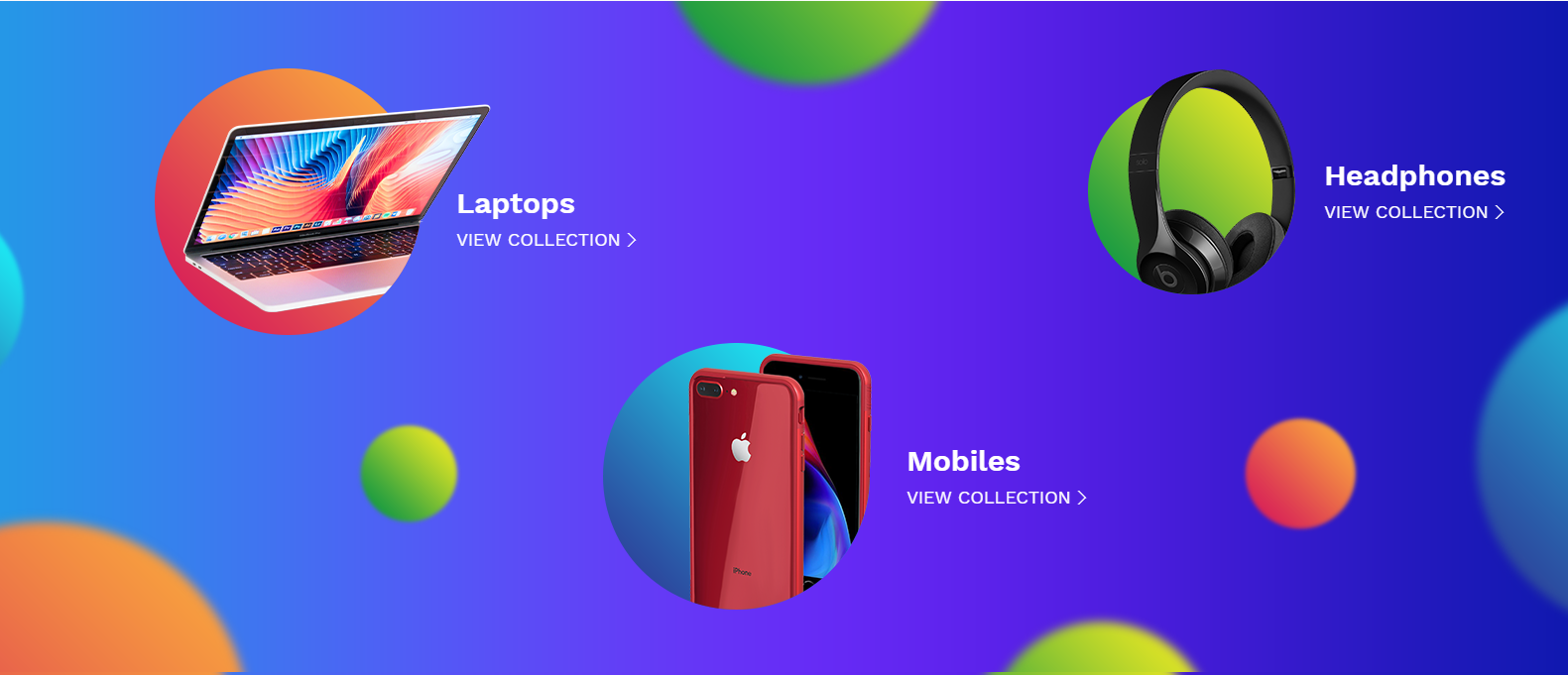
<!-- start Collections 2 section -->
<div class="home_collection_section electronics_headphones_collection_section  wow fadeIn padding-top-60">
                <div class="container">
                    <div class="row">
                        <div class="col-md-6  wow fadeInRight animated">
                            <div class="home_collection_content d-table h-100 w-100 headphones_bg">
                                <div class="col_dec d-inline-block align-middle">
                                    <h3 class="title_h3"></h3>
                                    <p></p>
                                    <a href="product_list_with_filter.html" class="border-0 d-table text-uppercase background-btn text-white"></a>
                                </div>
                                <div class="col_img d-inline-block align-middle">
                                    <img src="Your image" alt="img"  class="img-fluid"/>
                                </div>
                            </div>

                        </div>
                        <div class="col-md-6  wow fadeInRight animated">
                            <div class="home_collection_content d-table h-100 w-100 laptops_bg">
                                <div class="col_dec d-inline-block align-middle  ">
                                    <h3 class="title_h3"></h3>
                                    <p></p>
                                    <a href="product_list_with_filter.html" class="border-0 d-table text-uppercase background-btn text-white"></a>
                                </div>
                                <div class="col_img d-inline-block align-middle">
                                    <img src="Your image" alt="img"  class="img-fluid"/>
                                </div>
                            </div>
                        </div>
                    </div>
                </div>
            </div>
<!-- end Collections 2 section -->
Featured Categories
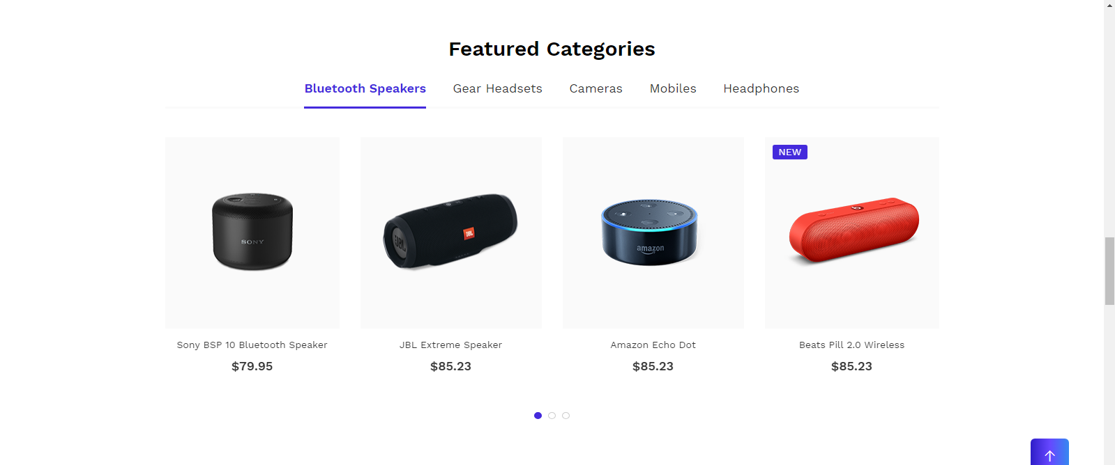
<!-- start Featured Categories section -->
<section class="padding-top-text-60 featured_section electronics_featured_tab_section electronics_featured_section wow fadeIn ">
                <div class="container">
                    <h3 class="title_h3  text-capitalize home_title_h3 text-center">Featured Title</h3>
                    <ul class="tabs d-none d-md-inline-block w-100 position-relative text-center">
                        <li class="active" rel="tab1">Tab title</li>
                        <li rel="tab2">Tab title</li>
                    </ul>
                    <div class="tab_container w-100 d-inline-block position-relative">
                        <h3 class="d_active tab_drawer_heading  position-relative  d-md-none" rel="tab1">Bluetooth Speakers</h3>
                        <div id="tab1" class="tab_content active_content">
                             <div  class="owl-carousel electronics_tab_slider">
                                <div class="item">
                                   <div class="featured_content">
                                        Product Grid
                                    </div>
                                </div>
                            </div>
                        </div>
                        <!-- #tab1 -->
                        <h3 class="tab_drawer_heading  position-relative  d-md-none" rel="tab2">Gear Headsets</h3>
                        <div id="tab2" class="tab_content">
                            <div  class="owl-carousel electronics_tab_slider">
                                <div class="item">
                                   <div class="featured_content">
                                        Product Grid
                                    </div>
                                </div>
                            </div>
                        </div>
                        <!-- #tab2 -->
                    </div>
                    <!-- .tab_container -->
                </div>
            </section>
<!-- end Featured Categories section -->
Collections 3

<!-- start Collections 3 section -->
  <div class="home_collection_section electronics_launch_collection_section  wow fadeIn padding-top-60">
                <div class="container container-md-fluid">
                    <div class="row no-gutters">
                        <div class="col-lg-6  wow fadeInRight animated ele_phone_bg">
                            <div class="home_collection_content d-flex align-items-center h-100  w-100  ">
                                <div class="col_img d-inline-block align-middle">
                                    <img src="Your image" alt="img" class="img-fluid"/>
                                </div>
                                <div class="col_dec d-inline-block align-middle">
                                    <h3 class="title_h3 text-white"></h3>
                                    <p class="text-white"></p>
                                    <a href="product_list_with_filter.html" class=" d-table text-uppercase border-btn text-white"></a>
                                </div>
                            </div>

                        </div>
                        <div class="col-lg-6  wow fadeInRight animated ele_game_bg">
                            <div class="home_collection_content  d-flex align-items-center h-100  w-100 ">
                                <div class="col_img d-inline-block align-middle">
                                     <img src="Your image" alt="img" class="img-fluid"/>
                                </div>
                                <div class="col_dec d-inline-block align-middle  ">
                                    <h3 class="title_h3 text-white"></h3>
                                    <p class="text-white"></p>
                                    <a href="product_list_with_filter.html" class=" d-table text-uppercase border-btn text-white"></a>
                                </div>
                            </div>
                        </div>
                    </div>
                </div>
            </div>
<!-- end Collections 3 section -->
Featured Products
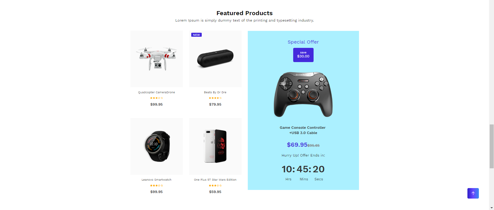
<!-- start Featured Products section -->
<section class="padding-top-text-60 featured_section electronics_featured_section wow fadeIn ">
                <div class="container">
                    <h3 class="title_h3  text-capitalize home_title_h3 text-center">Featured Products</h3>
                    <p class="text-center">Lorem Ipsum is simply dummy text of the printing and typesetting industry.</p>
                    <div class="row">
                        <div class="col-lg-6">
                            <div class="row">
                                <div class=" col-sm-6 wow fadeInLeft animated" data-wow-duration="1300ms" data-wow-delay="0.6s">
                                    <div class="featured_content">
                                        Product Grid
                                    </div>
                                </div>
                            </div>
                        </div>
                        <div class="col-lg-6">
                            <div class="electronics_featured_offer text-center">
                                Product Special Offer content
                            </div>
                        </div>
                    </div>

                </div>
            </section>
<!-- end Featured Products section -->
Collections 4
<!-- start Collections 4 section -->
<div class="home_collection_section electronics_smart_collection_section  wow fadeIn padding-top-60">
                <div class="container">
                    <div class="row ">
                        <div class="col-lg-8 col-md-7 wow fadeInRight animated ">
                            <div class="home_collection_content  d-flex align-items-center h-100  w-100  ele_tv_bg">
                                <div class="col_dec d-inline-block align-middle">
                                    <h3 class="title_h3 text-white"></h3>
                                    <p class="text-white"></p>
                                    <a href="product_list_with_filter.html" class=" d-table text-uppercase border-btn text-white"></a>
                                </div>
                            </div>

                        </div>
                        <div class="col-lg-4 col-md-5  wow fadeInRight animated ">
                            <div class="home_collection_content  d-flex align-items-center h-100  w-100 ele_camera_bg">
                                <div class="col_dec d-inline-block align-middle  ">
                                    <h3 class="title_h3 text-white"></h3>
                                    <p class="text-white"></p>
                                    <a href="product_list_with_filter.html" class=" d-table text-uppercase border-btn text-white"></a>
                                </div>
                            </div>
                        </div>
                    </div>
                </div>
            </div>
<!-- end Collections 4 section -->
Promotion

<!-- start Promotion section -->
                                                <div class="free_promo_section wow fadeIn padding-top-60 padding-bottom-60">
                <div class="container">
                    <div class="row no-xl-gutters">
                        <div class="col-xl-4 col-md-6">
                            <div class="free_promo_content h-100 free_promo_shipping">
                                <div class="free_promo_img d-inline-block position-relative text-center  align-middle">
                                    <img src="your image" class="img-fluid vertical_middle m-auto" alt="img"/>
                                </div>
                                <div class="free_promo_dec d-inline-block  align-middle">
                                    <h4 class="title_h4"></h4>
                                    <p class="mb-0"></p>
                                </div>
                            </div>
                        </div>
                        </div>
                    </div>
                </div>
            </div>
                                           <!-- end Promotion section -->
Baby
Note To see the landing page of "Baby" Please click here.Banner
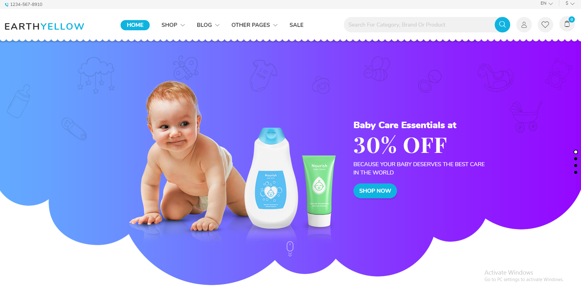
<!-- start Banner Section -->
<div class="baby_banner_slider_section position-relative">
                <div class="rev_slider_wrapper fullwidthbanner-container">
                     <!-- the ID here will be used in the JavaScript below to initialize the slider -->
                    <div id="rev_slider_2_baby" class="rev_slider fullwidthabanner" data-version="5.4.5" style="display:none;">
                     <!-- BEGIN MAIN SLIDE LIST -->
                        <ul>
                       <!-- MINIMUM SLIDE STRUCTURE -->
                            <li data-transition="fade">
                          <!-- SLIDE'S MAIN BACKGROUND IMAGE -->
                                <img src="your image" alt="" class="rev-slidebg">
                                 <!-- LAYER NR. 1 -->
                                <div class="container">
                                <div class="tp-caption Restaurant-Display   tp-resizeme"
                                    id="slide-3010-layer-1"
                                         data-x="['left','middle','middle','middle']" data-hoffset="['685','0','0','0']"
                                         data-y="['top','middle','middle','middle']" data-voffset="['264','0','0','0']"
                                         data-type="text"
                                         data-responsive_offset="on"
                                         data-frames='[{"from":"y:[100%];z:0;rX:0deg;rY:0;rZ:0;sX:1;sY:1;skX:0;skY:0;","mask":"x:0px;y:0px;s:inherit;e:inherit;","speed":1500,"to":"o:1;","delay":500,"ease":"Power3.easeInOut"},{"delay":"wait","speed":1000,"to":"opacity:0;","ease":"nothing"}]'
                                         data-textAlign="['left','left','left','left']"
                                         data-paddingtop="[0,0,0,0]"
                                         data-paddingright="[0,0,0,0]"
                                         data-paddingbottom="[0,0,0,0]"
                                         data-paddingleft="[0,0,0,0]"
                                         style="z-index: 5;font-size:30px;line-height:30px;color:#fff;font-family: 'NunitoBlack_1';">Baby Care Essentials at </div> </div>
                                 <!-- LAYER NR. 2 -->
                                <div class="tp-caption Restaurant-Cursive   tp-resizeme"
                                    id="slide-3010-layer-2"
                                         data-x="['left','middle','middle','middle']" data-hoffset="['685','0','0','0']"
                                         data-y="['top','middle','middle','middle']" data-voffset="['300','0','0','0']"
                                         data-type="text"
                                         data-responsive_offset="on"
                                         data-frames='[{"from":"y:[100%];z:0;rX:0deg;rY:0;rZ:0;sX:1;sY:1;skX:0;skY:0;","mask":"x:0px;y:0px;s:inherit;e:inherit;","speed":1500,"to":"o:1;","delay":700,"ease":"Power3.easeInOut"},{"delay":"wait","speed":1000,"to":"opacity:0;","ease":"nothing"}]'
                                         data-textAlign="['left','left','left','left']"
                                         data-paddingtop="[0,0,0,0]"
                                         data-paddingright="[0,0,0,0]"
                                         data-paddingbottom="[0,0,0,0]"
                                         data-paddingleft="[0,0,0,0]"
                                         style="z-index: 6;font-family: 'PlayfairDisplay-Bold';font-size: 70px;line-height: 78px;text-transform: uppercase;font-variant: lining-nums;">30% off</div>
                                 <!-- LAYER NR. 3 -->
                                <div class="tp-caption Restaurant-Cursive   tp-resizeme"
                                    id="slide-3010-layer-3"
                                         data-x="['left','middle','middle','middle']" data-hoffset="['685','0','0','0']"
                                         data-y="['top','middle','middle','middle']" data-voffset="['392','0','0','0']"
                                         data-type="text"
                                         data-responsive_offset="off"
                                         data-frames='[{"from":"y:[100%];z:0;rX:0deg;rY:0;rZ:0;sX:1;sY:1;skX:0;skY:0;","mask":"x:0px;y:0px;s:inherit;e:inherit;","speed":1500,"to":"o:1;","delay":700,"ease":"Power3.easeInOut"},{"delay":"wait","speed":1000,"to":"opacity:0;","ease":"nothing"}]'
                                         data-textAlign="['left','left','left','left']"
                                         data-paddingtop="[0,0,0,0]"
                                         data-paddingright="[0,0,0,0]"
                                         data-paddingbottom="[0,0,0,0]"
                                         data-paddingleft="[0,0,0,0]"
                                         style="z-index: 7;font-family: 'Nunito';line-height: 1.5;font-weight: 400;letter-spacing: 0;text-transform: uppercase;font-size: 18px">Because your baby deserves the best care
in the world</div>
                                 <!-- LAYER NR. 4 -->
                                <div class="tp-caption Restaurant-Cursive   tp-resizeme"
                                    id="slide-3010-layer-4"
                                         data-x="['left','middle','middle','middle']" data-hoffset="['685','0','0','0']"
                                         data-y="['top','middle','middle','middle']" data-voffset="['467','0','0','0']"
                                         data-type="text"
                                         data-responsive_offset="off"
                                         data-frames='[{"from":"y:[-100%];z:0;rX:0deg;rY:0;rZ:0;sX:1;sY:1;skX:0;skY:0;","mask":"x:0px;y:0px;s:inherit;e:inherit;","speed":1500,"to":"o:1;","delay":700,"ease":"Power3.easeInOut"},{"delay":"wait","speed":1000,"to":"opacity:0;","ease":"nothing"}]'
                                         data-textAlign="['left','left','left','left']"
                                         data-paddingtop="[0,0,0,0]"
                                         data-paddingright="[0,0,0,0]"
                                         data-paddingbottom="[0,0,0,0]"
                                         data-paddingleft="[0,0,0,0]"
                                         style="z-index: 9;">
                                    <a class="background-btn text-uppercase baby_btn_shadow" style="letter-spacing: 0;margin-bottom: 4px ;padding: 14.5px 18px;font-size: 18px;line-height: 18px;">shop now  </a>
                                </div>
                                <!-- LAYER NR. 5 -->
                                <div class="tp-caption Restaurant-Cursive   tp-resizeme"
                                    id="slide-3010-layer-5"
                                         data-x="['middle','middle','middle','middle']" data-hoffset="['0','0','0','0']"
                                         data-y="['bottom','middle','middle','middle']" data-voffset="['92','0','0','0']"
                                         data-type="text"
                                         data-responsive_offset="off"
                                         data-frames='[{"from":"y:[-100%];z:0;rX:0deg;rY:0;rZ:0;sX:1;sY:1;skX:0;skY:0;","mask":"x:0px;y:0px;s:inherit;e:inherit;","speed":1500,"to":"o:1;","delay":700,"ease":"Power3.easeInOut"},{"delay":"wait","speed":1000,"to":"opacity:0;","ease":"nothing"}]'
                                         data-textAlign="['left','left','left','left']"
                                         data-paddingtop="[0,0,0,0]"
                                         data-paddingright="[0,0,0,0]"
                                         data-paddingbottom="[0,0,0,0]"
                                         data-paddingleft="[0,0,0,0]"
                                         style="z-index: 10;">
                                    <a href="#baby_collection_section_id" ><img src="src/images/banner_mouse.png" alt="" >  </a>
                                </div>
                            </li>
                            </ul>
                             <!-- END MAIN SLIDE LIST -->
                    </div>
                </div>
            </div>
                                            <!-- end Banner Section -->
Collection
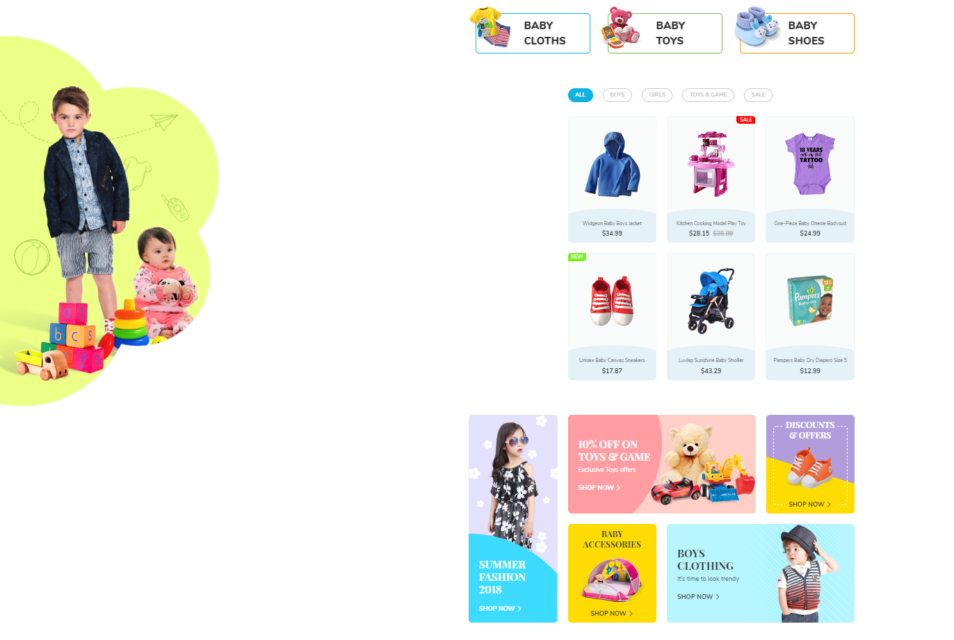
<!-- start Collection Section -->
<div class="baby_three_section_back_image" >
    <div class="home_collection_section baby_collection_top_section wow fadeIn mt-100" >
                    <div class="container">
                        <div class="row">
                            <div class="col-sm-6 col-lg-4 wow fadeInLeft animated baby_collection position-relative" >
                                <img src="your-image.jpg" alt="blog" class="img-fluid">
                                <div class="home_collection_content position-relative">
                                    <p class=" mb-0 d-inline-block title_h3">Title</p>
                                    <a href="product_list_with_sidebar.html" class="position-absolute"><span class="flaticon-arrows d-inline-block"></span></a>
                                    </div>
                                </div>
                            </div>
                        </div>
                    </div>
    </div>

    <div class="mt-100 arrival_featured_section baby_arrival_featured_section wow fadeIn" >
        <div class="container" >
            <div class="row" >
                <div class="col-lg-9 col-md-12 col-12 offset-lg-3 wow fadeInUp animated" >
                    <div id="myBtnContainer" >
                        <button class="btn active" onclick="filterSelection('baby_all')" >all</button>
                        <button class="btn" onclick="filterSelection('baby_boys')" >boys</button>
                        <button class="btn" onclick="filterSelection('baby_girls')" >girls</button>
                        <button class="btn" onclick="filterSelection('baby_toys')" >toys & game</button>
                        <button class="btn" onclick="filterSelection('baby_sale')" >sale</button>
                    </div>
                </div>
                <div class="col-lg-9 col-md-12 col-12 offset-lg-3 wow fadeInUp animated" >
                    <div class="row" >
                         <div class="col-lg-4 col-sm-6 baby_boys baby_item wow fadeInLeft animated" >
                            <div class="featured_content" >
                                Product  grid
                            </div>
                        </div>
                    </div>
                </div>
            </div>
        </div>
    </div>

    <div class="baby_collection_section padding-top-60 wow fadeIn mb-100" id="baby_collection_section_id >
        <div class="container" >
            <div class="row" >
                <div class="col-md-12 col-lg-3 wow fadeInLeft animated mt-30" >
                    <div class="home_collection_content  position-relative baby_left_collection_sec h-100 border_radius_10" >
                         <img src="your-image.jpg" alt="women" class="img-fluid d-block m-auto">
                         <div class="baby_collection_content position-absolute d-inline-block" >
                            <p class="text-uppercase title_h3_30 text-white">Title</p>
                            <a href="product_list_with_sidebar.html" class="text-white  text-uppercase shop_now">shop now<i class="flaticon-right-arrow"></i></a>
                         </div>
                    </div>
                </div>
                <div class="col-md-12 col-lg-9 wow fadeInRight animated" >
                    <div class="row" >
                        <div class="col-sm-12 col-md-8 wow fadeInDown animated mt-30" >
                            <div class="row baby_collection_last baby_collection_2 m-0 h-100" >
                                <div class="col-6 col-lg-6 wow fadeInDown animated baby_collection_last_left" >
                                    <div class="baby_collection_content d-inline-block" >
                                        <p class="text-uppercase title_h3_30 text-white">Text</p>
                                        <p class="text-white">Text</p>
                                        <a href="product_list_with_sidebar.html" class="text-white  text-uppercase shop_now">shop now<i class="flaticon-right-arrow"></i></a>
                                    </div>
                                </div>
                                <div class="col-6 col-lg-6 toy_image wow fadeInDown animated p-0" >
                                    <div class="toy_img_middle h-100" >
                                        <img src="your-image.jpg" alt="women" class="img-fluid d-block m-auto">
                                    </div>
                                </div>
                            </div>
                        </div>
                        <div class="col-sm-6 col-md-4 wow fadeInDown animated mt-30" >
                            <div class="home_collection_content baby_right_collection_sec_4 border_radius_10 text-center" >
                                <div class="baby_collection_content d-inline-block" >
                                    <p class="text-uppercase title_h3_24 title_h3_30 text-white">Text</p>
                                    <img src="your-image.jpg" alt="women" class="img-fluid d-block m-auto">
                                    <a href="product_list_with_sidebar.html" class="text-uppercase shop_now">shop now<i class="flaticon-right-arrow"></i></a>
                                </div>
                            </div>
                        </div>
                    </div>
                </div>
            </div>
        </div>
    </div>

 </div>
                                            <!-- end Collection Section -->
Exclusive Deals
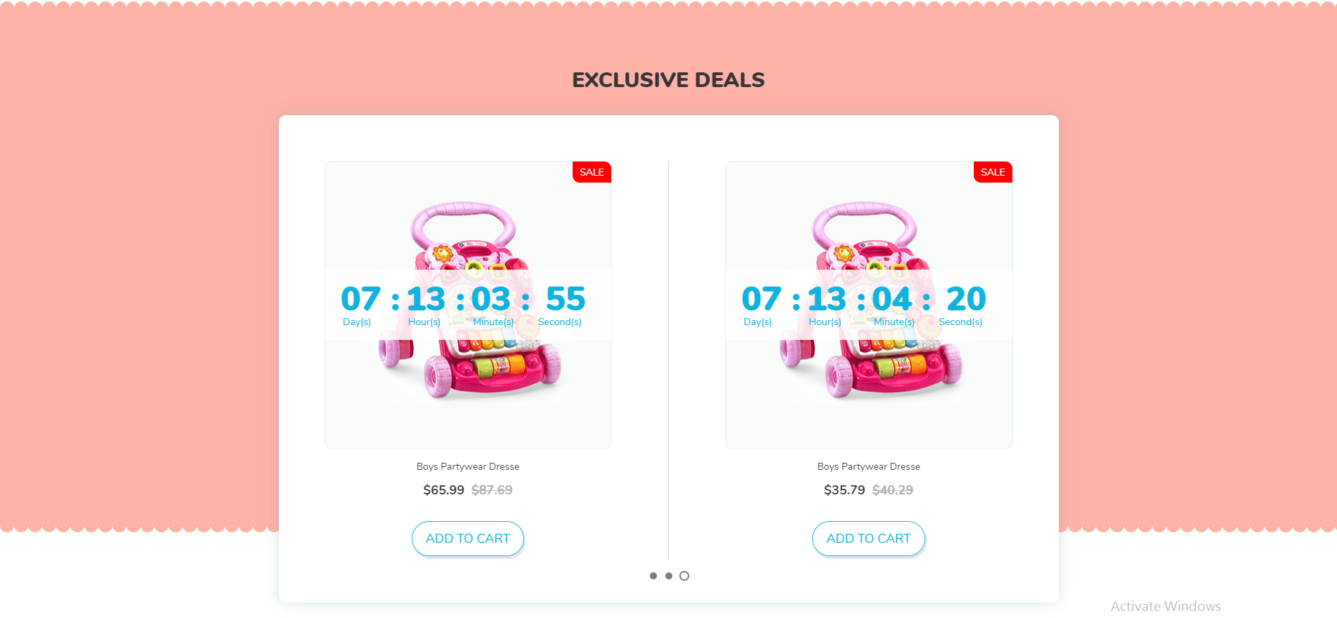
<!-- start Exclusive Deals Section -->
                <section class="baby_exclusive_deals_section wow fadeIn">
                    <div class="container">
                        <div class="row">
                            <div class="col-12 text-center text-uppercase">
                                <div class="baby_client_title">
                                    <h3 class="title_h3">exclusive deals</h3>
                                </div>
                            </div>
                            <div class="col-12 text-center">
                                <div class="owl-carousel baby_exclusive_deals_slider">
                                    <div class="item wow fadeInLeft animated">
                                        <div class="deals_img_content position-relative">
                                            <img src="your-image.jpg" alt="exclusive_product" class="img-fluid vertical_middle m-auto">
                                            <ul id="baby_exclusive_countdowntimer1" class="product-date position-absolute"></ul>
                                            <div class="product-label  text-uppercase  sale-label ">sale</div>
                                        </div>
                                        <div class="featured_detail_content">
                                            <a href="product_list_detail.html"><p class="featured_title  text-capitalize text-center ">Boys Partywear Dress</p></a>
                                            <p class="featured_price title_h5  text-center"><span > price </span><span class="compare_price"> compare price </span></p>
                                            <a href="cart.html" class="border-btn text-uppercase baby_btn_shadow d-inline-block">add to cart</a>
                                        </div>
                                    </div>
                                </div>
                            </div>
                        </div>
                    </div>
                </section>
                                            <!-- end Exclusive Deals Section -->
Product

<!-- start Product Section -->
                <section class="baby_lookbook_section lookbook_section padding-bottom-60 wow fadeIn" >
                    <div class="container">
                        <div class="row">
                            <div class="col-md-8 wow fadeInLeft" data-wow-duration="1300ms">
                                <div class="lookbook_content">
                                    <div class="lookbook_img lookbook_img_1">
                                        <img src="your-image.jpg" alt="LookBook" class="img-fluid">
                                        <div class="block_list vertical_middle">
                                            <div class="number_1_1_baby blocks text-center rounded-circle">
                                                <span></span>
                                                <div class="hover_div small_tool_right">
                                                    <div class="look_wrapper text-left">
                                                        <a href="product_list_detail.html" class="text-left"><p>Waterproof Kids Watch</p></a>
                                                        <span class="title_h5">$32.95</span>
                                                        <div class="look_btn">
                                                            <a href="product_list_detail.html" class="border-btn text-uppercase">details</a>
                                                            <a href="cart.html" class="background-btn text-uppercase">add to cart</a>
                                                        </div>
                                                    </div>
                                                </div>
                                            </div>
                                        </div>
                                    </div>
                                </div>
                            </div>
                            <div class="col-md-4 wow text-md-left text-center fadeInRight baby_lookbook_right" data-wow-duration="1300ms">
                                 <span class="title_h3 text-uppercase d-inline-block">season </span>
                                 <h2 class="title_h2 text-uppercase">lookbook </h2>
                                 <span class="lookbook_title text-uppercase"> 2018 </span>
                                 <p> Get this look now! </p>
                                 <a href="cart.html" class="background-btn text-uppercase lookbook_cart baby_btn_shadow d-inline-block"> add to cart </a>
                            </div>
                        </div>
                      </div>
                </section>
                                            <!-- end Product Section -->
Service

<!-- Service Brand Section -->
                <section class="baby_services_section wow fadeIn">
                    <div class="container-fluid no-gutters">
                        <div class="col-12">
                            <div class="row">
                                <div class="col-lg-4 no-gutters service_content_div p-0 fadeInLeft animated wow">
                                    <div class="service_content d-inline-block text-center text-sm-left">
                                        <div class="service_image position-relative d-sm-inline-block d-block float-sm-left">
                                            <img src="your-image.jpg" alt="blog" class="img-fluid">
                                        </div>
                                        <div class="service_text d-inline-block">
                                            <h3 class="title_h3 text-uppercase"> Title </h3>
                                            <p class="text-uppercase"> Text </p>
                                        </div>
                                    </div>
                                </div>
                            </div>
                        </div>
                    </div>
                </section>
                                            <!-- end Service Section -->
Blog
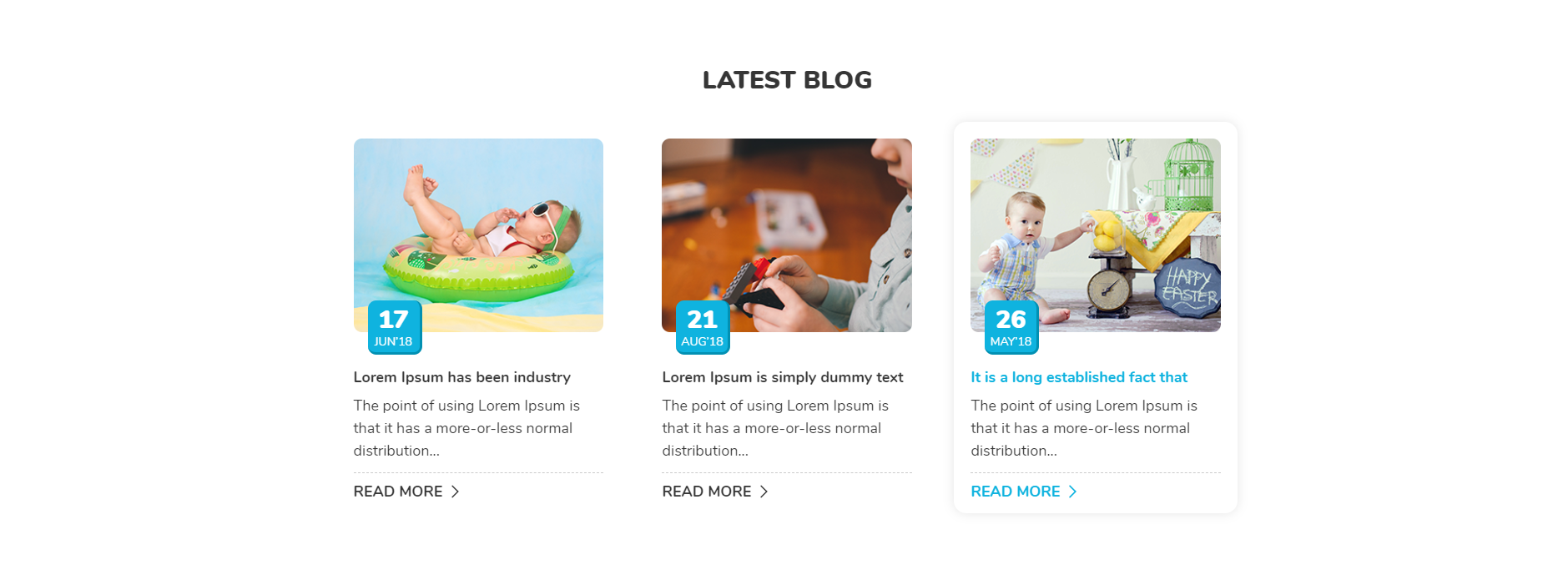
<!-- start Blog Section -->
                <section class="blog_section baby_blog_section wow fadeIn">
                    <div class="container">
                        <div class="col-12">
                            <div class="row">
                                <div class="col-12 text-center text-uppercase">
                                    <h3 class="title_h3">Latest blog</h3>
                                </div>
                                <div class="col-lg-4 col-sm-6 wow fadeInLeft animated">
                                    <div class="blog_content mt-0">
                                        Blog Content
                                    </div>
                                </div>
                            </div>
                        </div>
                    </div>
                </section>
                                            <!-- end Blog Section -->
Customer Review
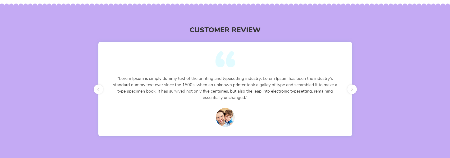
<!-- start Customer Review Section -->
                <section class="baby_clients_section wow fadeIn">
                    <div class="container">
                        <div class="row">
                                <div class="col-12 text-center text-uppercase">
                                    <div class="baby_client_title">
                                        <h3 class="title_h3"> customer review </h3>
                                    </div>
                                </div>
                                <div class="col-12 text-center">
                                    <div id="baby_customer_slider" class="owl-carousel w-auto">
                                        <div class="item fadeInLeft animated wow">
                                            <div class="baby_client_content">
                                                    <span class="quote d-block"><img src="your-image.jpg" alt="fur_client" class="m-auto"></span>
                                                    <p> Text </p>
                                                <div class="rounded-circle position-relative client_img m-auto">
                                                    <img src="your-image.jpg" alt="fur_client" class="img-fluid position-absolute">
                                                </div>
                                            </div>
                                        </div>
                                    </div>
                                </div>
                        </div>
                    </div>
                </section>
                                            <!-- end Customer Review Section -->
Newsletter
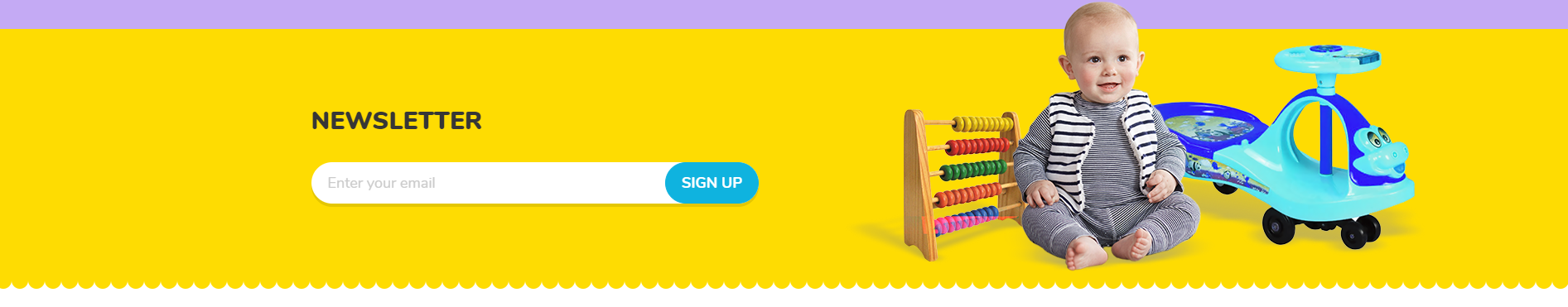
<!-- start Newsletter Section -->
                <section class="newsletter baby_newsletter wow fadeIn position-relative">
                    <div class="container">
                        <div class="row align-items-center baby_new_row">
                                <div class="col-12 col-lg-6 baby_news_letter_content">
                                    <h3 class="title_h3 text-sm-left  text-uppercase home_title_h3  wow fadeInLeft position-relative"> Newsletter </h3>
                                    <form class="form-inline justify-content-center position-relative">
                                        <input type="email" class="form-control wow fadeInRight"  placeholder="Enter your email" name="email"/>
                                        <button type="submit" class="btn border-btn text-uppercase wow fadeInRight position-absolute">SIGN UP</button>
                                    </form>
                                </div>
                                <div class="col-12 col-lg-6 p-0 baby_img_right">
                                    <img src="your-image.jpg" alt="arrival_product" class="img-fluid d-block ml-auto">
                                </div>
                        </div>
                    </div>
                </section>
                                            <!-- end Newsletter Section -->
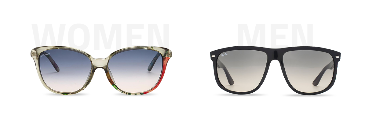
Eye Glasses
Note To see the landing page of "Eye Glasses" Please click here.Banner
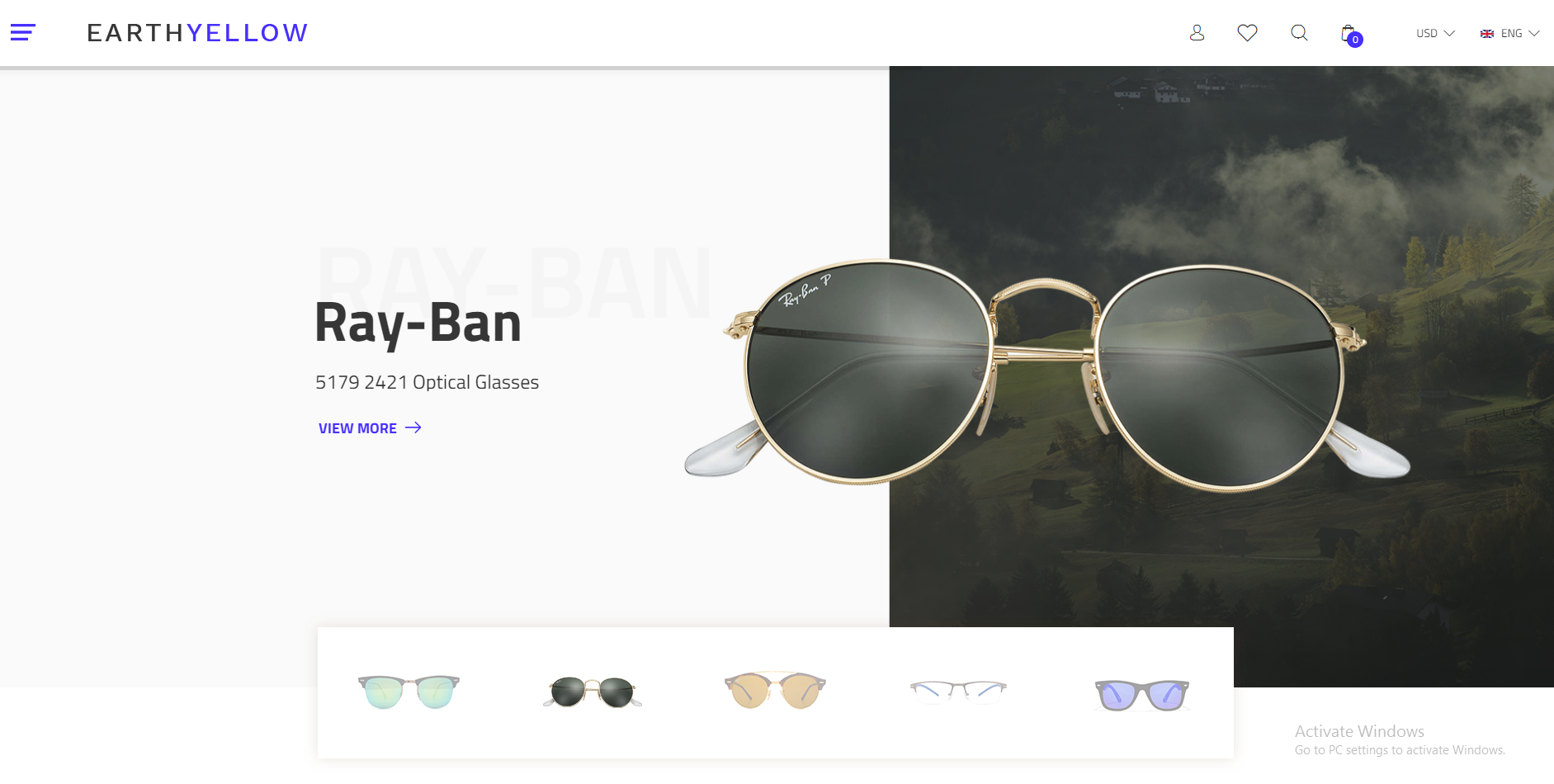
<!-- start Banner Section -->
<div class="banner_slider_section eye_glass_banner_section">
                <div id="rev_slider_1043_1_wrapper" class="rev_slider_wrapper fullwidthbanner-container" data-alias="image-gallery" data-source="gallery" style="margin:0px auto;background-color:#000000;padding:0px;margin-top:0px;margin-bottom:0px;">
                     <!-- the ID here will be used in the JavaScript below to initialize the slider -->
                    <div id="rev_slider_1043_1" class="rev_slider fullwidthabanner" style="display:none;" data-version="5.4.1">
                     <!-- BEGIN MAIN SLIDE LIST -->
                        <ul>
                       <!-- MINIMUM SLIDE STRUCTURE -->
                            <li data-transition="fade">
                          <!-- SLIDE'S MAIN BACKGROUND IMAGE -->
                                <img src="your image" alt="" class="rev-slidebg">
                                 <!-- LAYER NR. 1 -->

                                <div class="tp-caption Restaurant-Display   tp-resizeme"
                                    id="slide-3010-layer-1"
                                         id="slide-3010-layer-1"
                                     data-x="['left','left','left','left']" data-hoffset="['395','0','0','0']"
                                     data-y="['top','middle','middle','middle']" data-voffset="['170','0','0','0']"
                                     data-type="text"
                                     data-responsive_offset="on"
                                     data-frames='[{"from":"y:[100%];z:0;rX:0deg;rY:0;rZ:0;sX:1;sY:1;skX:0;skY:0;","mask":"x:0px;y:0px;s:inherit;e:inherit;","speed":1500,"to":"o:1;","delay":500,"ease":"Power3.easeInOut"},{"delay":"wait","speed":1000,"to":"opacity:0;","ease":"nothing"}]'
                                     data-textAlign="['left','left','left','left']"
                                     data-paddingtop="[0,0,0,0]"
                                     data-paddingright="[0,0,0,0]"
                                     data-paddingbottom="[0,0,0,0]"
                                     data-paddingleft="[0,0,0,0]"
                                     style="z-index: 5;font-size:125px;line-height: 185px;color:#f5f5f5;text-transform: uppercase;font-weight: 600;font-family: 'Titillium Web';">RAY-BAN</div>
                                 <!-- LAYER NR. 2 -->
                                <div class="tp-caption Restaurant-Cursive   tp-resizeme"
                                    id="slide-3010-layer-2"
                                     data-x="['left','left','left','left']" data-hoffset="['395','0','0','0']"
                                     data-y="['top','middle','middle','middle']" data-voffset="['270','0','0','0']"
                                     data-type="text"
                                     data-responsive_offset="on"
                                     data-frames='[{"from":"y:[-100%];z:0;rX:0deg;rY:0;rZ:0;sX:1;sY:1;skX:0;skY:0;","mask":"x:0px;y:0px;s:inherit;e:inherit;","speed":1500,"to":"o:1;","delay":700,"ease":"Power3.easeInOut"},{"delay":"wait","speed":1000,"to":"opacity:0;","ease":"nothing"}]'
                                     data-textAlign="['left','left','left','left']"
                                     data-paddingtop="[0,0,0,0]"
                                     data-paddingright="[0,0,0,0]"
                                     data-paddingbottom="[0,0,0,0]"
                                     data-paddingleft="[0,0,0,0]"
                                     style="z-index: 6;font-size:70px;line-height: 83px;color:#333;letter-spacing: 0;font-weight: 700;font-family: 'Titillium Web';">Ray-Ban</div>
                                 <!-- LAYER NR. 3 -->
                                <div class="tp-caption Restaurant-Cursive   tp-resizeme"
                                    id="slide-3010-layer-3"
                                     data-x="['left','left','left','left']" data-hoffset="['398','0','0','0']"
                                     data-y="['top','middle','middle','middle']" data-voffset="['374','0','0','0']"
                                     data-type="text"
                                     data-responsive_offset="on"
                                     data-frames='[{"from":"y:[-100%];z:0;rX:0deg;rY:0;rZ:0;sX:1;sY:1;skX:0;skY:0;","mask":"x:0px;y:0px;s:inherit;e:inherit;","speed":1500,"to":"o:1;","delay":700,"ease":"Power3.easeInOut"},{"delay":"wait","speed":1000,"to":"opacity:0;","ease":"nothing"}]'
                                     data-textAlign="['left','left','left','left']"
                                     data-paddingtop="[0,0,0,0]"
                                     data-paddingright="[0,0,0,0]"
                                     data-paddingbottom="[0,0,0,0]"
                                     data-paddingleft="[0,0,0,0]"
                                     style="z-index: 6;font-size:24px;line-height: 24px;color:#333;letter-spacing: 0;font-weight: 400;font-family: 'Titillium Web';">5179 2421 Optical Glasses</div>
                                 <!-- LAYER NR. 4 -->
                                <div class="tp-caption Restaurant-Cursive   tp-resizeme"
                                    id="slide-3010-layer-4"
                                     data-x="['left','left','left','left']" data-hoffset="['398','0','0','0']"
                                     data-y="['top','middle','middle','middle']" data-voffset="['429','0','0','0']"
                                     data-type="text"
                                     data-responsive_offset="off"
                                     data-frames='[{"from":"y:[-100%];z:0;rX:0deg;rY:0;rZ:0;sX:1;sY:1;skX:0;skY:0;","mask":"x:0px;y:0px;s:inherit;e:inherit;","speed":1500,"to":"o:1;","delay":700,"ease":"Power3.easeInOut"},{"delay":"wait","speed":1000,"to":"opacity:0;","ease":"nothing"}]'
                                     data-textAlign="['left','left','left','left']"
                                     data-paddingtop="[0,0,0,0]"
                                     data-paddingright="[0,0,0,0]"
                                     data-paddingbottom="[0,0,0,0]"
                                     data-paddingleft="[0,0,0,0]"
                                     style="z-index: 7; font-size: 18px;line-height: 18px;font-family: 'Titillium Web';">
                                    <a class="btn_active text-uppercase" >View more lt;i class="flaticon-arrows-4" ></i> </a>
                                </div>

                            </li>
                            </ul>
                             <!-- END MAIN SLIDE LIST -->
                    </div>
                </div>
            </div>
                                            <!-- end Banner Section -->
Collection
<!-- start Collection Section -->

    <div class="glass_collection_section wow fadeIn" >
                    <div class="container">
                        <div class="row">
                            <div class="col-md-6 wow fadeInLeft animated" >
                                <div class="glass_collection_content  position-relative">
                                    <h2 class="title_h2 text-center text-uppercase">Title</h2>
                                     <div class="collection_section_img text-center">
                                        <a href="product_list_with_filter.html"  class="text-center"> <img src="yourimage.jpg" class="img-fluid" alt="img" /> </a>
                                     </div>
                                    <a href="product_list_with_sidebar.html" class="text-uppercase glass_view_range d-table m-auto" >view range <i class="flaticon-arrows-4 title_h5 read_more_i" ></i> </a>
                                    </div>
                                </div>
                            </div>

                        </div>
                    </div>
    </div>


                                            <!-- end Collection Section -->
Collection Offer
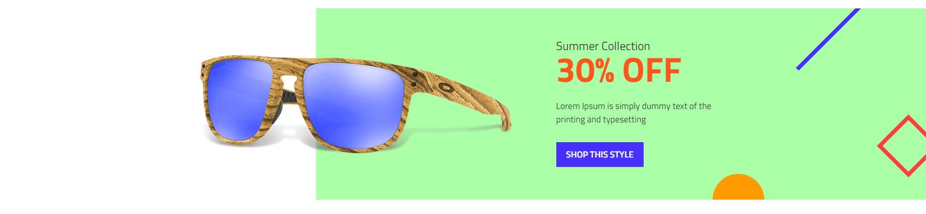
<!-- start Collection Offer Section -->
<section class="padding-top-60 wow fadeIn glass_summer_collection mt-100 mb-100">
                    <div class="container">
                         <div class="row">
                            <div class="ol-xl-4 col-lg-6 offset-xl-8 offset-lg-6 text-left wow fadeInUp">
                                 <h4 class="title_h4 text-capitalize ">Summer Collection<span class="d-block">30% OFF </span></h4>
                                 <p>Lorem Ipsum is simply dummy text of the printing and typesetting</p>
                                 <a href="product_list_with_sidebar.html" class="text-uppercase background-btn text-white">Shop this style</a>
                            </div>
                        </div>
                    </div>
                </section>
                                            <!-- end Collection Offer Section -->
Featured Products
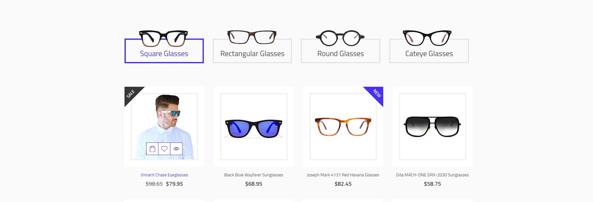
<!-- start Featured Products Section -->
<section class="featured_section wow fadeIn glass_featured_section" >
                    <div class="container">
                        <div class="row">
                            <ul class="tabs d-none visible-md glass_featured_nav col-lg-12 col-md-12 col-12 no-gutters">
						<li class="active col-md-3 text-center no-gutters" rel="tab1">
							 <img src="yourimage.jpg" alt="img" class="nav-item-img" alt="glass_tab"/>
                                                         <span class="d-inline-block title_h4">tab heading</span>
						</li>
                                                <li class=" col-md-3 text-center no-gutters" rel="tab1">
							 <img src="yourimage.jpg" alt="img" class="nav-item-img" alt="glass_tab"/>
                                                         <span class="d-inline-block title_h4">tab heading</span>
						</li>
                            </ul>
                            <div class="tab_container col-lg-12 col-md-12 col-12 no-gutters">
                                <h3 class="d_active tab_drawer_heading d-md-none" rel="tab1">
                                    <img src="yourimage.jpg" alt="img" class="nav-item-img" alt="glass_tab"/>
                                    <span>tab heading</span>
				</h3>
                            </div>
                            <div "id="tab1" class="tab_content active_content">
                                <div class="row">
                                    <div class="col-lg-3 col-md-4 col-6 wow fadeInLeft animated glass_featured_section_div" data-wow-duration="1300ms">
                                        <div class="featured_content featured_content_sale">
                                            <div class="product-label  text-uppercase  new-label product-label-sale glass_webregular">
                                            </div>
                                            <div class="featured_img_content position-relative">
                                                 <img src="yourimage.jpg" alt="img" class="nav-item-img" alt="glass_tab"/>
                                                 <div class="featured_btn vertical_middle">
                                                 </div>
                                            </div>
                                                 <div class="featured_btn d-xl-none">
                                                 </div>
                                                 <div class="featured_detail_content">
                                                    <a href="product_list_detail.html"><p class="featured_title  text-capitalize text-center glass_webregular">Title </p></a>
                                                    <p class="featured_price title_h5 text-center glass_websemibold"><span class="compare_price"> compare price </span><span > price </span></p>
                                                 </div>
                                         </div>
                                    </div>
                                </div>
                            </div>
                        </div>
                     </div>
                </section>
                                            <!-- end Featured Products Section -->
Deal of the day
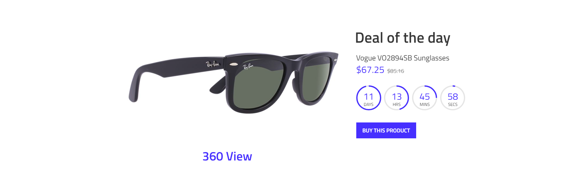
<!-- start Deal of the day Section -->
<section class="wow fadeIn eye_glass_product_section mt-100">
                    <div class="container">
                        <div class="row">
                            <div class="col-xl-8 col-lg-7" >
                                <div class="rotation rotation_style eye_glass_3d">
                                    <img src="yourimage.jpg" alt="img" alt="glass_tab"/>
                                </div>
                                <div class="rotate_border m-auto position-relative">
                                    <span class="text-center position-absolute"></span>
                                </div>
                            </div>
                            <div class="col-xl-4 col-lg-5" >
                                <h2 class="title_h2">Title</h2>
                                <p>Sub Title</p>
                                <p class="featured_price title_h5 "><span > price </span><span class="compare_price"> compare price </span></p>
                                <div id="eye_glass_countdown" class="countdown  product-date">
                                    countdown value
                                    <a href="product_list_detail.html" class="text-white background-btn text-uppercase">Buy this product</a>
                                </div>
                            </div>
                        </div>
                    </div>
</section>
                                            <!-- end Deal of the day Section -->
Blog
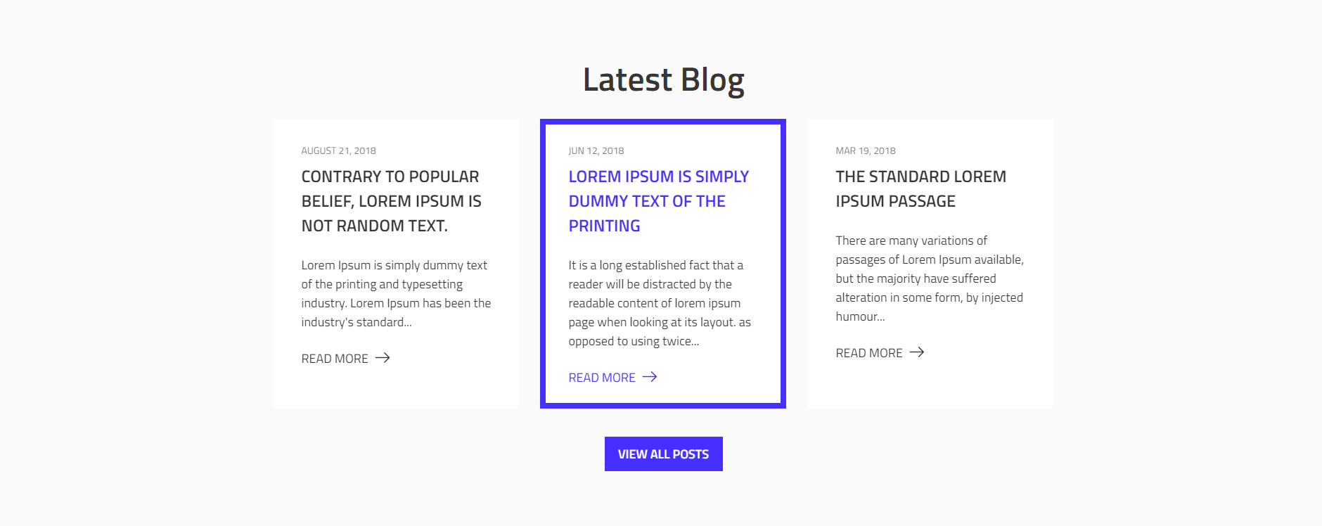
<!-- start Latest Blog Section -->
                <section class="blog_section wow fadeIn eye_glass_blog_section mt-100">
                    <div class="container">
                        <h2 class="title_h2  text-capitalize text-center">Latest Blog</h2>
                        <div class="row">
                            <div class="col-lg-4 wow fadeInLeft " data-wow-duration="1300ms">
                                <div class="eye_glass_blog_content">
                                   <span class="article__date_glass text-uppercase ">Date</span>
                                    <a href="blog_list_detail.html" class="d-inline-block w-100"><h4 class="title_h4 text-uppercase"> title </h4></a>
                                    <p> Text </p>
                                    <a href="javascript:void(0);" class=" text-uppercase read_more "><span> Read More </span><i class="flaticon-arrows-4 title_h5 read_more_i" ></i></a>
                                </div>
                                <div class="text-center col-sm-12">
                                    <a href="grids_blog_list.html" class="blog_view_post_btn text-uppercase text-white background-btn d-table mr-auto ml-auto"> View All Posts </a>
                                </div>
                            </div>
                        </div>
                    </div>
                </section>
                                            <!-- end Latest Blog Section -->
What Client Says
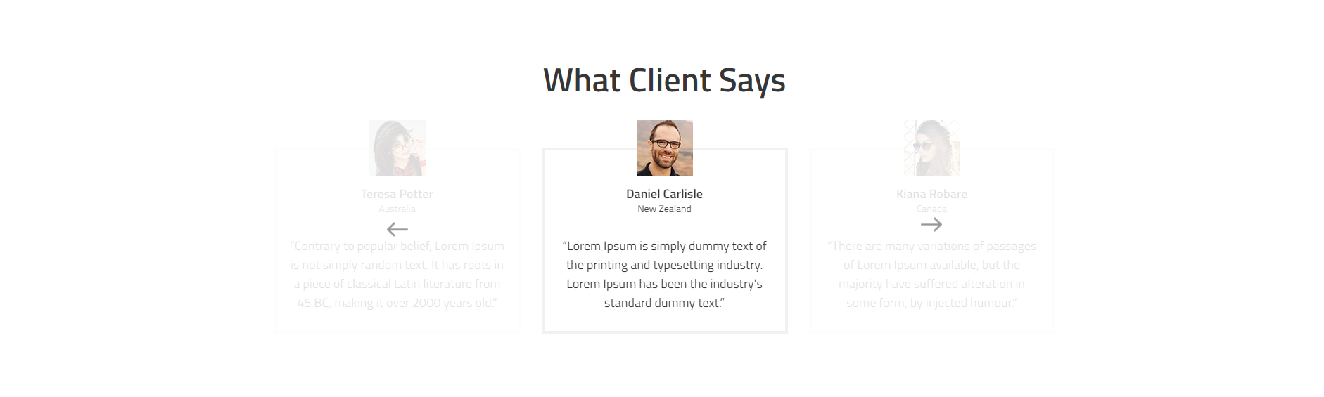
<!-- start What Client Says Section -->
                <section class="glass_testimonial_slider_section testimonial_section mt-100 mb-100">
                            <div class="container">
                                <h2 class="text-center text-capitalize title_h2">What Client Says</h2>
                                <div class="owl-carousel owl-theme d-block" id="glass_client_slider">
                                    <div class="item">
                                        <div class="featured_content mb-0">
                                        </div>
                                    </div>
                                </div>
                            </div>
                </section>
                                            <!-- end What Client Says Section -->
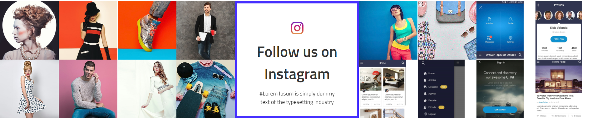
<!-- start Instagram Section -->
                <section class="instagram_section  wow animated glass_instagram_section position-relative animated">
                            <div class="container-fluid p-0">
                                <div class="instagram_title text-center m-auto h-100">
                                    <img src="yourimage.jpg" alt="img" alt="ins_icon_big"/>
                                    <h2 class="title_h2">Follow us on Instagram </h2>
                                    <p class="m-auto">#Lorem Ipsum is simply dummy text of the typesetting industry</p>
                                </div>
                                <div class="row no-gutters">
                                    <div class="col-lg-12 wow fadeInLeft" data-wow-duration="1300ms" data-wow-delay="0.2s"></div>
                                    <div class="glass_insta row no-gutters justify-content-between" id="glass_instafeed"></div>
                                </div>
                            </div>
                </section>
                                            <!-- end Instagram Section -->
Newsletter

<!-- start Newsletter Section -->
                <section class="wow fadeIn eye_glass_newsletter mt-100 mb-100">
                            <div class="container">
                                <div class="row">
                                    <div class="col-lg-12">
                                        <h2 class="title_h2  text-capitalize   wow fadeInUp glass_websemibold">Newsletter</h2>
                                        <p class="glass_webregular">Get the latest news & discount offers on your email</p>
                                    </div>
                                    <div class="col-xl-6 col-lg-8">
                                        <form class="form-inline">
                                            <input type="email" class="form-control border-0 d-sm-inline-block"  placeholder="Enter your email" name="email"/>
                                            <input type="submit" class="background-btn d-sm-inline-block text-uppercase text-white" value="SIGN UP"/>
                                        </form>
                                    </div>
                                </div>
                            </div>
                </section>
                                            <!-- end Newsletter Section -->
Jewellery
Note To see the landing page of "jewellery" Please click here.Banner
<!-- start Banner Section -->
<div class="jewellery_landing_banner wow fadeIn d-md-block">
                <div class="rev_slider_wrapper fullwidthbanner-container jewellery_banner_slider_section">
                     <!-- the ID here will be used in the JavaScript below to initialize the slider -->
                    <div id="j_rev_slider_2" class="rev_slider fullwidthbanner" data-version="5.4.5" style="display:none;">
                     <!-- BEGIN MAIN SLIDE LIST -->
                        <ul>
                       <!-- MINIMUM SLIDE STRUCTURE -->
                            <li data-transition="slideleft">
                                <!-- LAYER NR. 1 -->
                                <div class="tp-caption Restaurant-Cursive tp-resizeme slider_img"
                                    id="slide-3010-layer-1"
                                     data-x="['center','center','center','center']" data-hoffset="['0','0','0','0']"
                                     data-y="['top','middle','middle','middle']" data-voffset="['0','0','0','0']"
                                     data-type="text"
                                     data-responsive_offset="off"
                                     data-frames='[{"from":"y:[-100%];z:0;rX:0deg;rY:0;rZ:0;sX:1;sY:1;skX:0;skY:0;","mask":"x:0px;y:0px;s:inherit;e:inherit;","speed":1500,"to":"o:1;","delay":700,"ease":"Power3.easeInOut"},{"delay":"wait","speed":1000,"to":"opacity:0;","ease":"nothing"}]'
                                     data-textAlign="['center','center','center','center']"
                                     data-paddingtop="[0,0,0,0]"
                                     data-paddingright="[0,0,0,0]"
                                     data-paddingbottom="[0,0,0,0]"
                                     data-paddingleft="[0,0,0,0]"
                                     style="background-size: contain; left: 0;"><img src="yourimage.jpg" alt="img" class="rev-slidebg img-fluid slider_img"/></div>
                                 <!-- LAYER NR. 2 -->
                                <div class="tp-caption Restaurant-Cursive tp-resizeme"
                                    id="slide-3010-layer-2"
                                     data-x="['center','center','center','center']" data-hoffset="['0','0','0','0']"
                                     data-y="['top','middle','middle','middle']" data-voffset="['620','0','0','0']"
                                     data-type="text"
                                     data-responsive_offset="on"
                                     data-frames='[{"from":"y:[-100%];z:0;rX:0deg;rY:0;rZ:0;sX:1;sY:1;skX:0;skY:0;","mask":"x:0px;y:0px;s:inherit;e:inherit;","speed":1500,"to":"o:1;","delay":700,"ease":"Power3.easeInOut"},{"delay":"wait","speed":1000,"to":"opacity:0;","ease":"nothing"}]'
                                     data-textAlign="['center','center','center','center']"
                                     data-paddingtop="[0,0,0,0]"
                                     data-paddingright="[0,0,0,0]"
                                     data-paddingbottom="[0,0,0,0]"
                                     data-paddingleft="[0,0,0,0]"
                                     style="z-index: 99;font-size:30px;line-height: 71.04px;color: #f5dfa3;font-family: 'PlayfairDisplay';text-transform: uppercase;">Gold Diamond Rings</div>
                                 <!-- LAYER NR. 3 -->
                                <div class="tp-caption Restaurant-Cursive tp-resizeme"
                                    id="slide-3010-layer-3"
                                     data-x="['center','center','center','center']" data-hoffset="['0','0','0','0']"
                                     data-y="['top','middle','middle','middle']" data-voffset="['660','0','0','0']"
                                     data-type="text"
                                     data-responsive_offset="on"
                                     data-frames='[{"from":"y:[-100%];z:0;rX:0deg;rY:0;rZ:0;sX:1;sY:1;skX:0;skY:0;","mask":"x:0px;y:0px;s:inherit;e:inherit;","speed":1500,"to":"o:1;","delay":700,"ease":"Power3.easeInOut"},{"delay":"wait","speed":1000,"to":"opacity:0;","ease":"nothing"}]'
                                     data-textAlign="['center','center','center','center']"
                                     data-paddingtop="[0,0,0,0]"
                                     data-paddingright="[0,0,0,0]"
                                     data-paddingbottom="[0,0,0,0]"
                                     data-paddingleft="[0,0,0,0]"
                                     style="z-index: 100;font-size:60px;line-height:88.8px;color:#fff;font-family: 'PlayfairDisplay-Bold';text-transform: uppercase;">Unique Designs </div>
                            </li>
                            </ul>
                             <!-- END MAIN SLIDE LIST -->
                    </div>
                </div>
            </div>
                                            <!-- end Banner Section -->
<!-- start sale now Section -->
                                        <div class="jewellery_landing_sale-now" >
                                            <div class="sale-now-top" >
                                                <a href="#"> Shop Now </a>
                                            </div>
                                            <div class="sale-now-bottom" >
                                                <a href="#offer_section"> <img src="yourimage.jpg" class="img-fluid" alt="img" /> </a>
                                            </div>
                                        </div>
                                            <!-- end sale now  Section -->
Collection
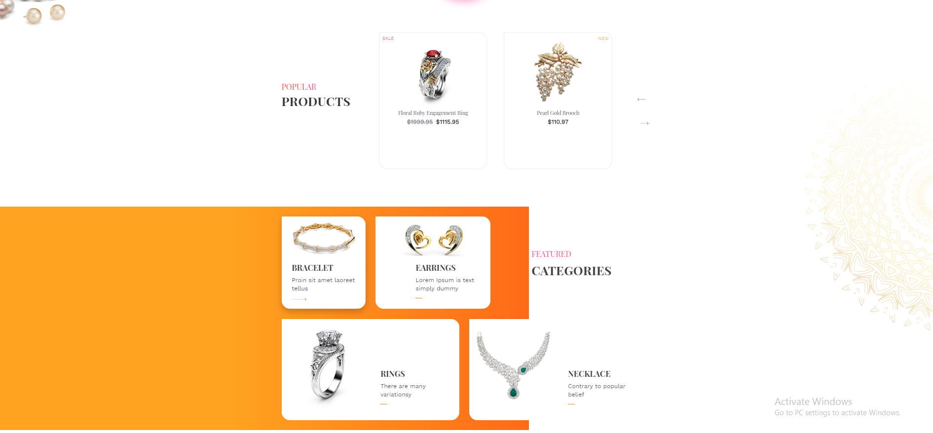
<!-- start Collection Section -->
    <div class="jewellery_landing_product_featured" >

        <section class="jewellery_popular_product  wow fadeIn">
            <div class="container j_popular_product">
                <div class="row">
                    <div class="col-12 col-sm-12 col-lg-3 jewellery_popular" >
                        <h4 >Popular</h4>
                        <h3 >Products</h3>
                    </div>
                    <div class="col-sm-11 col-lg-8 col-10 p-0" >
                        <div id="jewellery_popular_product_slider" class="owl-carousel">
                            <div class="item">
                                <div class="popular_product">
                                    Product Grid
                                </div>
                            </div>
                        </div>
                    </div>
                </div>
            </div>
        </section>

        <section class="featured_categories">
            <div class="container">
                <div class="row featured_top flex-container">
                    <div class="col-md-4 col-lg-3 col-sm-6 img1" >
                        <div class="categories_bracetet item">>
                            <div class="barcetet-img text-center ">>
                                <img src="yourimage.jpg" alt="img" class="img-fluid"/>
                            </div>
                            <h3>Products Title</h3>
                            <p>Products Text</p>
                            <hr/>
                        </div>
                    </div>
                </div>
            </div>
        </section>

    </div>
                        <!-- end Collection Section -->
Promotion
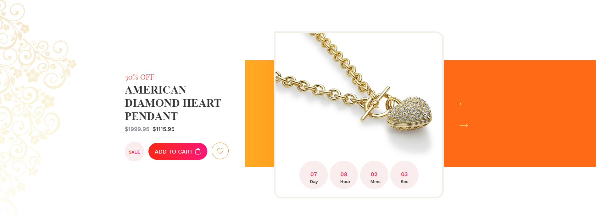
<!-- start Promotion Offer Section -->
                <section class="jewellery_landing_american_dimond">
                    <div class="container">
                        <div id="jewellery_american_d_slider" class="owl-carousel">
                            <div class="row item flex-container">
                                <div class="col-md-4 ad_text">
                                    <div class="american_d_text">
                                        <h5></h5>
                                        <h2></h2>
                                        <h4><span></span></h4>
                                        <a class="sale" href="#"><span>Sale</span></a>
                                        <a class="add_to_cart" href="#">Add To Cart<span class="flaticon-shopping-bag"></span></a>
                                        <a class="sale_like" href="#" ><i class="flaticon-heart"></i></a>
                                    </div>
                                </div>
                            </div>
                            <div class="offset-md-1 col-md-6 col-sm-11 col-10 ad_img">
                                <div class="america_d_image">
                                    <div class="america-img">
                                        <img src="yourimage.jpg" alt="img" class="img-fluid"/>
                                    </div>
                                    <ul id="jewellery_countdowntimer1" class="product-date "></ul>
                                </div>
                            </div>
                        </div>
                    </div>
                </section>
                                            <!-- end Promotion Offer Section -->
Products

<!-- start Products Section -->
                <section class="jewellery_landing_offer_section" id="offer_section">
                    <div class="container">
                        <div class="row">
                            <div class="col-lg-6 col-md-12 wow fadeInUp" >
                                <div class="diamond_nect_contain item">
                                    <div class="row">
                                        Product Contant
                                    </div>
                                </div>
                            </div>

                        </div>
                    </div>
                </section>
                                            <!-- end Products Section -->
Featured Products
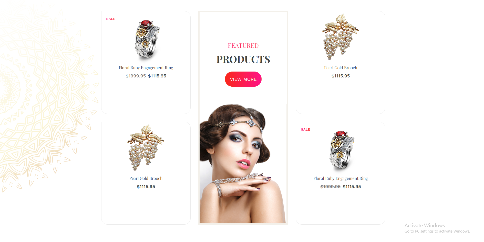
<!-- start Featured Products Section -->
            <div class="jewellery_landing_featured_partner">
                <section class="featured_product">
                    <div class="container">
                        <div class="row">
                            <div class="col-md-4 text-center" >
                                <div class="item">
                                    Featured Product Contant
                                </div>
                            </div>
                        </div>
                    </div>
                </section>
            </div>
                                            <!-- end Featured Products Section -->
Our Partners

<!-- start Our Partners Section -->
            <div class="jewellery_landing_featured_partner">
                <section class="partners">
                    <div class="partner_slider">
                            <div class="container pantners-container">
                                <div class="row pantners-padding">
                                    <div class="col-md-3 col-sm-12" >
                                        <div class="partners-details">
                                            <h5>our</h5>
                                            <h3>Partners</h3>
                                        </div>
                                    </div>
                                    <div class="col-md-8 pl-1 pr-0 col-sm-12" >
                                        <div class="owl-carousel" id="jewellery_our_partner_slider">
                                            <div class="item">
                                                <div class="logo-partners veronas">
                                                    <img src="yourimage.jpg" alt="img" class="img-fluid"/>
                                                </div>
                                            </div>
                                        </div>
                                   </div>
                                </div>
                            </div>
                    </div>
                </section>
             </div>
                                            <!-- end Our Partners Section -->
Newsletter

<!-- start Newsletter Section -->
                <footer class="jewellery_footer wow fadeIn animated  main_footer">
                    <div class="footer_top position-relative">
                            <div class="container">
                                <div class="row">
                                    <div class="col-lg-4 col-sm-6  wow fadeInUp">
                                        <div class="column">
                                            <h5 class=title_h5 text-uppercase">Newsletters</h5>
                                            <form class="form-inline position-relative">
                                                <input type="email" class="form-control wow fadeInLeft" placeholder="Email" name="email" style="visibility: visible; animation-name: fadeInLeft;"/>
                                                <button type="submit" class="btn border-btn text-uppercase wow fadeInRight" style="visibility: visible; animation-name: fadeInRight;"><i class="flaticon-arrows-4></i></button>
                                            </form>
                                        </div>
                                    </div>
                                    <div class="col-lg-2 col-sm-6  wow fadeInUp offset-1">
                                        <div class="column">
                                            ...
                                        </div>
                                    </div>
                                    <div class="col-lg-2 col-sm-6  wow fadeInUp ">
                                        <div class="column">
                                            ...
                                        </div>
                                    </div>
                                    <div class="col-lg-3 col-sm-6  wow fadeInUp ">
                                        <div class="column">
                                            ...
                                        </div>
                                    </div>
                                </div>
                            </div>
                    </div>
                </footer>
                                            <!-- end Newsletter Section -->
Beauty
Note To see the landing page of "beauty" Please click here.Banner
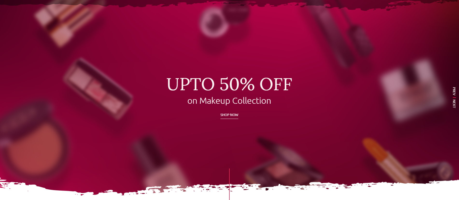
<!-- start Banner Section -->
<div class="beauty_banner_slider_section position-relative">
                <div class="rev_slider_wrapper fullwidthbanner-container">
                     <!-- the ID here will be used in the JavaScript below to initialize the slider -->
                    <div id="beauty_rev_slider_2" class="rev_slider fullwidthabanner" data-version="5.4.5" style="display:none;">
                     <!-- BEGIN MAIN SLIDE LIST -->
                        <ul>
                       <!-- MINIMUM SLIDE STRUCTURE -->
                            <li data-transition="fade">

                            <!-- SLIDE'S MAIN BACKGROUND IMAGE -->

                                <img src="src/images/beauty_banner_bg.png" alt="Sky" class="rev-slidebg img-fluid">
                                <!-- LAYER NR. 1 -->
                                <div class="tp-caption Restaurant-Display tp-resizeme"
                                    id="slide-3010-layer-1"
                                         data-x="['middle','middle','middle','middle']" data-hoffset="['0','0','0','0']"
                                         data-y="['top','middle','middle','middle']" data-voffset="['418','0','0','0']"
                                         data-type="text"
                                         data-responsive_offset="on"
                                         data-frames='[{"from":"y:[100%];z:0;rX:0deg;rY:0;rZ:0;sX:1;sY:1;skX:0;skY:0;","mask":"x:0px;y:0px;s:inherit;e:inherit;","speed":1500,"to":"o:1;","delay":500,"ease":"Power3.easeInOut"},{"delay":"wait","speed":1000,"to":"opacity:0;","ease":"nothing"}]'
                                         data-textAlign="['left','left','left','left']"
                                         data-paddingtop="[0,0,0,0]"
                                         data-paddingright="[0,0,0,0]"
                                         data-paddingbottom="[0,0,0,0]"
                                         data-paddingleft="[0,0,0,0]"
                                         style="z-index: 5;font-size:72px;line-height: 71.4px;color:#faf1f1;text-transform: uppercase;font-family: 'Lora-Regular';font-weight: 400;">Upto 50% off</div>
                                 <!-- LAYER NR. 2 -->
                                <div class="tp-caption Restaurant-Cursive tp-resizeme"
                                    id="slide-3010-layer-2"
                                         data-x="['middle','middle','middle','middle']" data-hoffset="['0','0','0','0']"
                                         data-y="['top','middle','middle','middle']" data-voffset="['494','0','0','0']"
                                         data-type="text"
                                         data-responsive_offset="on"
                                         data-frames='[{"from":"y:[-100%];z:0;rX:0deg;rY:0;rZ:0;sX:1;sY:1;skX:0;skY:0;","mask":"x:0px;y:0px;s:inherit;e:inherit;","speed":1500,"to":"o:1;","delay":700,"ease":"Power3.easeInOut"},{"delay":"wait","speed":1000,"to":"opacity:0;","ease":"nothing"}]'
                                         data-textAlign="['left','left','left','left']"
                                         data-paddingtop="[0,0,0,0]"
                                         data-paddingright="[0,0,0,0]"
                                         data-paddingbottom="[0,0,0,0]"
                                         data-paddingleft="[0,0,0,0]"
                                         style="z-index: 6;font-size:36px;line-height:53.28px;color:#faf1f1;font-family: 'Ubuntu-Light';font-weight: 300;letter-spacing: 0;">on Makeup Collection</div>
                                 <!-- LAYER NR. 3 -->
                                <div class="tp-caption Restaurant-Cursive tp-resizeme"
                                    id="slide-3010-layer-3"
                                         data-x="['middle','middle','middle','middle']" data-hoffset="['0','0','0','0']"
                                         data-y="['top','middle','middle','middle']" data-voffset="['568px','0','0','0']"
                                         data-type="text"
                                         data-responsive_offset="off"
                                         data-frames='[{"from":"y:[-100%];z:0;rX:0deg;rY:0;rZ:0;sX:1;sY:1;skX:0;skY:0;","mask":"x:0px;y:0px;s:inherit;e:inherit;","speed":1500,"to":"o:1;","delay":700,"ease":"Power3.easeInOut"},{"delay":"wait","speed":1000,"to":"opacity:0;","ease":"nothing"}]'
                                         data-textAlign="['left','left','left','left']"
                                         data-paddingtop="[0,0,0,0]"
                                         data-paddingright="[0,0,0,0]"
                                         data-paddingbottom="[0,0,0,0]"
                                         data-paddingleft="[0,0,0,0]"
                                         style="z-index:7;font-size:18px;line-height:20.72px;color:#faf1f1;font-family: 'UbuntuRegular';letter-spacing: 0"> <a href="product_list_with_sidebar.html" class="text-uppercase"> shop now  </a> </div>
                            </li>
                            </ul>
                             <!-- END MAIN SLIDE LIST -->

                    </div>
                </div>
            </div>
                                            <!-- end Banner Section -->
Collection

<!-- START Collection Section -->


        <section class="beauty_offer_section mt-100">
            <div class="container">
                <div class="row">
                    <div class="col-sm-5 collection_1" >
                        <div class="img_div">
                            <img src="yourimage.png" alt="offer_image" class="img-fluid"/>
                        </div>
                    <div class="text-sm-left text-center">
                        <h4 class="title_h4" >Brush Collection</h4>
                        <h2 class="title_h2 text-uppercase">Upto 30% off</h2>
                    </div>
                    </div>
                    <div class="col-sm-7 collection_2" >
                        <div class="img_div">
                            <img src="yourimage.png" alt="offer_image" class="img-fluid"/>
                        </div>
                    </div>
                    <div class="text-sm-left text-center">
                        <h4 class="title_h4" >Bronzer & Blusher Brush</h4>
                        <h2 class="title_h2 text-uppercase">Flat 15% off</h2>
                    </div>

                </div>
            </div>
        </section>

                        <!-- END Collection Section -->
Products
<!-- START Products Section -->
                <section class="beauty_trending_product_section">
                    <div class="container-fluid">
                        <div class="row flex-container">
                            <div class="col-xl-7 p-0 custom_slider_section order-xl-1 order-3" >
                                <div h3 class="d_active tab_drawer_heading d-md-none" rel="tab1" > Features </h3>
                                < id="tab1" class="tab_content active_content">
                                    <div class="owl-carousel beauty_trending_slider">
                                        <div class="slider_content text-center item">
                                            <div class="slider_img">
                                                <img src="yourimage.png" alt="" class="img-fluid vertical_middle m-auto"/>
                                            </div>
                                            <div class="slider_text">
                                                <h5 class="title_h5" >Gel Eyeliner with Brush</h5>
                                                <p><span>$150.95</span>$120.95</p>
                                            </div>
                                        </div>
                                    </div>
                                </div>
                            </div>
                            <div class="col-xl-2 p-0 d-flex align-items-center custom_slider_heading order-xl-2 order-1" >
                                 <div class="section_title" >
                                    <h3 class="title_h3  text-capitalize home_title_h3" >Trending Products</h3>
                                    <ul class="tabs d-none d-md-inline-block w-100 position-relative">
                                            <li class="active" rel="tab1" >Featured</li>
                                            <li rel="tab2" >Latest</li>
                                            <li rel="tab3" >Best Seller</li>
                                        </ul>
                                 </div>
                            </div>
                            <div class="col-xl-3 p-0 custom_image_section d-xl-block d-none order-xl-3" >
                                 <div class="compact_img" >
                                     <img src="yourimage.png" alt="nail_polish" class="img-fluid w-100"/>
                                 </div>
                            </div>
                        </div>
                    </div>
                </section>
                        <!-- END Products Section -->
Service

<!-- START Service Section -->

                <section class="beauty_ship_quality wow fadeIn">
                    <div class="container">
                        <div class="row">
                            <div class="col-xl-5 col-md-6 col_style" >
                                <div class="row">
                                    <div class="shipping_image col-md-2 mt-auto mb-auto pr-md-0">
                                        <img src="yourimage.png" alt="" class="img-fluid"/>
                                    </div>
                                    <div class="shipping_text col-md-10">
                                       <h2 class="mb-0">Free Shipping</h2>
                                       <p>Orders Over $99 Dollars Free Shipping</p>
                                    </div>
                                </div>
                            </div>
                            <div class="col-xl-5 col-md-6 col_style" >
                                <div class="row">
                                    <div class="shipping_image col-md-2 mt-auto mb-auto pr-md-0 text-md-right">
                                        <img src="yourimage.png" alt="" class="img-fluid"/>
                                    </div>
                                    <div class="shipping_text col-md-10">
                                       <h2 class="mb-0">Guaranteed Quality</h2>
                                       <p>All Our Products are Animal Cruelty Free</p>
                                    </div>
                                </div>
                            </div>
                        </div>
                    </div>
                </section>
                                            <!-- END Service Section -->
Promotion
<!-- START Promotion Section -->
                <section class="beauty_shopnow_section">
                    <div class="container-fluid">
                        <div class="row flex-container">
                                <div class="col-xl-6 col-md-7 d-flex align-items-center order-md-1 order-1 p-0">
                                    <div class="product_image">
                                       <img src="yourimage.png" alt="nail_polish" class="img-fluid"/>
                                    </div>
                                </div>
                            <div class="col-xl-6 col-md-5 order-md-2 order-1">
                                <div class="product_text d-md-inline-block">
                                    <div class="product_details">
                                       <span class="sale text-uppercase" >SALE</span>
                                       <h3 class="title_h3">Extended Shine Long Lasting Nail Polish</h3>
                                       <p class="price"><span>$170.00</span>$150.95</p>
                                       <p class="pera">Sed ut perspiciatis unde omnis iste natus error sit voluptatem accusantium dolorem laudantium totam rem aperiam eaque ipsa quae
                                        ab illo inventore veritatis et quasi architecto beatae vitae dicta sunteplicabo nemo enim ipsam voluptatem quia.</p>
                                    </div>
                                    <ul id="beauty_landing_countdowntimer" class="product-date"></ul>
                                        <ul class="color_picker">
                                            <li class="">
                                               <input type="checkbox" value="">
                                               <label for="" style="background:;"></label>
                                            </li>
                                        </ul>
                                        <div class="td" data-title="Quantity">
                                            <div class="form-group quantity_box">
                                                <div class="qty_number"><input type="text" value="1" ></div>
                                            </div>
                                        </div>
                                        <div class="add_to_cart">
                                            <div class="add_bttn" ><a href="#">ADD TO CART</a> </div>
                                            <div class="add_bttn" <a href="#"><i class="flaticon-heart" aria-hidden="true"></i></a> </div>
                                        </div>
                                </div>
                            </div>
                        </div>
                    </div>
                </section>
                                            <!-- END Promotion Section -->
New Launches
<!-- START New Launches Section -->
            <div section="padding-top-60 wow fadeIn beauty_summer_collection">
                <div class="container">
                    <div class="wow fadeInUp">
                            <div class="row">
                                    <div class="col-md-5 beauty_summer_content_main text-md-left text-center" >
                                        <div class="beauty_summer_content d-block w-100">
                                            <h2 class="title_h2 text-white">New Launches</h2>
                                            <p class="text-uppercase text-white">The Latest New Brands</p>
                                            <span class="text-uppercase text-white">Sale up to 15%</span>
                                            <p class="text-uppercase text-white">in the first week.</p>
                                            <a href="product_list_with_sidebar.html" class="text-uppercase border-bottom-btn d-inline-block">SHOP NOW</a>
                                        </div>
                                    </div>
                                    <div class="col-md-7" >
                                         <img src="yourimage.png" alt="" class="img-fluid"/>
                                   </div>
                            </div>
                    </div>
                </div>
             </section>
                                            <!-- END New Launches Section -->
Blog
<!-- START Blog Section -->

                <section class="beauty_blog_section wow fadeIn mt-100">
                    <div class="b_container container">
                        <div class="row m-0">
                            <div class="col-xl-3 col-lg-5 col-md-6 pr-md-0" >
                                <div class="beauty_title">
                                    <h2 class="title_h2" >Latest Blog</h2>
                                    <p>Totam rem aperiam eaque ipsa quae ab illo inventore veritatis et quasi architecto beatae vitae dicta sunteplicabo nemo enim ipsam voluptatem quia.</p>
                                </div>
                            </div>
                            <div class="col-xl-9 col-lg-7 col-md-6 pr-md-0" >
                                <div id="beauty_blog_slider" class="owl-carousel beauty_blog_slider_content">
                                    <div class="item">
                                        <div class="brand_logo_img text-center position-relative">
                                            <div class="brand_img_top_layer position-relative d-inline-block">
                                                <img src="yourimage.png" alt="brand_logo" class="img-fluid"/>
                                            </div>
                                            <div class="brand_logo_content d-inline-block position-absolute w-100 text-left">
                                                <span class="text-white text-capitalize">Apr 22, 2018</span>
                                                <a href="blog_list_detail.html"><p class="text-white">Sed ut perspiciatis unde omnis iste natus error sit voluptatem</p></a>
                                            </div>
                                        </div>
                                    </div>
                                </div>
                            </div>
                        </div>
                    </div>
                </section>
                                            <!-- END Blog Section -->
Brands

<!-- START Brand Section -->

                <div class="brand_logo_section beauty_brand_logo_section wow fadeIn mt-100 mb-100">
                    <div class="container">
                            <div id="beauty_brand_slider" class="owl-carousel">
                                <div class="item">
                                    <div class="brand_logo_img text-center position-relative" >
                                        <img src="yourimage.png" alt="brand_logo" class="img-fluid vertical_middle"/>
                                    </div>
                                </div>
                            </div>
                    </div>
                </div>
                                            <!-- END Brand Section -->
Cosmetic
Note To see the landing page of "cosmetic" Please click here.Banner

<!-- start Banner Section -->

<div class="cosmatic_banner_slider_section position-relative">
                <div class="rev_slider_wrapper fullwidthbanner-container ">
                     <!-- the ID here will be used in the JavaScript below to initialize the slider -->
                    <div id="rev_slider_2_cosmetic" class="rev_slider fullwidthabanner" data-version="5.4.5" style="display:none;">
                     <!-- BEGIN MAIN SLIDE LIST -->
                        <ul>
                       <!-- MINIMUM SLIDE STRUCTURE -->
                            <li data-transition="fade">
                                    <!-- SLIDE'S MAIN BACKGROUND IMAGE -->
                                <img src="yourimage.png" alt="Sky" class="rev-slidebg img-fluid"/>
                                <!-- LAYER NR. 1 -->
                            <div class="container">
                                <div class="tp-caption Restaurant-Display   tp-resizeme"
                                    id="slide-3010-layer-1"
                                     data-x="['left','middle','middle','middle']" data-hoffset="['685','0','0','0']"
                                     data-y="['top','middle','middle','middle']" data-voffset="['344','0','0','0']"
                                     data-type="text"
                                     data-responsive_offset="on"
                                     data-frames='[{"from":"y:[100%];z:0;rX:0deg;rY:0;rZ:0;sX:1;sY:1;skX:0;skY:0;","mask":"x:0px;y:0px;s:inherit;e:inherit;","speed":1500,"to":"o:1;","delay":500,"ease":"Power3.easeInOut"},{"delay":"wait","speed":1000,"to":"opacity:0;","ease":"nothing"}]'
                                     data-textAlign="['left','left','left','left']"
                                     data-paddingtop="[0,0,0,0]"
                                     data-paddingright="[0,0,0,0]"
                                     data-paddingbottom="[0,0,0,0]"
                                     data-paddingleft="[0,0,0,0]"
                                     style="z-index: 5;font-family: 'PlayfairDisplay-Regular'; font-weight: 400; font-size: 60px;line-height: 88.8px;color:#fff;text-transform: capitalize;">Anti Tan Expert</div>
                                 <!-- LAYER NR. 2 -->
                                <div class="tp-caption Restaurant-Cursive tp-resizeme"
                                    id="slide-3010-layer-2"
                                     data-x="['left','middle','middle','middle']" data-hoffset="['685','0','0','0']"
                                     data-y="['top','middle','middle','middle']" data-voffset="['398px','0','0','0']"
                                     data-type="text"
                                     data-responsive_offset="on"
                                     data-frames='[{"from":"y:[100%];z:0;rX:0deg;rY:0;rZ:0;sX:1;sY:1;skX:0;skY:0;","mask":"x:0px;y:0px;s:inherit;e:inherit;","speed":1500,"to":"o:1;","delay":700,"ease":"Power3.easeInOut"},{"delay":"wait","speed":1000,"to":"opacity:0;","ease":"nothing"}]'
                                     data-textAlign="['left','left','left','left']"
                                     data-paddingtop="[0,0,0,0]"
                                     data-paddingright="[0,0,0,0]"
                                     data-paddingbottom="[0,0,0,0]"
                                     data-paddingleft="[0,0,0,0]"
                                     style="z-index: 6;text-transform: uppercase;font-family: 'ProximaNova-Light';font-weight: 300;font-size: 100px;line-height: 148px;color:#fff;margin-left: -6px;">20% off</div>
                                 <!-- LAYER NR. 3 -->
                                <div class="tp-caption Restaurant-Cursive   tp-resizeme"
                                    id="slide-3010-layer-3"
                                     data-x="['left','middle','middle','middle']" data-hoffset="['685','0','0','0']"
                                     data-y="['top','middle','middle','middle']" data-voffset="['515','0','0','0']"
                                     data-type="text"
                                     data-responsive_offset="off"
                                     data-frames='[{"from":"y:[100%];z:0;rX:0deg;rY:0;rZ:0;sX:1;sY:1;skX:0;skY:0;","mask":"x:0px;y:0px;s:inherit;e:inherit;","speed":1500,"to":"o:1;","delay":700,"ease":"Power3.easeInOut"},{"delay":"wait","speed":1000,"to":"opacity:0;","ease":"nothing"}]'
                                     data-textAlign="['left','left','left','left']"
                                     data-paddingtop="[0,0,0,0]"
                                     data-paddingright="[0,0,0,0]"
                                     data-paddingbottom="[0,0,0,0]"
                                     data-paddingleft="[0,0,0,0]"
                                     style="z-index: 7;font-family: 'ProximaNova-Regular';line-height: 26.64px;font-weight: 400;font-size: 18px;letter-spacing: 0;margin-left: -2px;"> Exclusive Tan Removal Offer on TANFREE Sun Expert
 UV Lotion products - SPF 50 & SPF 24  </div>
                                <!-- LAYER NR. 4 -->
                                <div class="tp-caption Restaurant-Cursive   tp-resizeme"
                                    id="slide-3010-layer-4"
                                     data-x="['left','middle','middle','middle']" data-hoffset="['685','0','0','0']"
                                     data-y="['top','middle','middle','middle']" data-voffset="['599','0','0','0']"
                                     data-type="text"
                                     data-responsive_offset="off"
                                     data-frames='[{"from":"y:[-100%];z:0;rX:0deg;rY:0;rZ:0;sX:1;sY:1;skX:0;skY:0;","mask":"x:0px;y:0px;s:inherit;e:inherit;","speed":1500,"to":"o:1;","delay":700,"ease":"Power3.easeInOut"},{"delay":"wait","speed":1000,"to":"opacity:0;","ease":"nothing"}]'
                                     data-textAlign="['left','left','left','left']"
                                     data-paddingtop="[0,0,0,0]"
                                     data-paddingright="[0,0,0,0]"
                                     data-paddingbottom="[0,0,0,0]"
                                     data-paddingleft="[0,0,0,0]"
                                     style="z-index: 9;"> <a  href="product_list_with_sidebar.html" class="shop_now text-uppercase" style="font-family: 'PlayfairDisplayRegular';color: #a73e5c;font-size: 18px;display: inline-block;letter-spacing: 0;padding: 10px 19.25px;">shop now </a> </div>
                            </div>
                            </li>
                            </ul>
                             <!-- END MAIN SLIDE LIST -->

                    </div>
                </div>
            </div>
                                            <!-- end Banner Section -->
Collection

<!-- START Collection Section -->


        <section class="cosmetic_category_products wow fadeIn">
            <div class="container wow fadeInUp">
                <div class="row">
                    <div class="col-md-4" >
                        <div class="product" >
                            <img src="yourimage.png" alt="" class="img-fluid"/>
                        </div>
                         <h5 >Cleanser</h5>
                    </div>
                    <div class="col-md-4 m-md-0 mt-3 mb-3" >
                        <div class="product" >
                            <img src="yourimage.png" alt="" class="img-fluid"/>
                        </div>
                         <h5 >Moisterizer</h5>
                    </div>
                    <div class="col-md-4" >
                        <div class="product" >
                            <img src="yourimage.png" alt="" class="img-fluid"/>
                        </div>
                         <h5 >Sunscreen</h5>
                    </div>
                </div>
            </div>
        </section>

                        <!-- END Collection Section -->
Product
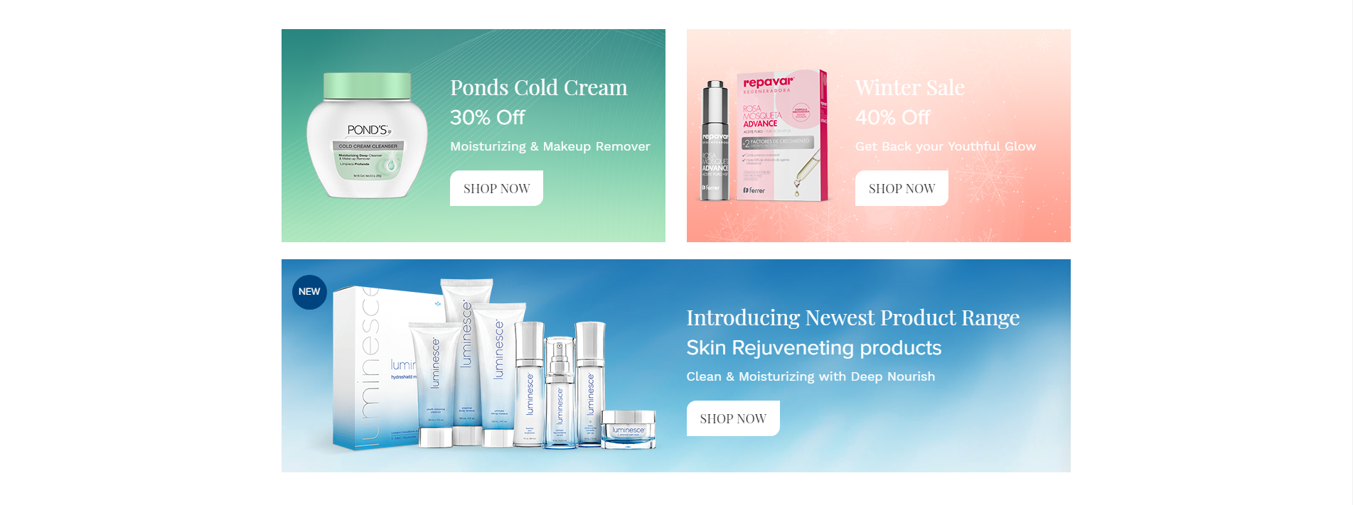
<!-- START Product Section -->
                <section class="cosmetic_ads_section wow fadeIn">
                    <div class="container">
                        <div class="row">
                            <div class="col-lg-6 wow fadeInLeft" >
                                <div class="ads1">
                                    <div class="row ads">
                                        <div class="col-sm-6 text-md-center p-0">
                                            <div class="img_div">
                                                <img src="yourimage.png" alt="" class="img-fluid"/>
                                            </div>
                                        </div>
                                        <div class="col-sm-6  p-0">
                                            <div class="ads_dec">
                                                 <h5>Ponds Cold Cream</h5>
                                                 <h5 class="discount">30% Off</h5>
                                                 <p> Moisturizing & Makeup Remover </p>
                                                 <a href="product_list_with_sidebar.html" class="shop_now"> shop now </a>
                                            </div>
                                        </div>
                                    </div>
                                </div>
                            </div>
                            <div class="col-lg-6 wow fadeInRight" >
                                <div class="ads2">
                                    <div class="row ads">
                                        <div class="col-sm-6 text-md-center p-0">
                                        <div class="img_div">
                                            <img src="yourimage.png" alt="" class="img-fluid"/>
                                        </div>
                                        </div>
                                        <div class="col-sm-6 m-auto p-0">
                                            <div class="ads_dec">
                                                 <h5>Winter Sale</h5>
                                                 <h5 class="discount">40% Off</h5>
                                                 <p> Get Back your Youthful Glow </p>
                                                 <a href="javascript:void(0)" class="shop_now"> shop now </a>
                                            </div>
                                        </div>
                                    </div>
                                </div>
                            </div>
                            <div class="col-md-12 wow fadeInUp" >
                                <div class="ads3">
                                    <div class="row ads">
                                        <div class="col-md-6 text-md-center">
                                            <img src="yourimage.png" alt="" class="img-fluid"/>
                                            <div class="product-label rounded-circle text-uppercase">new</div>
                                        </div>
                                        <div class="col-md-6">
                                            <div class="ads_dec">
                                                 <h5>Introducing Newest Product Range</h5>
                                                 <h5 class="discount">Skin Rejuveneting products</h5>
                                                 <p> Clean & Moisturizing with Deep Nourish </p>
                                                 <a href="javascript:void(0)" class="shop_now"> shop now </a>
                                            </div>
                                        </div>
                                    </div>
                                </div>
                            </div>
                        </div>
                    </div>
                </section>
                                            <!-- END Product Section -->
Featured Products
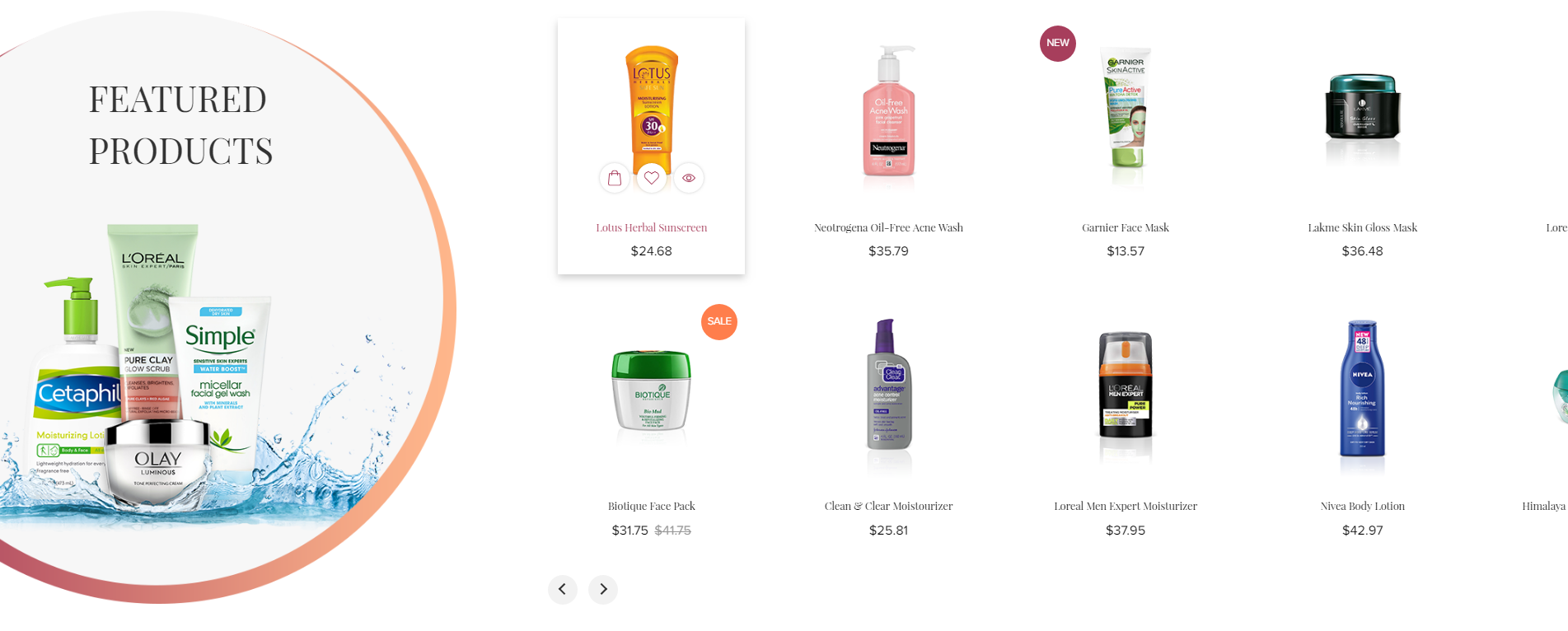
<!-- START Featured Products Section -->
                <section class="cosmetic_featured_products wow fadeIn">
                    <div class="container-fluid">
                        <div class="row">
                                <div class="col-lg-4 col-md-5 p-0 d-md-block featured_image wow fadeInLeft">
                                    <div class="img_div">
                                        <img src="yourimage.png" alt="nail_polish" class="img-fluid desktop_banner"/>
                                        <img src="yourimage.png" alt="nail_polish" class="img-fluid mobile_banner mt-5"/>
                                    </div>
                                    <div class="cosmetic_featured_text">
                                        <h4>Featured Products</h4>
                                    </div>
                                </div>
                            <div class="col-lg-8 col-md-7 wow fadeInRight pr-0">
                                <div class="featured_products">
                                    <div class="row ml-0">
                                         <div class="owl-carousel" id="cosmetics_product_slider">
                                            <div class="item">
                                                <div class="row">
                                                   <div class="col-lg-12">
                                                        <div class="featured_content">
                                                             featured product content
                                                        </div>
                                                        <div class="featured_detail_content text-center">
                                                             featured detail content
                                                        </div>
                                                   </div>
                                                </div>
                                            </div>
                                        </div>
                                    </div>
                                </div>
                            </div>
                        </div>
                    </div>
                </section>
                                            <!-- END Featured Products Section -->
Deal of the day
<!-- START Deal of the day Section -->
            <section class="cosmetic_deal_of_the_day wow fadeIn">
                <div class="container-fluid">
                    <div class="row flex-column-reverse flex-md-row">
                                    <div class="offset-xl-2 offset-md-1 col-xl-4 col-md-5 deal_title wow fadeInLeft" >
                                        <div class="deal_contend">
                                            <h4>deal of the day</h4>
                                            <p>Garnier Skin Active Botanical gel Face wash</p>
                                            <div class="star"><img src="yourimage.png" alt="star" class="img-fluid"/></div>
                                            <div class="deal_price"><span class="main_price">$31.75</span><span class="deal_compare_price">$41.75</span></div>
                                            <ul id="cosmetic_countdowntimer" class="product-date"></ul>
                                            <form class="d-inline-block w-100">
                                                <div class="form-group mb-0 quantity_box d-inline-block align-middle ">
                                                    <p class="qty">Quantity</p>
                                                    <div class="qty_number"><input type="text" value="1"></div>
                                                </div>
                                                <a href="cart.html" class="cart_btn text-uppercase d-inline-block align-middle">add to cart</a>
                                            </form>
                                        </div>
                                    </div>
                                    <div class="col-md-6 m-auto pr-0 wow fadeInRight" >
                                         <img src="yourimage.png" alt="" class="img-fluid"/>
                                    </div>
                                 </div>
                            </div>
            </section>
                                            <!-- END Deal of the day Section -->
New Products
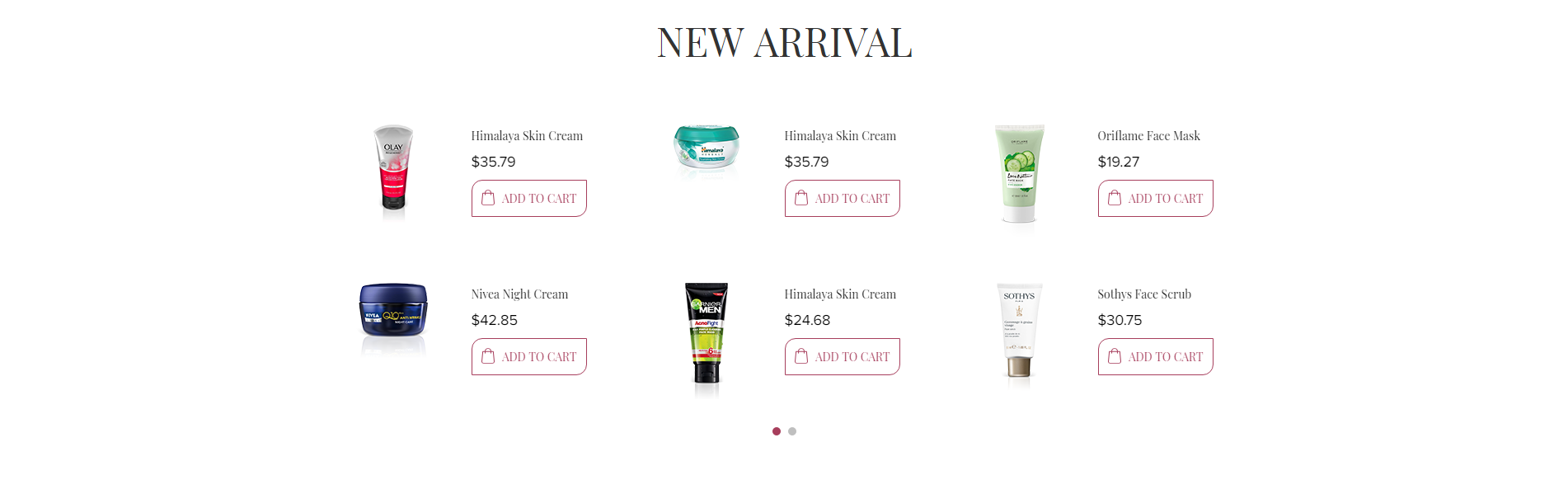
<!-- START New Products Section -->

                <section class="cosmetic_new_arrival_section wow fadeIn">
                    <div class="container">
                        <h4 class="text-center text-uppercase h4_mb wow fadeInDown" >New Arrival</h4>
                        <div class="row wow fadeInUp">
                            <div class="owl-carousel" id="cosmetics_new_arrival">
                                <div class="item">
                                    <div class="row m-0">
                                        <div class="col-lg-12 mt-3 mb-3">
                                            <div class="cosmetic_collection_content">
                                                <div class="row">
                                                    <div class="col-md-6  text-center img">
                                                            New Arrival image
                                                    </div>
                                                    <div class="col-md-6 p-0">
                                                        <div class="new_description">
                                                            New Arrival Content
                                                        </div>
                                                    </div>
                                                </div>
                                            </div>
                                        </div>
                                    </div>
                                </div>
                            </div>
                        </div>
                    </div>
                </section>
                                            <!-- END New Products Section -->
Promotion
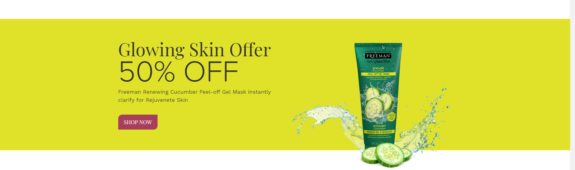
<!-- START Promotion Section -->

                <section class="cosmetic_ads_offer_section wow fadeIn">
                    <div class="container">
                        <div class="row flex-column-reverse flex-md-row wow fadeInDown">
                            <div class=col-md-6 pb-sm-3" >
                                    <h3>Glowing Skin Offer</h3>
                                    <h2>50% OFF</h2>
                                    <p class="mb-5">Freeman Renewing Cucumber Peel-off Gel Mask instantly clarify for Rejuvenete Skin</p>
                                    <a href="javascript:void(0)" class="shop_now">Shop Now</a>
                            </div>
                            <div class="col-md-6 wow fadeInRight" >
                                <div class="img_div">
                                    <img src="yourimage.png" class="img-fluid"/>
                                </div>
                            </div>
                        </div>
                    </div>
                </section>
                                            <!-- END Promotion Section -->
Our Latest News
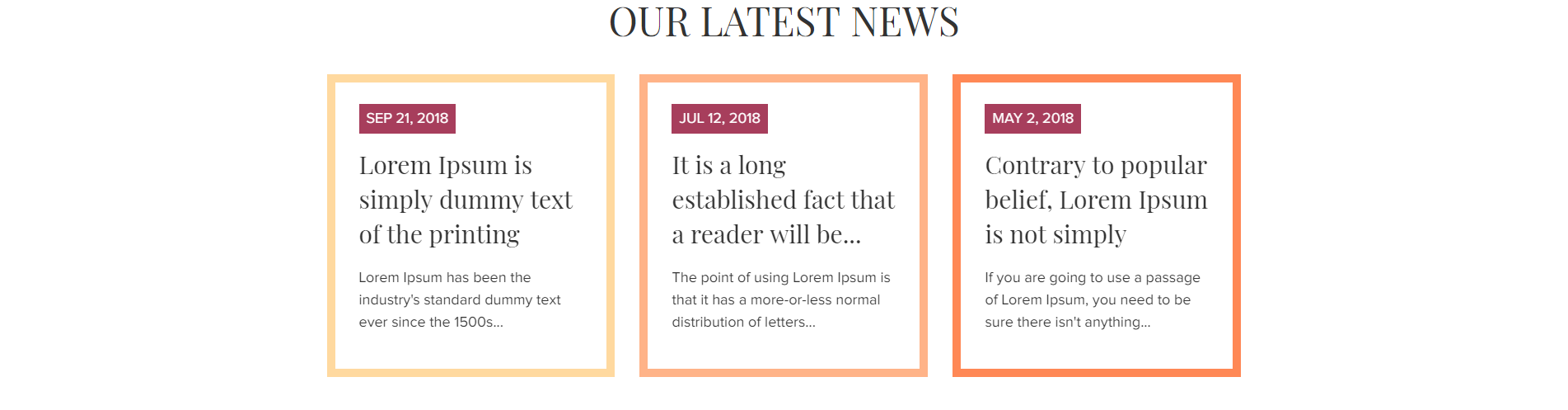
<!-- START Our Latest News Section -->

                <section class="cosmetic_latest_news wow fadeIn">
                    <div class="container">
                        <h4 class="text-center text-uppercase h4_mb_news wow fadeInDown" >Our Latest News</h4>
                        <div class="row news_contend">
                            <div class="col-md-4">
                                <div class="latest_news wow fadeInLeft">
                                    <span class="news_date text-uppercase">Date</span>
                                    <h5 class="news_title" >Title</h5>
                                    <p class="news_description">Text</p>
                                </div>
                            </div>
                        </div>
                    </div>
                </section>
                                            <!-- END Our Latest News Section -->
Brands

<!-- START Brand Section -->

                <div class=" brand_logo_section cosmetic_brand_logo_section wow fadeIn">
                    <div class="container">
                            <div id="cosmetic_brand_slider" class="owl-carousel">
                                <div class="item">
                                    <div class="brand_logo_img text-center position-relative" >
                                        <img src="yourimage.png" alt="brand_logo" class="img-fluid vertical_middle"/>
                                    </div>
                                </div>
                            </div>
                    </div>
                </div>
                                            <!-- END Brand Section -->
Handcraft
Note To see the landing page of "handcraft" Please click here.Banner
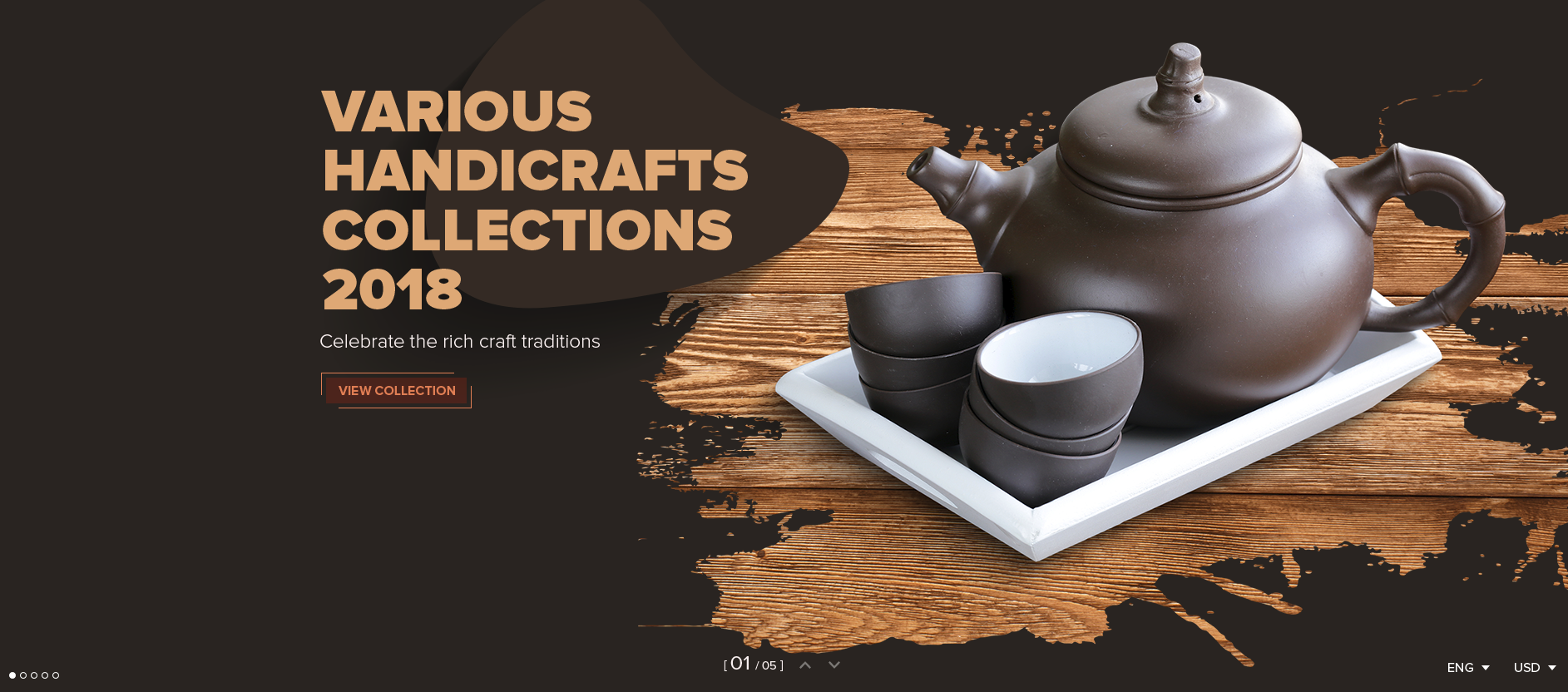
<!-- start Banner Section -->
            <div class="handcraft_banner_slider_section position-relative">
                <div class="rev_slider_wrapper fullwidthbanner-container">
                     <!-- the ID here will be used in the JavaScript below to initialize the slider -->
                    <div id="rev_slider_2_handcraft" class="rev_slider fullwidthabanner" data-version="5.4.5" style="display:none;">
                     <!-- BEGIN MAIN SLIDE LIST -->
                        <ul>
                       <!-- MINIMUM SLIDE STRUCTURE -->
                            <li data-transition="fade">
                           <!-- SLIDE'S MAIN BACKGROUND IMAGE -->
                            <img src="yourimage.jpg" alt="Sky" class="rev-slidebg img-fluid"/>
                            <div class="">
                                <!-- LAYER NR. 1 -->
                                <div class="tp-caption Restaurant-Display   tp-resizeme"
                                     id="slide-3010-layer-1"
                                     data-x="['left','left','left','left']" data-hoffset="['-78','0','0','0']"
                                     data-y="['top','middle','middle','middle']" data-voffset="['186','0','0','0']"
                                     data-type="text"
                                     data-responsive_offset="on"
                                     data-frames='[{"from":"y:[100%];z:0;rX:0deg;rY:0;rZ:0;sX:1;sY:1;skX:0;skY:0;","mask":"x:0px;y:0px;s:inherit;e:inherit;","speed":1500,"to":"o:1;","delay":500,"ease":"Power3.easeInOut"},{"delay":"wait","speed":1000,"to":"opacity:0;","ease":"nothing"}]'
                                     data-textAlign="['left','left','left','left']"
                                     data-paddingtop="[0,0,0,0]"
                                     data-paddingright="[0,0,0,0]"
                                     data-paddingbottom="[0,0,0,0]"
                                     data-paddingleft="[0,0,0,0]"
                                     style="z-index: 15;font-size:72px;line-height: 71.4px;color: #dfaa76;text-transform: uppercase;font-family: 'ProximaNova-Black';"/>Various  <br/> Handicrafts  <br/> Collections <br/> 2018 </div>
                                 <!-- LAYER NR. 2 -->
                                <div class="tp-caption Restaurant-Cursive tp-resizeme"
                                    id="slide-3010-layer-2"
                                     data-x="['left','left','left','left']" data-hoffset="['-77','0','0','0']"
                                     data-y="['top','middle','middle','middle']" data-voffset="['481','0','0','0']"
                                     data-type="text"
                                     data-responsive_offset="on"
                                     data-frames='[{"from":"y:[-100%];z:0;rX:0deg;rY:0;rZ:0;sX:1;sY:1;skX:0;skY:0;","mask":"x:0px;y:0px;s:inherit;e:inherit;","speed":1500,"to":"o:1;","delay":700,"ease":"Power3.easeInOut"},{"delay":"wait","speed":1000,"to":"opacity:0;","ease":"nothing"}]'
                                     data-textAlign="['left','left','left','left']"
                                     data-paddingtop="[0,0,0,0]"
                                     data-paddingright="[0,0,0,0]"
                                     data-paddingbottom="[0,0,0,0]"
                                     data-paddingleft="[0,0,0,0]"
                                     style="z-index: 15;font-size:24px;line-height: 35.52px;color:#faf1f1;letter-spacing: 0;font-family: 'ProximaNova-Regular';font-weight: 300;font-family: 'ProximaNova-Light';">Celebrate the rich craft traditions</div>
                                 <!-- LAYER NR. 3 -->
                                <div class="tp-caption Restaurant-Cursive handcraft_border_btn_a  tp-resizeme"
                                     id="slide-3010-layer-3"
                                     data-x="['left','left','left','left']" data-hoffset="['-75','0','0','0']"
                                     data-y="['top','middle','middle','middle']" data-voffset="['526','0','0','0']"
                                     data-type="text"
                                     data-responsive_offset="off"
                                     data-frames='[{"from":"y:[-100%];z:0;rX:0deg;rY:0;rZ:0;sX:1;sY:1;skX:0;skY:0;","mask":"x:0px;y:0px;s:inherit;e:inherit;","speed":1500,"to":"o:1;","delay":700,"ease":"Power3.easeInOut"},{"delay":"wait","speed":1000,"to":"opacity:0;","ease":"nothing"}]'
                                     data-textAlign="['left','left','left','left']"
                                     data-paddingtop="[0,0,0,0]"
                                     data-paddingright="[0,0,0,0]"
                                     data-paddingbottom="[0,0,0,0]"
                                     data-paddingleft="[0,0,0,0]"
                                     style="z-index: 19;font-size:18px;line-height:18px;margin-top: 11px;"><a href="product_list_with_sidebar.html" class="handcraft_border_btn text-uppercase">View Collection</a></div>
                                  <!-- LAYER NR. 4 -->
                                <div class="tp-caption  "
                                     id="slide-1041-layer-10"
                                     data-x="['left','left','left','left']" data-hoffset="['0','0','0','0']"
                                     data-y="['bottom','top','top','top']" data-voffset="['0','0','0','0']"
                                     data-width="none"
                                     data-height="none"
                                     data-whitespace="nowrap"
                                     data-type="text"
                                     data-responsive_offset="off"
                                     data-responsive="off"
                                     data-frames='[{"from":"y:[100%];z:0;rX:0deg;rY:0;rZ:0;sX:1;sY:1;skX:0;skY:0;","mask":"x:0px;y:0px;s:inherit;e:inherit;","speed":1500,"to":"o:1;","delay":500,"ease":"Power3.easeInOut"},{"delay":"wait","speed":1000,"to":"opacity:0;","ease":"nothing"}]'
                                     data-margintop="[0,0,0,0]"
                                     data-marginright="[30,30,30,10]"
                                     data-marginbottom="[0,0,0,0]"
                                     data-marginleft="[0,0,0,30]"
                                     data-textAlign="['inherit','inherit','inherit','inherit']"
                                     data-paddingtop="[0,0,0,0]"
                                     data-paddingright="[5,5,5,5]"
                                     data-paddingbottom="[0,0,0,0]"
                                     data-paddingleft="[5,5,5,5]"
                                     style="z-index: 13; white-space: nowrap; font-size: 14px; line-height: 20.01px;; font-weight: 400; color: #faf1f1; letter-spacing: 0px; display: inline-block;font-family: 'ProximaNova-Regular';">[ <span style="font-size:24px;">01</span> / 05 ]</div>
                                  <!-- LAYER NR. 5 -->
                                <div class="tp-caption  "
                                     id="slide-1041-layer-11"
                                     data-x="['left','left','left','left']" data-hoffset="['0','0','0','0']"
                                     data-y="['bottom','top','top','top']" data-voffset="['0','0','0','0']"
                                     data-width="30"
                                     data-height="['none','none','none','30']"
                                     data-whitespace="nowrap"
                                     data-type="text"
                                     data-actions='[{"event":"click","action":"jumptoslide","slide":"previous","delay":""}]'
                                     data-responsive_offset="off"
                                     data-responsive="off"
                                     data-frames='[{"delay":"+240","speed":500,"sfxcolor":"#ffffff","sfx_effect":"blockfromtop","frame":"0","from":"z:0;","to":"o:1;","ease":"Power3.easeInOut"},{"delay":"wait","speed":500,"frame":"999","to":"opacity:0;","ease":"Power4.easeOut"},{"frame":"hover","speed":"0","ease":"Linear.easeNone","to":"o:1;rX:0;rY:0;rZ:0;z:0;","style":"c:rgb(255,255,255);"}]'
                                     data-margintop="[0,0,0,0]"
                                     data-marginright="[5,5,5,5]"
                                     data-marginbottom="[0,0,0,0]"
                                     data-marginleft="[0,0,0,0]"
                                     data-textAlign="['center','center','center','center']"
                                     data-paddingtop="[0,0,0,0]"
                                     data-paddingright="[0,0,0,0]"
                                     data-paddingbottom="[0,0,0,0]"
                                     data-paddingleft="[0,0,0,0]"
                                     style="z-index: 14; min-width: 30px; max-width: 30px; white-space: nowrap; font-size: 15px; line-height: 30px; font-weight: 400; color: rgba(255,255,255,0.5); letter-spacing: 0px; display: inline-block;font-family:revicons;cursor:pointer;"><i class="fa-icon-chevron-up"></i></div>
                                  <!-- LAYER NR. 6 -->
                                <div class="tp-caption  "
                                     id="slide-1041-layer-12"
                                     data-x="['left','left','left','left']" data-hoffset="['0','0','0','0']"
                                     data-y="['bottom','top','top','top']" data-voffset="['0','0','0','0']"
                                     data-width="30"
                                     data-height="['none','none','none','30']"
                                     data-whitespace="nowrap"
                                     data-type="text"
                                     data-actions='[{"event":"click","action":"jumptoslide","slide":"next","delay":""}]'
                                     data-responsive_offset="off"
                                     data-responsive="off"
                                     data-frames='[{"delay":"+290","speed":500,"sfxcolor":"#ffffff","sfx_effect":"blockfrombottom","frame":"0","from":"z:0;","to":"o:1;","ease":"Power3.easeInOut"},{"delay":"wait","speed":500,"frame":"999","to":"opacity:0;","ease":"Power4.easeOut"},{"frame":"hover","speed":"0","ease":"Linear.easeNone","to":"o:1;rX:0;rY:0;rZ:0;z:0;","style":"c:rgb(255,255,255);"}]'
                                     data-margintop="[0,0,0,0]"
                                     data-marginright="[0,0,0,0]"
                                     data-marginbottom="[0,0,0,0]"
                                     data-marginleft="[0,0,0,0]"
                                     data-textAlign="['center','center','center','center']"
                                     data-paddingtop="[0,0,0,0]"
                                     data-paddingright="[0,0,0,0]"
                                     data-paddingbottom="[0,0,0,0]"
                                     data-paddingleft="[0,0,0,0]"
                                     style="z-index: 15; min-width: 30px; max-width: 30px; white-space: nowrap; font-size: 15px; line-height: 30px; font-weight: 400; color: rgba(255,255,255,0.5); letter-spacing: 0px; display: inline-block;font-family:revicons;cursor:pointer;""><i class="fa-icon-chevron-down"></i> </div>
                                  <!-- LAYER NR. 7 -->
                                <div class="tp-caption Restaurant-Cursive   tp-resizeme"
                                     id="slide-3010-layer-14"
                                     data-x="['left','middle','middle','middle']" data-hoffset="['-69','0','0','0']"
                                     data-y="['top','middle','middle','middle']" data-voffset="['62','0','0','0']"
                                     data-type="text"
                                     data-responsive_offset="off"
                                     data-frames='[{"from":"y:[-100%];z:0;rX:0deg;rY:0;rZ:0;sX:1;sY:1;skX:0;skY:0;","mask":"x:0px;y:0px;s:inherit;e:inherit;","speed":1500,"to":"o:1;","delay":700,"ease":"Power3.easeInOut"},{"delay":"wait","speed":1000,"to":"opacity:0;","ease":"nothing"}]'
                                     data-textAlign="['left','left','left','left']"
                                     data-paddingtop="[0,0,0,0]"
                                     data-paddingright="[0,0,0,0]"
                                     data-paddingbottom="[0,0,0,0]"
                                     data-paddingleft="[0,0,0,0]"
                                     style="z-index: 5;"><img src="yourimage.jpg" /></div>
                            </div>
                            </li>
                            </ul>
                             <!-- END MAIN SLIDE LIST -->
                    </div>
                </div>
            </div>
                                            <!-- end Banner Section -->
Collection
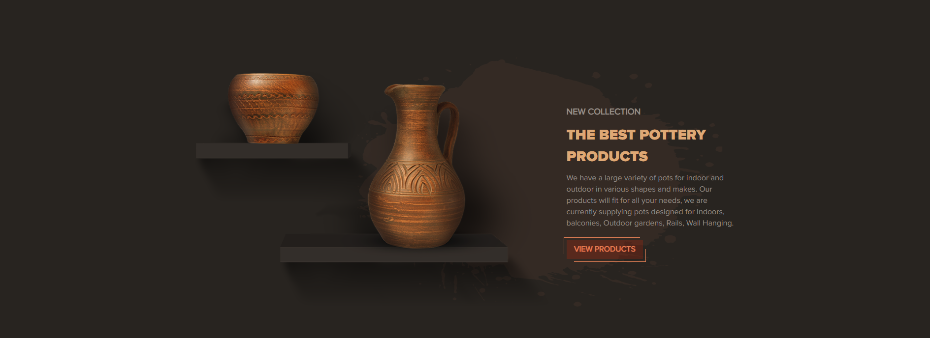
<!-- start Collection Section -->
        <section class="handcraft_collection_section">
            <div class="container">
                <div class="row flex-container">
                    <class="col-lg-8 order-lg-1 order-1" >
                        <div class="image_div">
                            <img src="yourimage.jpg" class="img-fluid" alt="New collection image"/>
                        </div>
                    </div>
                    <div class="col-lg-4 order-lg-2 order-2 text_container text-lg-left text-center" >
                        <div class="text_div">
                            <h6 class="price">New Collection</h6>
                            <h2 class="main_heading">The best Pottery Products</h2>
                            <p class="pera_font">We have a large variety of pots for indoor and outdoor in various shapes and makes.
                                Our products will fit for all your needs, we are currently supplying pots designed for Indoors, balconies, Outdoor gardens, Rails, Wall Hanging.</p>
                            <a href="product_list_with_sidebar.html" class="handcraft_border_btn">View Products</a>
                        </div>
                    </div>
                </div>
            </div>
        </section>
                                    <!-- end Collection Section -->
Trending Products
<!-- start Trending Products Section -->
                <section class="handcraft_trending_section wow fadeInUp">
                    <div class="container-fluid">
                        <div class="row">
                            <div class="col-xl-6 col-md-12 main_image wow fadeInLeft">
                                <div class="row item">
                                    <div class="col-sm-6 pr-2 slider_img">
                                        <div class="image_div pr-0">
                                            product Image
                                        </div>
                                    </div>
                                    <div class="col-sm-6 slider_content wow fadeOutDowng">
                                        <div class="text_div pr-0">
                                            product Content
                                        </div>
                                    </div>
                                </div>
                            </div>
                            <div class="col-xl-6 col-md-12 right_section wow fadeInRight">
                                <div class="row wow fadeOutDown">
                                    <div class="col-md-6 col-12 p-0">
                                        <div class="row item">
                                            <div class="col-sm-6 slider_img">
                                                <div class="image_div">
                                                    product Image
                                                </div>
                                            </div>
                                            <div class="col-sm-6 slider_content">
                                                <div class="text_div">
                                                    product Content
                                                </div>
                                            </div>
                                        </div>
                                    </div>
                                </div>
                            </div>
                        </div>
                    </div>
                </section>
                                            <!-- end Trending Products Section -->
Latest Products
<!-- start Latest Products Section -->
                <div class="handcraft_latest_product_section wow fadeIn>
                    <div class="container">
                        <div class="row">
                            <div class="col-lg-6" >
                                <h2 class="bold_heading">Latest Product</h2>
                            </div>
                            <div class="col-lg-6 text-lg-right" >
                                <ul class="tabs latest_product_ul visible-md d-none">
                                    <li class="text-uppercase" rel="tab1">Features</li>
                                    <li class="rec_dots text-uppercase active" rel="tab2">Latest</li>
                                    <li class="text-uppercase" rel="tab3">Best Seller</li>
                                </ul>
                            </div>
                            <div class="col-lg-12 no-gutters tab_container " >
                                <h3 class="tab_drawer_heading d-md-none" rel="tab1"><span>Features</span></h3>
                                <div id="tab1" class="tab_content">
                                    <div class="row">
                                        <div class="col-lg-3 col-md-4 col-6 wow fadeInLeft handcraft_div">
                                            <div class="featured_content">
                                                Latest Product Content
                                            </div>
                                        </div>
                                    </div>
                                </div>
                            </div>
                        </div>
                    </div>
                </div>
                                            <!-- end Latest Products Section -->
Home Decor Products
<!-- start Home Decor Products Section -->
            <section class="handcraft_shopnow_section position-relative">
                <div class="owl-carousel"  id="handcraft_shopnow_slider">
                    <div class="container item">
                        <div class="row flex-container">
                            <div class="ccol-lg-4 col-md-5 col-12 slider_content order-2 order-md-1" >
                                <div class="text_div">
                                    <h6 class="price">Home Decor Products</h6>
                                    <h2 class="main_heading">Modern Decorative terracotta pots</h2>
                                    <h5 class="price>$265.00</h5>
                                    <p class="pera_font">Our products will fit for all your needs, we are currently supplying pots designed for Indoors, balconies, Outdoor gardens, Rails, Wall Hanging.</p>
                                    <a href="product_list_with_sidebar.html" class="handcraft_border_btn">shop now</a>
                                </div>
                            </div>
                            <div class="col-lg-8 col-md-7 col-12 slider_img order-1 order-md-2">
                                    <img src="yourimage.jpg" class="img-fluid" alt="pot image"/>
                            </div>
                        </div>
                    </div>
                </div>
            </section>

                                            <!-- end Home Decor Products Section -->
Latest Blog

<!-- start Latest Blog Section -->
            <section class="handcraft_blog_section">
                <div class="container">
                    <div class="row flex-container">
                        <div class="col-md-9 col-sm-7 col-12 owl-carousel blog_content order-sm-1 order-2 wow fadeInLeft" id="handcraft_blog" >
                            <div class="item">
                                <h6>Title</h6>
                                <h4>Description</h4>
                                <a class="pera_font" href="grid_blog_list_with_sidebar.html">Read more</a>
                            </div>
                        </div>
                        <div class="col-md-3 col-sm-5 col-12 blog_title order-sm-2 order-1 text-sm-left text-center" >
                            <h2 class="bold_heading">Latest Blog</h2>
                        </div>
                    </div>
                </div>
            </section>

                                            <!-- end Latest Blog Section -->
what client say
<!-- start what client say Section -->
            <section class="handcraft_client_section  position-relative">
                <div class="container position-relative">
                    <div class="row flex-container">
                        <div class="col-md-12 clients_img order-lg-1 order-1" >
                            <div class="col-lg-9 col-12 image_container" >
                                <div class="handcraft_blink_img" >
                                    <div class="image" >
                                        <img src="yourimage.jpg" class="img-fluid" alt=""/>
                                    </div>
                                </div>
                            </div>
                        </div>
                         <div class="col-lg-5 owl-carousel client_say_sec order-lg-2 order-2" id="handcraft_client" >
                            <div class="slider_content item">
                                Client Content
                            </div>
                        </div>
                    </div>
                </div>
                <div class="client_say_bg position-absolute" >

                </div>
            </section>

                                            <!-- end what client say Section -->
Promotion
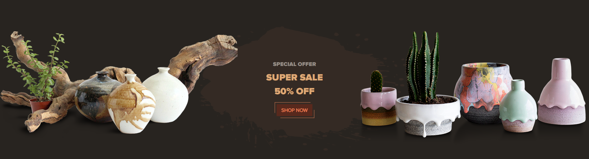
<!-- start Promotion Section -->
                <section class="handcraft_offer_section wow fadeInDownBig">
                    <div class="container-fluid">
                            <div class="row flex-container">
                                <div class="col-lg-5 col-md-4 col-sm-6 col-12 order-1 order-md-1 order-sm-2 order-1  wow fadeInLeft">
                                    <div class="left_image float-left">
                                        <img src="yourimage.jpg" class="img-fluid" alt=""/>
                                    </div>
                                </div>
                                <div class="col-lg-2 col-md-4 col-12 order-sm-1 text-md-left text-center order-md-2 order-sm-1 order-2 wow fadeInDownBig" >
                                    <div class="offer_text text-center d-inline-block">
                                        <h5>Special Offer</h5>
                                        <h2>Super sale 50% off</h2>
                                        <a  href="product_list_with_sidebar.html" class="handcraft_border_btn">shop now</a>
                                    </div>
                                </div>
                                <div class="col-lg-5 col-md-4 col-sm-6 col-12 order-3 order-md-3 wow fadeInRight">
                                    <div class="image_right float-right">
                                        <img src="yourimage.jpg" class="img-fluid" alt=""/>
                                    </div>
                                </div>
                            </div>
                    </div>
                </section>
                                            <!-- end Promotion Section -->
Newsletter

<!-- start Newsletter Section -->
                <footer class="handcraft_footer_section">
                    <div class="h_footer_top text-sm-left text-center">
                            <div class="container">
                                <div class="row">
                                    <div class="col-md-6 text_details wow fadeInUp">
                                            <h2 class="bold_heading fadeInRight> Subscribe to our newsletter</h2>
                                            <h6 class="pera_font fadeInRight">Subscribe to our mailing list to get the update to you email</h6>
                                    </div>
                                    <div class="col-md-6 wow fadeInUp">
                                        <form action="">
                                            <div  class="input-container">
                                                <input class="input-field wow fadeInLeft pera_font" type="email" placeholder="Enter your email address" name="email"/>
                                                <button class="wow fadeInDownBig" type="submit"><img class="img-fluid" src="yourimage.jpg" alt="" /></button>
                                            </div>
                                        </form>
                                    </div>
                                </div>
                            </div>
                    </div>
                </footer>
                                            <!-- end Newsletter Section -->
Speaker
Note To see the landing page of "speaker" Please click here.Banner
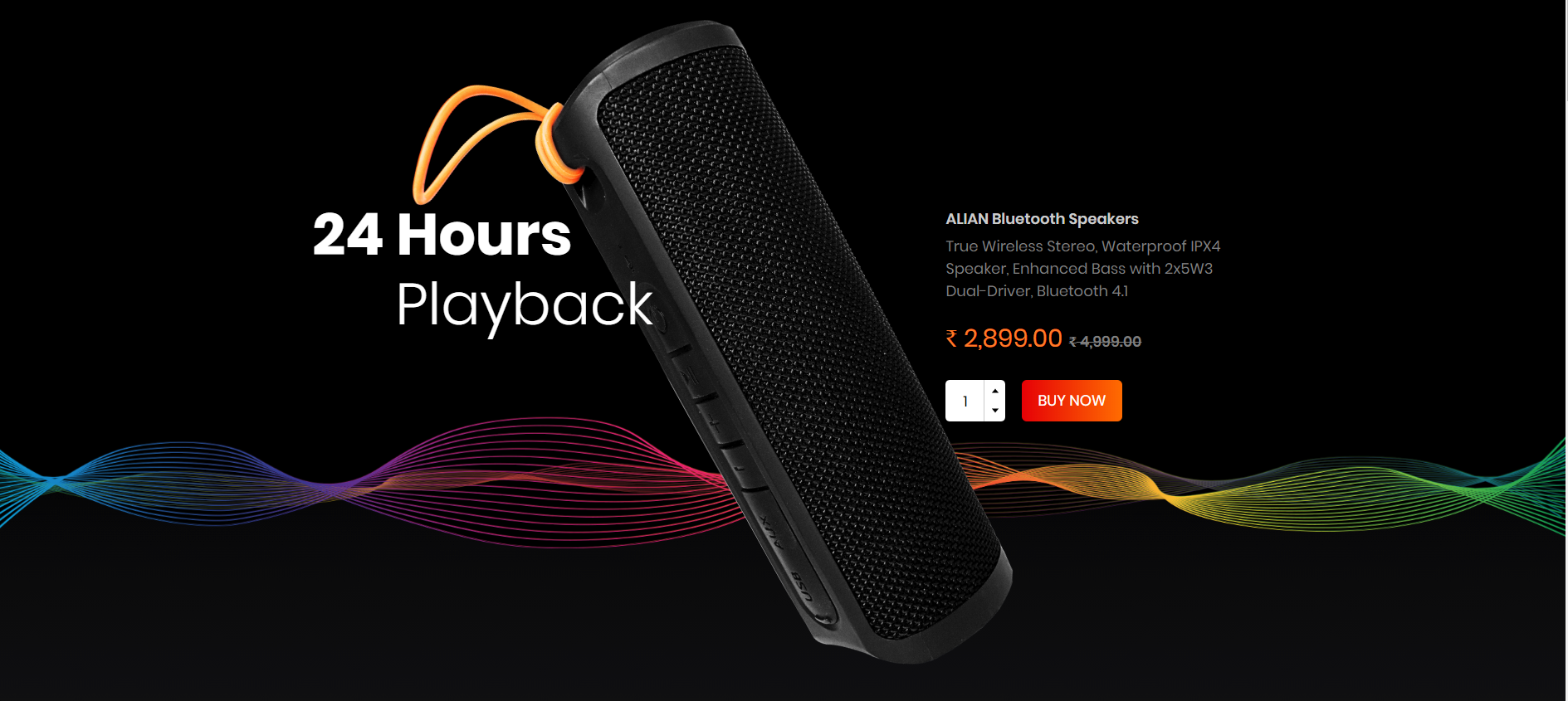
<!-- start Banner Section -->
            <section class="speaker_banner_section wow fadeIn">
                <div class="container">
                    <div class="row">
                        <div class="banner_title col-sm-4 wow fadeInLeft">
                            <h2 class="title1" >Title</h2>
                            <h2 class="title2" >Title</h2>
                        </div>
                        <div class="col-sm-4">
                            <img src="yourimage.png" alt="brand_logo" class="img-fluid position-absolute product_img"/>
                        </div>
                        <div class="col-sm-4 wow fadeInRight">
                            <p class="product_title">Text</p>
                            <p class="product_description">Text</p>
                            <form class="d-inline-block w-100">
                                <div class="form-group mb-0 mt-0 quantity_box d-inline-block align-middle">
                                    <div class="qty_number"><input type="text" value="1" onkeypress="return event.charCode >= 48 && event.charCode <= 57">
                                    </div>
                                </div>
                            </form>
                            <a href="cart.html" class="background-btn text-uppercase cart_btn d-inline-block align-middle">buy now</a>
                        </div>
                    </div>
                </div>
            </section>
                                            <!-- end Banner Section -->
Product 1
<!-- start Product 1 Section -->
        <section class="speaker_features_section wow fadeIn">
            <div class="container">
                <h3 class="text-center text-capitalize featured_title">features</h3>
                <div class="row flex-column-reverse flex-lg-row">
                    <div class="col-12">
                        <div class="row">
                            <div class="col-xl-3 col-lg-4 col-sm-6 wow fadeInLeftBig" >
                                <div class="featured_content">
                                    <div class="featured_content_image">
                                        <div class="featured_content_i_mic"></div>
                                    </div>
                                    <div class="featured_content_description">
                                        <div class="featured_description">
                                            <p>Title</p>
                                        </div>
                                    </div>
                                </div>
                            </div>
                        </div>
                    </div>
                    <div class="col-12">
                        <div class="featured_product_img text-center wow fadeInUp">
                            <img src="yourimage.png" alt="" class="img-fluid"/>
                        </div>
                    </div>
                </div>
            </div>
        </section>
                                    <!-- end Product 1 Section -->
Product 2
<!-- start Product 2 Section -->
                <section class="speaker_superior_section wow fadeIn">
                    <div class="container-fluid">
                        <div class="row">
                            <div class="col-md-6 sound_quality wow fadeInLeft">
                                <div class="superior">
                                    <img src="yourimage.jpg" class="img-fluid"/>
                                </div>
                            </div>
                            <div class="col-xl-4 col-md-6 superior_content wow fadeInRight">
                                <div class="contact_info">
                                    Product Content
                                </div>
                                <div class="offset-xl-2"></div>
                            </div>
                        </div>
                    </div>
                </section>
                                            <!-- end Product 2 Section -->
Bluetooth
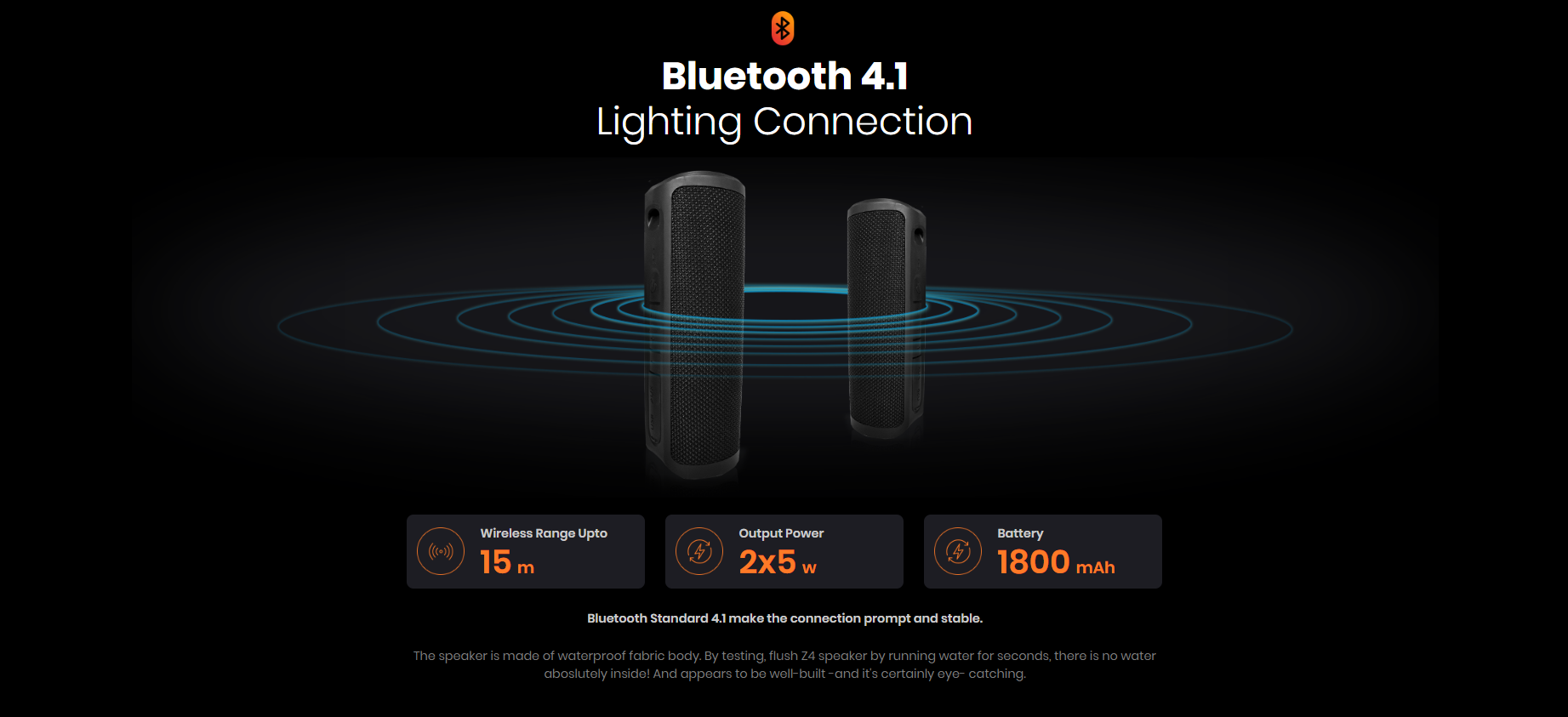
<!-- start Bluetooth Section -->
                <section class="speaker_bluetooth_section wow fadeIn">
                    <div class="container-fluid">
                        <div class="text-center">
                            <img src="yourimage.jpg" class="img-fluid"/>
                            <h3 class="title1">Bluetooth 4.1</h3>
                            <h3 class="title2">Lighting Connection</h3>
                            <img src="yourimage.jpg" class="img-fluid"/>
                        </div>
                        <div class="container">
                            <div class="row">
                                <div class="col-md-4 col-sm-6">
                                    <div class="row">
                                        <div class="bluetooth_features">
                                            <div class="col-3 features_image">
                                                <img src="yourimage.jpg" class="img"/>
                                            </div>
                                            <div class="col-9 m-auto featured_description">
                                                <p>Title</p>
                                                <h4>Description</h4>
                                            </div>
                                        </div>
                                    </div>
                                </div>
                            </div>
                            <div class="text-center bluetooth_content">
                                <p class="bluetooth">Description</p>
                                <p class="speaker">Description</p>
                            </div>
                        </div>
                    </div>
                </section>
                                            <!-- end Bluetooth Section -->
Product 3
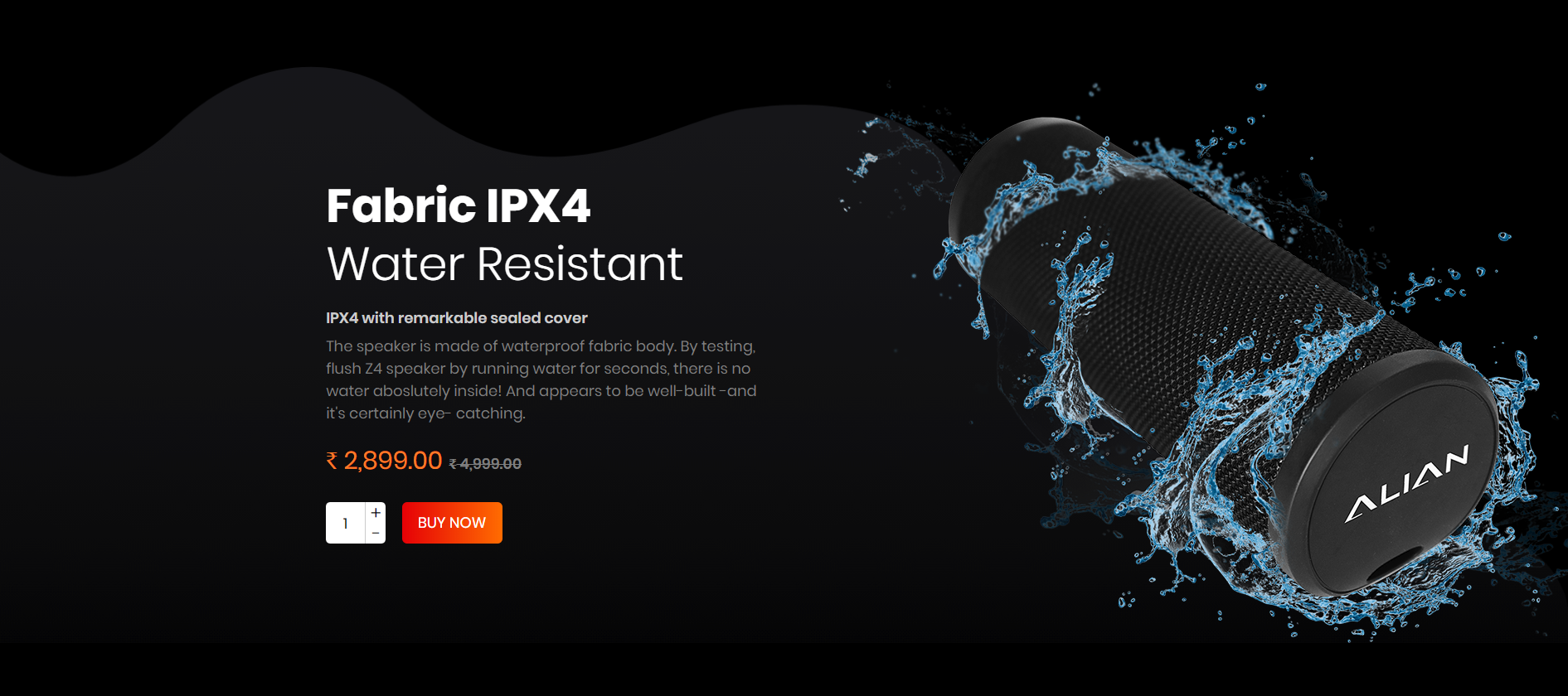
<!-- start Product 3 Section -->
            <section class="speaker_fabric_Section wow fadeIn">
                <div class="container-fluid">
                    <div class="row flex-column-reverse flex-sm-row">
                            <div class="offset-xl-2">
                            </div>
                            <div class="col-sm-6 col-xl-4 wow fadeInLeft" >
                                <div class="fabric_description">
                                    <h3 class="title1">Fabric IPX4</h3>
                                    <h3 class="title2">Water Resistant</h3>
                                    <p class="product_title">IPX4 with remarkable sealed cover</p>
                                    <p class="product_description">The speaker is made of waterproof fabric body. By testing, flush Z4 speaker by running water for seconds, there is no water aboslutely inside! And appears to be well-built -and it's certainly eye- catching.</p>
                                    <p class="product_price"><span>₹</span> 2,899.00<span class="compare_price"><span >₹</span>4,999.00</span></p>
                                    <form class="d-inline-block w-100">
                                        <div class="form-group mb-0  quantity_box d-inline-block align-middle mr-0">
                                            <div class="qty_number"><input type="text" value="1" onkeypress="return event.charCode >= 48 && event.charCode <= 57">
                                            </div>
                                        </div>
                                    </form>
                                    <a href="cart.html" class="background-btn text-uppercase cart_btn d-inline-block align-middle">buy now</a>
                                </div>
                            </div>
                            <div class="col-sm-6 col-xl-4 wow fadeInRight">
                                <div class="fabric_image">
                                    <img src="yourimage.jpg" class="img-fluid" />
                                </div>
                            </div>
                    </div>
                </div>
            </section>

                                            <!-- end Product 3 Section -->
Specifications
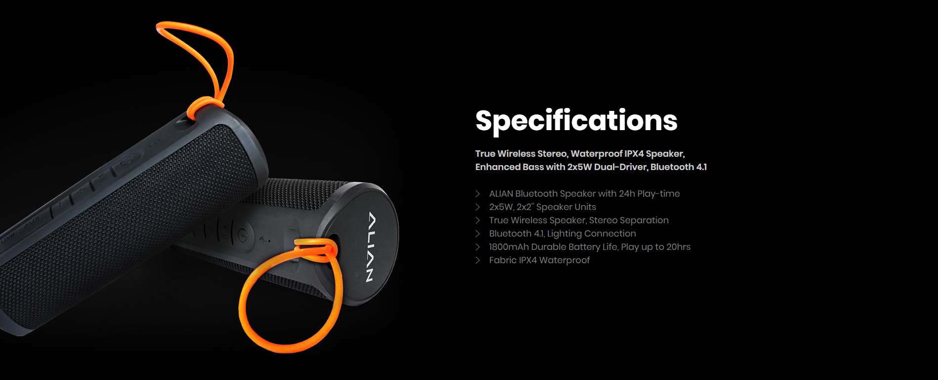
<!-- start Specifications Section -->
            <section class="speaker_specifications_section wow fadeI">
                <div class="container-fluid">
                    <div class="row">
                        <div class="col-xl-6 col-sm-6 wow specifications_img_content fadeInLeft" >
                            <div class="">
                                <img src="yourimage.jpg" class="img-fluid specifications_img" />
                            </div>
                        </div>
                        <div class="col-xl-4 col-sm-6  specifications_description_content wow fadeInRight" >
                            <div class="specifications_description">
                                <h3 class="title1">Specifications</h3>
                                <p class="product_title">True Wireless Stereo, Waterproof IPX4 Speaker, Enhanced Bass with 2x5W Dual-Driver, Bluetooth 4.1</p>
                                <ul class="sub_description>
                                    <li>ALIAN Bluetooth Speaker with 24h Play-time</li>
                                    <li>2x5W, 2x2'' Speaker Units</li>
                                    <li>True Wireless Speaker, Stereo Separation</li>
                                    <li>Bluetooth 4.1, Lighting Connection</li>
                                    <li>1800mAh Durable Battery Life, Play up to 20hrs</li>
                                    <li>Fabric IPX4 Waterproof</li>
                                </ul>
                            </div>
                        </div>
                        <div class="offset-xl-2"> </div>
                    </div>
                </div>
            </section>

                                            <!-- end Specifications Section -->
FAQ
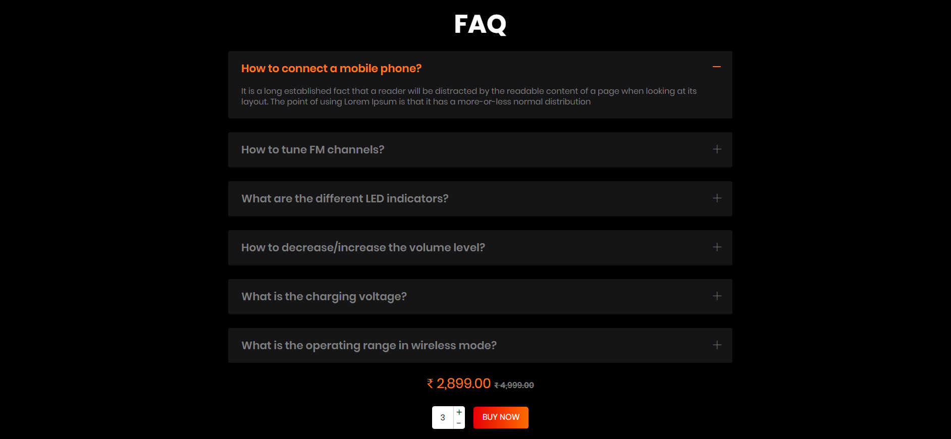
<!-- start FAQ Section -->
                    <section class="speaker_faq_section wow fadeIn">
                        <div class="container">
                            <h3 class="title1 text-center">FAQ</h3>
                            <div class="faq_accordion">
                                <div id="speaker_accordion" class="accordion_text">
                                    <h6>FAQ question</h6>
                                    <div>
                                        <div class="faq_text">
                                            <p>FAQ answer</p>
                                        </div>
                                    </div>
                                </div>
                            </div>
                            <div class="text-center">
                                 <p class="product_price"><span>₹</span>2,899.00<span class="compare_price"><span>₹</span>4,999.00</span></p>
                            </div>
                            <div class="text-center">
                                <form class="d-inline-block w-100">
                                    <div class="form-group mb-0  quantity_box d-inline-block align-middle mr-0">
                                        <div class="qty_number"><input type="text" value="1" onkeypress="return event.charCode >= 48 && event.charCode <= 57">
                                        </div>
                                    </div>
                                    <a href="cart.html" class="background-btn text-uppercase cart_btn d-inline-block align-middle">buy now</a>
                                </form>
                            </div>
                        </div>
                    </section>
<!-- end FAQ Section -->
Groccery
Note To see the landing page of "groccery" Please click here.Banner
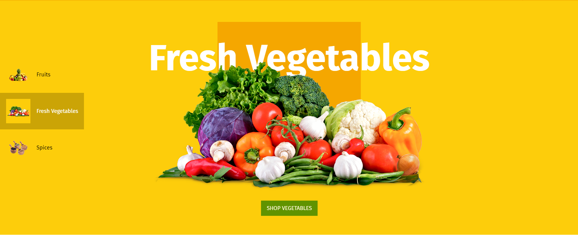
<!-- start Banner Section -->
        <div class="groccery_main_section">
            <div class="groccery_banner  banner_slider_section">
                <div class="rev_slider_wrapper fullwidthbanner-container">
                     <!-- the ID here will be used in the JavaScript below to initialize the slider -->
                    <div id="groccery_banner_id" class="rev_slider fullwidthabanner" data-version="5.4.5" style="display:none;">
                     <!-- BEGIN MAIN SLIDE LIST -->
                        <ul>
                       <!-- MINIMUM SLIDE STRUCTURE -->
                            <li data-transition="fade"  data-title="" data-thumb="yourimage.png">
                           <!-- SLIDE'S MAIN BACKGROUND IMAGE -->
                                <!-- LAYER NR. 1 -->
                                <div class="tp-caption Restaurant-Cursive tp-resizeme"
                                     id="slide-3010-layer-1"
                                     data-x="['middle','middle','middle','middle']" data-hoffset="['0','0','0','0']"
                                     data-y="['top','middle','middle','middle']" data-voffset="['171','0','0','0']"
                                     data-type="text"
                                     data-responsive_offset="off"
                                     data-frames='[{"from":"y:[-100%];z:0;rX:0deg;rY:0;rZ:0;sX:1;sY:1;skX:0;skY:0;","mask":"x:0px;y:0px;s:inherit;e:inherit;","speed":1500,"to":"o:1;","delay":700,"ease":"Power3.easeInOut"},{"delay":"wait","speed":1000,"to":"opacity:0;","ease":"nothing"}]'
                                     data-textAlign="['center','center','center','center']"
                                     data-paddingtop="[0,0,0,0]"
                                     data-paddingright="[0,0,0,0]"
                                     data-paddingbottom="[0,0,0,0]"
                                     data-paddingleft="[0,0,0,0]"
                                     style="z-index: 1;"/><img src="yourimage.jpg" > </div>
                                 <!-- LAYER NR. 2 -->
                                <div class="tp-caption Restaurant-Display   tp-resizeme"
                                     id="slide-3010-layer-2"
                                     data-x="['center','center','center','center']" data-hoffset="['0','0','0','0']"
                                     data-y="['top','middle','middle','middle']" data-voffset="['232','0','0','0']"
                                     data-type="text"
                                     data-responsive_offset="on"
                                     data-frames='[{"from":"y:[100%];z:0;rX:0deg;rY:0;rZ:0;sX:1;sY:1;skX:0;skY:0;","mask":"x:0px;y:0px;s:inherit;e:inherit;","speed":1500,"to":"o:1;","delay":500,"ease":"Power3.easeInOut"},{"delay":"wait","speed":1000,"to":"opacity:0;","ease":"nothing"}]'
                                     data-textAlign="['left','left','left','left']"
                                     data-paddingtop="[0,0,0,0]"
                                     data-paddingright="[0,0,0,0]"
                                     data-paddingbottom="[0,0,0,0]"
                                     data-paddingleft="[0,0,0,0]"
                                     style="z-index: 2;font-size:120px;line-height: 120px;color:#fff;text-transform: capitalize;  font-family: 'FiraSans-Bold';">Banner Title</div>
                                 <!-- LAYER NR. 3 -->
                                <div class="tp-caption Restaurant-Display   tp-resizeme"
                                     id="slide-3010-layer-3"
                                     data-x="['center','center','center','center']" data-hoffset="['0','0','0','0']"
                                     data-y="['top','middle','middle','middle']" data-voffset="['305','0','0','0']"
                                     data-type="text"
                                     data-responsive_offset="on"
                                     data-frames='[{"from":"y:[100%];z:0;rX:0deg;rY:0;rZ:0;sX:1;sY:1;skX:0;skY:0;","mask":"x:0px;y:0px;s:inherit;e:inherit;","speed":1500,"to":"o:1;","delay":500,"ease":"Power3.easeInOut"},{"delay":"wait","speed":1000,"to":"opacity:0;","ease":"nothing"}]'
                                     data-textAlign="['left','left','left','left']"
                                     data-paddingtop="[0,0,0,0]"
                                     data-paddingright="[0,0,0,0]"
                                     data-paddingbottom="[0,0,0,0]"
                                     data-paddingleft="[0,0,0,0]"
                                     style="z-index: 3;font-size:120px;line-height: 120px;color:#fff;text-transform: capitalize;  font-family: 'FiraSans-Bold';"><img src="yourimage.jpg" alt="banner"></div>
                                  <!-- LAYER NR. 4 -->
                                <div class="tp-caption" id="slide-3010-layer-4"
                                     data-x="['center','center','center','center']" data-hoffset="['0','0','0','0']"
                                     data-y="['top','middle','middle','middle']" data-voffset="['766','0','0','0']"
                                     data-type="button"
                                     data-basealign="slide"
                                     data-responsive_offset="on"
                                     data-responsive="on"
                                     data-frames='[{"from":"y:50px;opacity:0;","speed":1500,"to":"o:1;","delay":1500,"ease":"Power3.easeInOut"},{"delay":"wait","speed":1000,"to":"y:50px;opacity:0;","ease":"nothing"}]'
                                     data-textAlign="['left','left','left','left']"
                                     data-paddingtop="[0,0,0,0]"
                                     data-paddingright="[0,0,0,0]"
                                     data-paddingbottom="[0,0,0,0]"
                                     data-paddingleft="[0,0,0,0]"
                                     style="z-index: 4;"><a href="product_list_with_sidebar.html" class="background-btn text-uppercase "><span>Shop Name</span></a></div>
                             </li>
                            </ul>
                             <!-- END MAIN SLIDE LIST -->
                    </div>
                </div>
            </div>
        </div>
                                            <!-- end Banner Section -->
Products
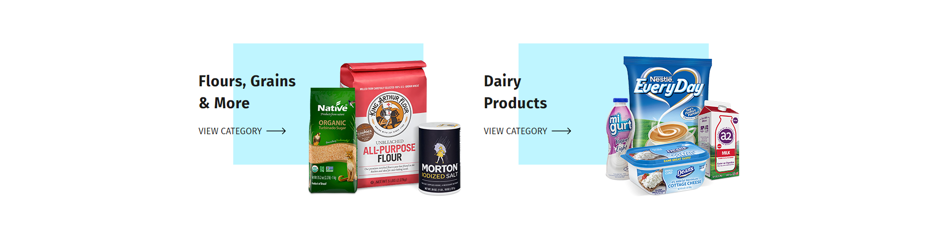
<!-- start Products Section -->
        <section class="groccery_view_category">
            <div class="container">
                <div class="row">
                    <div class="col-md-6">
                        <div class="category_content  d-inline-flex wow fadeInLeft">
                            <div class="category_details d-inline-block  wow fadeInUp " >
                                <h3 class="title_h3">Title</h3>
                                <a class="title_h5" href="product_list_with_filter.html">View Category</a>
                            </div>
                            <div class="category_img  d-inline-block wow  fadeInLeftBig">
                                <div class="images">
                                    <img src="yourimage.png" alt="" class="img-fluid"/>
                                </div>
                            </div>
                        </div>
                    </div>
                </div>
            </div>
        </section>
                                    <!-- end Products Section -->
Shop by Category
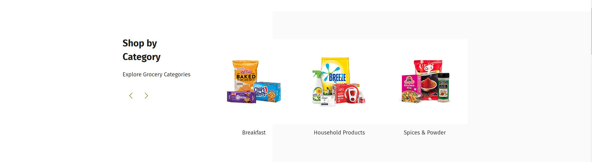
<!-- start Shop by category Section -->
                <section class="groccery_shop_category padding-bottom-60  wow fadeIn">
                    <div class="container">
                        <div class="row">
                            <div class="col-md-3">
                                <div class="groccery_shop_left_content">
                                    <h3 class="title_h3">Shop by Category</h3>
                                    <p >Explore Grocery Categories</p>
                                </div>
                            </div>
                            <div class="col-md-9">
                                <div id="groccery_shop_category_silder" class="owl-carousel">
                                    <div class="item">
                                        <div class="groccery_img">
                                            <img src="yourimage.jpg" class="img-fluid" alt="f_product"/>
                                            <div class="groccery_btn">
                                                <a href="cart.html" class="background-btn text-uppercase ">Shop This Category</a>
                                            </div>
                                        </div>
                                        <div class="groccery_detail">
                                            <a href="product_list_detail.html" class="text-capitalize  text-center">category title</a>
                                        </div>
                                    </div>
                                </div>
                            </div>
                        </div>
                    </div>
                </section>
                                            <!-- end Shop by category Section -->
Promotion
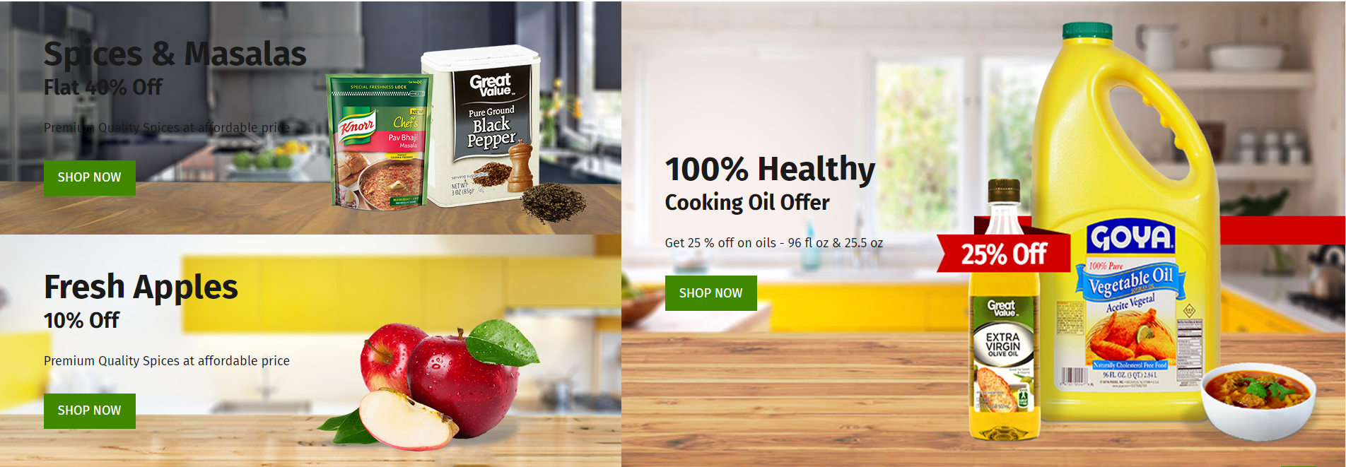
<!-- start Promotion Section -->
                <section class="groccery_offer wow fadeIn">
                    <div class="container-fluid p-0">
                        <div class="row-flex">
                            <div class="col-lg-6  p-0  box_1 wow fadeInLeft">
                                <div class="groccery_offer_left">
                                    <div class="offer_top row m-0">
                                        <div class=" col-sm-6 p-0 offer_left">
                                            <div class="offer">
                                                <h2 class="title2">Spices & Masalas</h2>
                                            </div>
                                            <div class="discount">
                                                <h3 class="title3">Flat 40% Off</h3>
                                            </div>
                                            <div class="details">
                                                <p>Premium Quality Spices at affordable price</p>
                                            </div>
                                            <div class="shop_btn">
                                                <a href="product_list_with_sidebar.html" class="text-uppercase background-btn text-center">Shop Now</a>
                                            </div>
                                        </div>
                                        <div class="col-sm-6 p-0 offer_right">
                                            <img src="yourimage.jpg" class="img-fluid" alt=""/>
                                        </div>
                                    </div>
                                    <div class="offer_bottom row m-0">
                                        <div class="col-sm-6 p-0 offer_left">
                                            <div class="offer">
                                                <h2 class="title2">Fresh Apples</h2>
                                            </div>
                                            <div class="discount">
                                                <h3 class="title3">10% Off</h3>
                                            </div>
                                            <div class="details">
                                                <p>Premium Quality Spices at affordable price</p>
                                            </div>
                                            <div class="shop_btn">
                                                <a href="product_list_with_sidebar.html" class="text-uppercase background-btn text-center">Shop Now</a>
                                            </div>
                                        </div>
                                        <div class="col-sm-6 p-0 offer_right">
                                            <img src="yourimage.jpg" class="img-fluid" alt=""/>
                                        </div>
                                    </div>
                                </div>
                            </div>
                            <div class="col-lg-6  p-0 box_2 wow fadeInRight">
                                <div class="groccery_offer_right">
                                    <div class="offer">
                                        <h2 class="title2">100% Healthy</h2>
                                    </div>
                                    <div class="discount">
                                        <h3 class="title3">Cooking Oil Offer</h3>
                                    </div>
                                    <div class="details">
                                        <p>Get 25 % off on oils - 96 fl oz & 25.5 oz</p>
                                    </div>
                                    <div class="shop_btn">
                                        <a href="product_list_with_sidebar.html" class="text-uppercase background-btn text-center">Shop Now</a>
                                    </div>
                                </div>
                            </div>
                        </div>
                    </div>
                </section>
                        <!-- end Promotion Section -->
Featured Items
<!-- start Featured Products Section -->
            <section class="padding-top-text-60 featured_section groccery_featured_section wow fadeIn">
                <div class="container p-0">
                    <h3 class="title_h3 text-capitalize home_title_h3 text-center">Featured Items</h3>
                    <div id="groccery_product_slider" class="owl-carousel">
                        <div class="item wow fadeInLeft animated" data-wow-duration="1300ms">
                            <div class="featured_content sale">
                                Description
                            </div>
                        </div>
                    </div>
                </div>
            </section>

                                            <!-- end Featured Products Section -->
Deals of the Week
<!-- start Deals of the Week Section -->
            <section class="groccery_deals wow fadeIn">
                <div class="container">
                    <h3 class="title_h3  home_title_h3 text-center wow fadeInUpBig">Deals of the Week</h3>
                    <div class="row">
                        <div class="col-lg-6 pr-0  wow fadeInDown" >
                            <div class="deal_products featured_content deal_products">
                                <div class="img_deals">
                                    <img src="yourimage.jpg" class="img-fluid" />
                                    <span class="sale_deal product-label  text-uppercase sale_label">sale</span>
                                    <ul class="featured_icon">
                                        <li><a href="wishlist.html"><svg></svg></a></li>
                                        <li><a href="javascript:void(0);" class="text-uppercase  popup_btn p-0 d-inline-block" data-modal="#modalone"><svg></svg></a></li>
                                    </ul>
                                    <div class="time_of_deals">
                                        <ul id="grocerry_deals_countdowntimer1" class="product-date style colorDefinition size_lg"></ul>
                                    </div>
                                </div>
                                <div class="featured_detail_content">
                                    <a href="product_list_detail.html"><p class="featured_title  text-capitalize  text-center">Karmiq California Almonds</p></a>
                                    <p class="featured_price  text-center"><span>$45.95</span><span>$75.95</span></p>
                                    <div class="featured_star text-center">
                                        <ul>
                                           <li><a href=""></a></li>
                                           <li><a href=""></a></li>
                                           <li><a href=""></a></li>
                                           <li><a href=""></a></li>
                                           <li><a href=""></a></li>
                                        </ul>
                                    </div>
                                    <ul class="featured_icon">
                                        <li><a href="wishlist.html"><svg></svg></a></li>
                                        <li><a href="javascript:void(0);" class="text-uppercase  popup_btn p-0 d-inline-block" data-modal="#modalone"><svg></svg></a></li>
                                    </ul>
                                    <div class="progress">
                                        <div class="progress-bar" role="progressbar" style="width: 65%;" aria-valuenow="25" aria-valuemin="0" aria-valuemax="100">
                                        </div>
                                    </div>
                                    <p class="featured_sold   text-capitalize text-center">65 % Sold</p>
                                    <div class="featured_btn" data-wow-duration="1300ms">
                                        <a href="cart.html" class="text-uppercase background-btn text-center add_to_bag_btn"><svg></svg>Add To cart</a>
                                    </div>
                                </div>
                            </div>
                        </div>
                    </div>
                </div>
            </section>
                                        <!-- end Deals of the Week Section -->
Services

<!-- start Services Section -->
                    <section class="groccery_delivery wow fadeIn">
                        <div class="container">
                            <div class="row">
                                <div class="col-md-6 wow fadeInUp">
                                    <div class="delivery_info">
                                        <div class="delivery_img">
                                            <img src="yourimage.jpg" class="img-fluid" />
                                        </div>
                                        <div class="delivery_details">
                                            <h3 class="title_h3  home_title_h3  wow fadeInUpBig" style="visibility: visible;">Fresh Vegetables</h3>
                                            <p>Organic Vegetables with Freshness Guaranteed</p>
                                        </div>
                                    </div>
                                </div>
                                <div class="col-md-6 wow fadeInUp">
                                    <div class="delivery_info">
                                        <div class="delivery_img">
                                            <img src="yourimage.jpg" class="img-fluid" />
                                        </div>
                                        <div class="delivery_details">
                                            <h3 class="title_h3  home_title_h3  wow fadeInUpBig" style="visibility: visible;">Delivery in 3 Hours</h3>
                                            <p>Min 3 Hours delivery near 120 km area</p>
                                        </div>
                                    </div>
                                </div>
                            </div>
                        </div>
                    </section>
                                        <!-- end Services Section -->
Blog
<!-- start Blog Section -->
                    <section class="groccery_blog wow fadeIn">
                        <div class="container-fluid">
                            <div class="row">
                                <div class="col-lg-6 p-0 wow fadeInUp">
                                    <div class="blog_content">
                                        <div class="read_more">
                                            <div class="blog_date">
                                                <p class="text-uppercase">sep 17, 2018</p>
                                            </div>
                                            <div class="blog_details">
                                                <h6 class="title_h5">Lorem Ipsum is simply dummy text of the printing and typesetting</h6>
                                                <p>There are many variations of passages of Lorem Ipsum available, but the majority have suffered alteration in some form, by injected humour.</p>
                                                <a class="title_h5 text-uppercase " href="grid_blog_list_with_sidebar.html">read more</a>
                                            </div>
                                        </div>
                                    </div>
                                </div>
                            </div>
                        </div>
                    </section>
                                        <!-- end Blog Section -->
Testimonial
<!-- start Testimonial Section -->
                    <section class="groccery_blog wow fadeIn">
                        <div class="container-fluid">
                            <div class="row">
                                <div class="col-lg-6 p-0 wow fadeInUp groccery_slider_slick">
                                    <div class="testimonials">
                                        <div class="groccery_testimonial_slider">
                                            <div class="item">
                                                <div class="silder_testimoials">
                                                    <div class="silder_img">
                                                        <div class="img">
                                                            <img src="yourimage.jpg" class="img-fluid" alt=""/>
                                                        </div>
                                                        <h5 class="text-capitalize title_h5">Title</h5>
                                                        <p class="text-uppercase">Title</p>
                                                    </div>
                                                    <div class="silder_content">
                                                        <img src="yourimage.jpg" class="img-fluid" alt=""/>
                                                        <div class="details">
                                                            <p>description</p>
                                                        </div>
                                                    </div>
                                                </div>
                                            </div>
                                        </div>
                                        <div class="groccery_slider_nav_thumbnails">
                                            <div class="item silder_img">
                                                <div class="img">
                                                    <img src="yourimage.jpg" class="img-fluid" alt=""/>
                                                </div>
                                            </div>
                                        </div>
                                    </div>
                                </div>
                            </div>
                        </div>
                    </section>
                                        <!-- end Testimonial Section -->
Page Titles
It includes page title with aligned left and breadcrumb. See below image and code for more information.
<!-- start page title and breadcrumb section -->

<section class="breadcrumb_section">
	<<iv class="container">
		<nav aria-label="breadcrumb">
			<ol class="breadcrumb">
				<li class="breadcrumb-item text-capitalize">
					<a href="index.html">Home</a>
					<i class="flaticon-arrows-4"></i>
				</li>
				<li class="breadcrumb-item active text-capitalize">Look Book</li>
			</ol>
		</nav>
		<!-- start page title -->
		<h1 class="title_h1 font-weight-normal text-capitalize">Page Title</h1>
		<!-- end page title -->
	</div>
</section>

<!-- end page title and breadcrumb section -->
Page Layout
You can choose between 3 Types of page layout while creating your page. The list of page layout options & its descriptions are provided below for your reference:
Full Width
<!-- start navigation -->
<!-- START Full screen section -->
<section class="padding-top-60 padding-bottom-60 we_are_earthyellow_section wow fadeIn">
	<!-- Start >content area -->
	<div class="welcome_earthyellow1">
		<div class="container">
			...
		 </div>
	 </div>
	 <!-- END content area -->
</section>
<!-- END Full screen Section -->
Left Sidebar
<!-- START Container Section   -->
<section class="padding-top-text-60 padding-bottom-60 page_section shipping_section">
	<div class="container">
		<div class="row">
			<div class="col-md-3">
				<!-- START Page Sidebar -->
				<div class="page_sidebar">
					...
				</div>
				<!-- End Page Sidebar -->
			</div>
			<div class="col-md-9">
				<!-- START Page Content -->
				<div class="page_content">
					...
				</div>
				<!-- End Page Content -->
			</div>
		</div>
	</div>
</section>
<!-- END Container Section  -->
Right Sidebar
<!-- START Container Section -->
<section class="blog_section blog_detail_section padding-top-60 padding-bottom-60">
	<div class="blog_list2_section blog_list_section wow fadeIn">
		<div class="container">
			<div class="row">
				<!-- START Content Section -->
				<div class="col-md-8 col-xl-9 wow fadeInLeft" data-wow-duration="1300ms">
					...
				</div>
				<!-- END Content Section -->
				<!-- START Right Sidebar Section -->
				<div class="col-xl-3 col-md-4 wow fadeInRight" data-wow-duration="1300ms">

				</div>
				<!-- END Right Sidebar Section -->
			</div>
		</div>
	</div>
</section>
<!-- END Container Section -->
Slider
Earthyellow includes Revolution Slider :
Revolution Slider
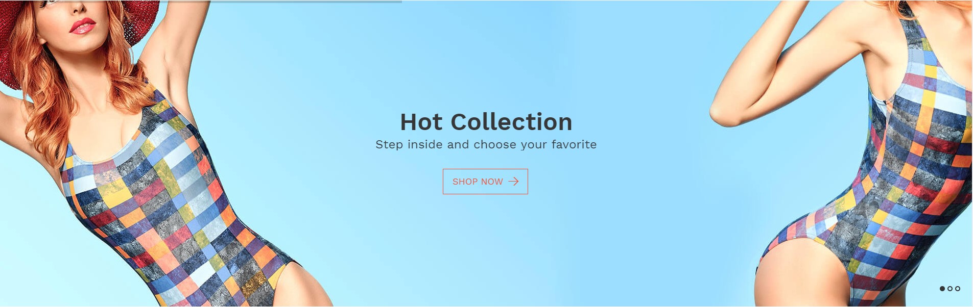
<!-- START slider Section -->
<section class="banner_slider_section">
	<div class="rev_slider_wrapper fullwidthbanner-container">
		<!-- the ID here will be used in the JavaScript below to initialize the slider -->
		<div id="rev_slider_1" class="rev_slider fullwidthabanner" data-version="5.4.5" style="display:none;">
			<!-- BEGIN MAIN SLIDE LIST -->
			<ul>
				<!-- MINIMUM SLIDE STRUCTURE -->
				<li data-transition="fade">
					<!-- SLIDE'S MAIN BACKGROUND IMAGE -->
					<img src="src/images/banner_img.jpg" alt="Sky" class="rev-slidebg">
					<!-- LAYER NR. 1 -->
					<div class="tp-caption Restaurant-Display   tp-resizeme"
						id="slide-3010-layer-1"
						data-x="['center','center','center','center']" data-hoffset="['0','0','0','0']"
						data-y="['middle','middle','middle','middle']" data-voffset="['-62','0','0','0']"
						data-type="text"
						data-responsive_offset="on"
						data-frames='[{"from":"y:[100%];z:0;rX:0deg;rY:0;rZ:0;sX:1;sY:1;skX:0;skY:0;","mask":"x:0px;y:0px;s:inherit;e:inherit;","speed":1500,"to":"o:1;","delay":500,"ease":"Power3.easeInOut"},{"delay":"wait","speed":1000,"to":"opacity:0;","ease":"nothing"}]'
						data-textAlign="['left','left','left','left']"
						data-paddingtop="[0,0,0,0]"
						data-paddingright="[0,0,0,0]"
						data-paddingbottom="[0,0,0,0]"
						data-paddingleft="[0,0,0,0]"
					style="z-index: 5;font-size:48px;line-height: 48px;color:#333;text-transform: capitalize;font-weight: 600;font-family: 'Work Sans';"> Hot Collection </div>
					<!-- LAYER NR. 2 -->
					<div class="tp-caption Restaurant-Cursive   tp-resizeme"
						id="slide-3010-layer-2"
						data-x="['center','center','center','center']" data-hoffset="['0','0','0','0']"
						data-y="['middle','middle','middle','middle']" data-voffset="['-18','0','0','0']"
						data-type="text"
						data-responsive_offset="on"
						data-frames='[{"from":"y:[-100%];z:0;rX:0deg;rY:0;rZ:0;sX:1;sY:1;skX:0;skY:0;","mask":"x:0px;y:0px;s:inherit;e:inherit;","speed":1500,"to":"o:1;","delay":700,"ease":"Power3.easeInOut"},{"delay":"wait","speed":1000,"to":"opacity:0;","ease":"nothing"}]'
						data-textAlign="['left','left','left','left']"
						data-paddingtop="[0,0,0,0]"
						data-paddingright="[0,0,0,0]"
						data-paddingbottom="[0,0,0,0]"
						data-paddingleft="[0,0,0,0]"
					style="z-index: 6;font-size:24px;line-height: 24px;color:#333;letter-spacing: 0;font-weight: normal;font-family: 'Work Sans';">Step inside and choose your favorite </div>
					<!-- LAYER NR. 3 -->
					<div class="tp-caption  "
						id="slide-3010-layer-5"
						data-x="['center','center','center','center']" data-hoffset="['0','0','0','0']"
						data-y="['middle','middle','middle','middle']" data-voffset="['55','0','0','0']"
						data-type="button"
						data-basealign="slide"
						data-responsive_offset="off"
						data-responsive="on"
						data-frames='[{"from":"y:50px;opacity:0;","speed":1500,"to":"o:1;","delay":1500,"ease":"Power3.easeInOut"},{"delay":"wait","speed":1000,"to":"y:50px;opacity:0;","ease":"nothing"}]'
						data-textAlign="['left','left','left','left']"
						data-paddingtop="[0,0,0,0]"
						data-paddingright="[0,0,0,0]"
						data-paddingbottom="[0,0,0,0]"
						data-paddingleft="[0,0,0,0]"
						style="z-index: 7; font-size: 18px;line-height: 18px;">
						<a href="product_list_with_sidebar.html" class="border-btn text-uppercase">shop now <i class="flaticon-arrows vertical_middle"></i>  </a>
					</div>
				</li>

			</ul>
			<!-- END MAIN SLIDE LIST -->
		</div>
	</div>
</section>
<!-- END slider Section -->
Note You can find revolution slider - code in index.html page and above is the code for your reference.
Read Revolution Slider Document
Accordions
Extend the default collapse behavior to create an accordion with the panel component. See below image and code for more information.
<!-- start accordion -->
<div id="accordion">
	<!-- start accordion item -->
	<div class="card">
		<div class="card-header" id="headingOne">
			<h5 class="mb-0">
			<button class="btn btn-link title_h5" data-toggle="collapse" data-target="#collapseOne" aria-expanded="true" aria-controls="collapseOne">
			Title
			</button>
			</h5>
		</div>
		<div id="collapseOne" class="collapse show" aria-labelledby="headingOne" data-parent="#accordion">
			<div class="card-body">
				Description..
			</div>
		</div>
	</div>
	<!-- end accordion item -->
	<!-- start accordion item -->
	<div class="card">
		<div class="card-header" id="headingTwo">
			<h5 class="mb-0">
			<button class="btn btn-link collapsed title_h5" data-toggle="collapse" data-target="#collapseTwo" aria-expanded="false" aria-controls="collapseTwo">
			Title
			</button>
			</h5>
		</div>
		<div id="collapseTwo" class="collapse" aria-labelledby="headingTwo" data-parent="#accordion">
			<div class="card-body">
				Description..
			</div>
		</div>
	</div>
	<!-- end accordion item -->
	<!-- start accordion item -->
	<div class="card">
		<div class="card-header" id="headingThree">
			<h5 class="mb-0">
			<button class="btn btn-link collapsed title_h5" data-toggle="collapse" data-target="#collapseThree" aria-expanded="false" aria-controls="collapseThree">
			Title
			</button>
			</h5>
		</div>
		<div id="collapseThree" class="collapse" aria-labelledby="headingThree" data-parent="#accordion">
			<div class="card-body">
				Description..
			<div>
		</div>
	</div>
	<!-- end accordion item -->
</div>
<!-- end accordion -->
NoteWe have many examples and shown in faq.html page.
Animation
Scroll to reveal animations are latest in the trends. You can do them too with Earthyellow. You can use animations on any element you want. Here is the Sample Code:
<div class="wow bounceInUp">
  Content to Reveal Here
</div>
You can also use delays, duration and offset for your animations:
<section class="wow slideInLeft" data-wow-duration="1200ms" data-wow-delay="500ms">
    ...
</section>
NoteDelay duration is in milliseconds.
Here is the list of the Animation Types you can use:
bounceflashpulserubberBandshakeswingtadawobblebounceInbounceInDownbounceInLeftbounceInRightbounceInUpbounceOutbounceOutDownbounceOutLeftbounceOutRightbounceOutUpfadeInfadeInDownfadeInDownBigfadeInLeftfadeInLeftBigfadeInRightfadeInRightBigfadeInUpfadeInUpBigfadeOutfadeOutDownfadeOutDownBigfadeOutLeftfadeOutLeftBigfadeOutRightfadeOutRightBigfadeOutUpfadeOutUpBigflipflipInXflipInYflipOutXflipOutYlightSpeedInlightSpeedOutrotateInrotateInDownLeftrotateInDownRightrotateInUpLeftrotateInUpRightrotateOutrotateOutDownLeftrotateOutDownRightrotateOutUpLeftrotateOutUpRighthingerollInrollOutzoomInzoomInDownzoomInLeftzoomInRightzoomInUpzoomOutzoomOutDownzoomOutLeftzoomOutRightzoomOutUp
Blog Post
Beautiful bog post layouts to display your content with attractive look. See below image and code for more information.
<!-- START Home Bolg Section -->
<section class="blog_section padding-top-text-60 wow fadeIn">
	<div class="container">
		<h3 class="title_h3  text-capitalize home_title_h3 text-center">Title of section</h3>
		<div class="row">
			<div class="col-md-6 wow fadeInLeft" data-wow-duration="1300ms">
				<div class="blog_content">
					<a href="blog_list_detail.html">
						<img src="your-image.jpg" alt="blog" class="img-fluid">
					</a>
					<span class="article__date">
						March 21, 2018 | Posted By Admin
						<span class="diamond_shape"></span>
					</span>
					<a href="blog_list_detail.html">
						<h5 class="article__title title_h5">
							Blog Title
						</h5>
					</a>
					<p>
						Short description of blog...
					</p>
				</div>
			</div>
			<div class="col-md-6 wow fadeInRight" data-wow-duration="1300ms" >
				<div class="blog_content">
					<a href="blog_list_detail.html">
						<img src="your-image.jpg" alt="blog" class="img-fluid">
					</a>
					<span class="article__date">
						March 21, 2018 | Posted By Admin
						<span class="diamond_shape"></span>
					</span>
					<a href="blog_list_detail.html">
						<h5 class="article__title title_h5">
							Blog post title
						</h5>
					</a>
					<p>
						Short Description of Blog post
					</p>
				</div>
			</div>
		</div>
	</div>
</section>
<!-- END Home Bolg Section -->
NoteFor demo, You can please check this in index.html page.
Contact Form
Contact form for contact pages or you can use it for any inquries. See below image and code for more information.
<!-- start form -->
<!-- START Contact From    -->
<div class="login_form">
	<form>
		<div class="row">
			<div class="col-sm-6">
				<div class="form-group">
					<label for="fname" class="title_h5">First Name*</label>
					<input type="text" class="form-control" id="fname" name="Firstname" required="">
				</div>
			</div>
			<div class="col-sm-6">
				<div class="form-group">
					<label class="title_h5" for="lname">Last Name*</label>
					<input type="text" class="form-control" "lname"="" name="Lastname" required="">
				</div>
			</div>
			<div class="col-sm-6">
				<div class="form-group">
					<label for="email" class="title_h5">Email*</label>
					<input type="email" class="form-control" id="email" name="Email" required="">
				</div>
			</div>
			<div class="col-sm-6">
				<div class="form-group">
					<label for="phone" class="title_h5">Phone*</label>
					<input type="text" class="form-control" id="phone" name="Phone" required="" >
				</div>
			</div>
			<div class="col-sm-6">
				<div class="form-group">
					<label for="onumber" class="title_h5">Order Number</label>
					<input type="text" class="form-control" id="onumber" name="onumber">
				</div>
			</div>
			<div class="col-sm-6">
				<div class="form-group">
					<label class="title_h5" for="myquestion">My Question</label>
					<select class="form-control" id="myquestion" name="myquestion" >
						<option>- Select -</option>
					</select>
				</div>
			</div>
			<div class="col-sm-12">
				<div class="form-group">
					<label class="title_h5" for="message">Message*</label>
					<textarea  class="form-control" id="message" name="message" required=""></textarea>
				</div>
				<div class="login_links ">
					<button type="submit" class="btn background-btn text-uppercase">submit</button>
				</div>
			</div>
		</div>
	</form>
</div>
<!-- END Contact From    -->
<!-- end form -->
NoteFor demo, You can please check this in contactus.html page.
heading
Different heading styles and font sizes. See below code for more information.
<h1 class="title_h1">Heading text</h1>
<h2  class="title_h2">Heading text</h2>
<h3  class="title_h3">Heading text</h3>
<h4  class="title_h4">Heading text</h4>
<h5  class="title_h5">Heading text</h5>
Functionality to get your instagram posts and display it on your website. See below image and code for more information.
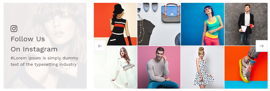
<!-- start instagram images -->
<section class="padding-top-60 instagram_section  wow animated">
	<div class="container">
		<div class="row">
			<div class="col-md-4 wow fadeInLeft" data-wow-duration="1300ms">
				<div class="instagram_title">
					<i class="flaticon-instagram-logo"></i>
					<h3 class="title_h3  text-capitalize">Follow Us <br>On Instagram </h3>
					<p>#Lorem Ipsum is simply dummy text of the typesetting industry</p>
				</div>
			</div>
			<div class="col-md-8 wow fadeInRight" data-wow-duration="1300ms" data-wow-delay="0.2s">
				<div class="owl-carousel owl-theme instagram_slider" id="instafeed"></div>
			</div>
		</div>
	</div>
</section>
<!-- end instagram images -->
Javascript (file path - /src/js/custom.js)
Earthuellow Landing Page Javascript
START Instagram slider
if (jQuery('#instafeed').length > 0) {
	var userFeed = new Instafeed({
		target: 'instafeed',
		get: 'user',
		userId: 'Add user id',
		accessToken: 'Add token id',
		resolution: 'thumbnail',
		template: '<a href="{{link}}" target="_blank"><img src="{{image}}"/></a>',
		after: function () {
                var x = $('.instagram_slider').children();
                var i = 0;
                for (i = 0; i < x.length; i += 2) {
                    $('.owl-item:empty').remove();
                    x.slice(i, i + 2).wrapAll('<div></div>');
                    instaslider('#instafeed');
                    $('.owl-next').on("click", function () {
                        $('.instagram_slider .owl-prev').show();
                        var active = $('.instagram_slider .active').length;
                        if (active > 1) {
                            $('.instagram_slider .owl-next').hide();
                        }
                    });
                    $('.owl-prev').on("click", function () {
                        $('.instagram_slider .owl-next').show();
                        if ($(this).hasClass('disabled') === 1) {
                            $('.instagram_slider .owl-prev').hide();
                        }
                    });

                }
            }
	});
	userFeed.run();
}
function instaslider(c) {
	jQuery(c).owlCarousel({
		margin: 2,
		items: 4,
		nav: true,
		dots: false
	});
}
End Instagram slider
Bag , Watch and Shoes Landing Page Javascript
START Instagram slider
if ($('#instafeed').length > 0) {
        var userFeed = new Instafeed({
            target: 'instafeed',
            get: 'user',
            tagName: 'shoes',
            userId: '6666610766',
            accessToken: '6666610766.2a7d13b.60b18490cde1420db117dce0dfe65513',
            resolution: 'standard_resolution',
            template: '<a href="{{link}}" target="_blank"><img src="{{image}}"/></a>',
            after: function () {
                 $('#instafeed').owlCarousel({
                    margin: 30,
                    items: 4,
                    nav: true,
                    dots: false,
                    responsiveClass:true,
                    responsive:{
                        0:{
                            items:2,
                            margin: 20
                        },
                        767:{
                            items:2,
                            margin: 20 ,
                            loop:false
                        },
                        768:{
                            items:3,
                            loop:false ,
                            margin: 20
                        },
                        992:{
                            items:4,
                            loop:false
                        }
                    }
                });
           }
        });
        userFeed.run();
    }
End Instagram slider
You have to add "user id" and "token" on custom.js. Reference how to get instagram token from here : https://jelled.com/instagram/access-token and paste in javascript code
NoteFor demo, You can please check this in index.html page.
Subscribe
See below image and code for more information.

<!-- START Newsletter Section -->
<section class="newsletter padding-top-text-60 padding-bottom-60 wow fadeIn">
	<div class="container">
		<h3 class="title_h3  text-capitalize home_title_h3 text-center wow fadeInUp">Sign Up Our Newsletter</h3>
		<form class="form-inline justify-content-center">
			<input type="email" class="form-control wow fadeInLeft"  placeholder="Enter your email" name="email">
			<button type="submit" class="btn border-btn text-uppercase wow fadeInRight">SIGN UP <i class="flaticon-arrows"></i></button>
		</form>
	</div>
</section>
<!-- END Newsletter Section -->
NoteFor demo, You can please check this in index.html page.
Products Layout
Earthyellow includes different types of product listing layout as mentioned below to setup your own product listing page as per your requirement:
Product list with filter popup
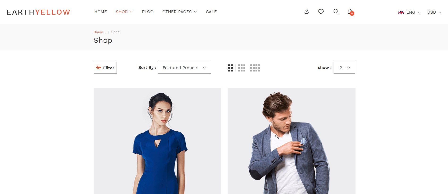
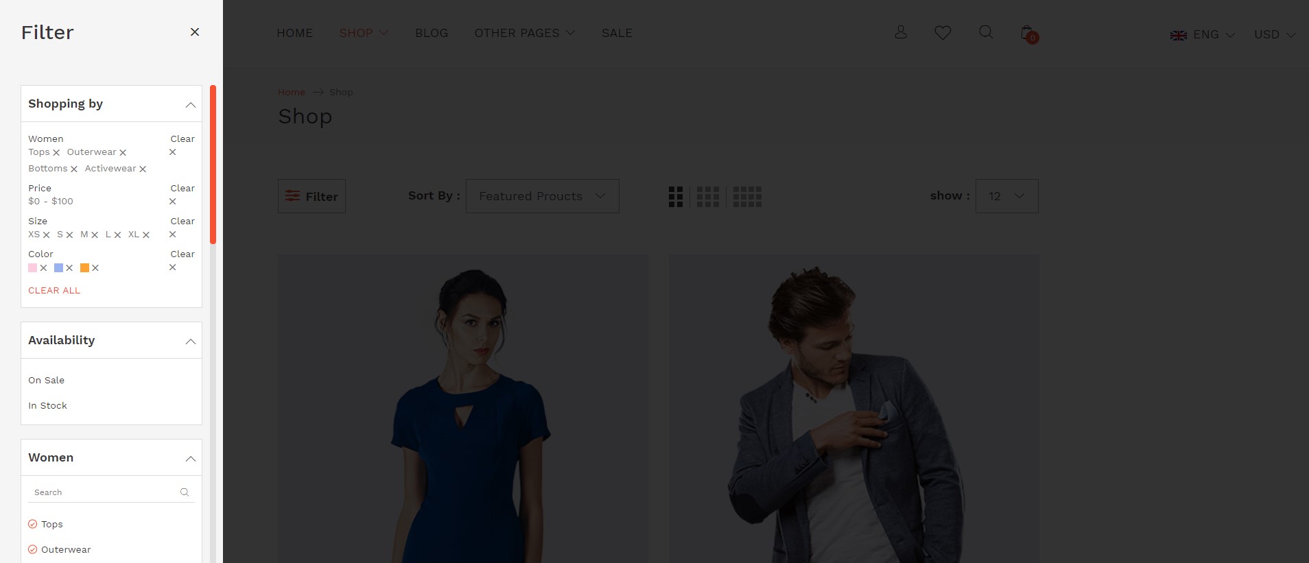
										<!-- START Products List Section -->
<section class="padding-top-text-60 padding-bottom-60 featured_section product_list_section product_list_filter_menu_section">
	<div class="container">
		<div class="row">
			<div class="col-lg-3">
				<!-- START Collection Sidebar-->
				<div class="collection_sidebar">
					<div class="sidebar_title padding-bottom-60 ">
						<h3 class="title_h3">Filter</h3>
						<a class="filter_colse" href="javascript:void(0);"><i class="flaticon-close"></i></a>
					</div>
					<div class="filter_content mCustomScrollbar">
						Filter options...
					</div>
				</div>
			</div>
			<!-- START Collection Sidebar-->
			<div class="col-sm-12">
				<!-- START Collection Sorting-->
				<div class="collection-sorting-row">
					Top Row
				</div>
				<!-- START Collection Sorting-->
				<!-- START Products -->
				<ul class=" category-products wow fadeIn">
					<div class="row">
						<li class="col-lg-3 col-md-4 col-6 column2 product wow fadeInLeft animated" data-wow-duration="1300ms">
							Product Grid
						</li>
						<li class="col-lg-3 col-md-4 col-6 column2 product wow fadeInLeft animated" data-wow-duration="1300ms" data-wow-delay="0.2s">
							Product Grid
						</li>
						<li class="col-lg-3 col-md-4 col-6 column2 product wow fadeInRight animated" data-wow-duration="1300ms" >
							Product Grid
						</li>
						<li class="col-lg-3 col-md-4 col-6 column2 product wow fadeInRight animated" data-wow-duration="1300ms" data-wow-delay="0.2s">
							Product Grid
						</li>
						<li class="col-lg-3 col-md-4 col-6 column2 product wow fadeInLeft animated" data-wow-duration="1300ms" >
						   Product Grid
						</li>
						<li class="col-lg-3 col-md-4 col-6 column2 product wow fadeInLeft animated" data-wow-duration="1300ms" data-wow-delay="0.2s">
							Product Grid
						</li>
						<li class="col-lg-3 col-md-4 col-6 column2 product wow fadeInRight animated" data-wow-duration="1300ms">
							Product Grid
						</li>

					</div>
				</ul>
				<!-- END Products -->
				<!-- START Products Pagination -->
				<div class="align-self-center">
					<ul class="pagination text-center justify-content-center">

					</ul>
				</div>
				<!-- END Products Pagination -->
			</div>
		</div>
	</div>
</section>
<!-- END Products List Section -->
NoteFor demo, You can please check this in product_list_with_filter.html page.
Product list with sidebar
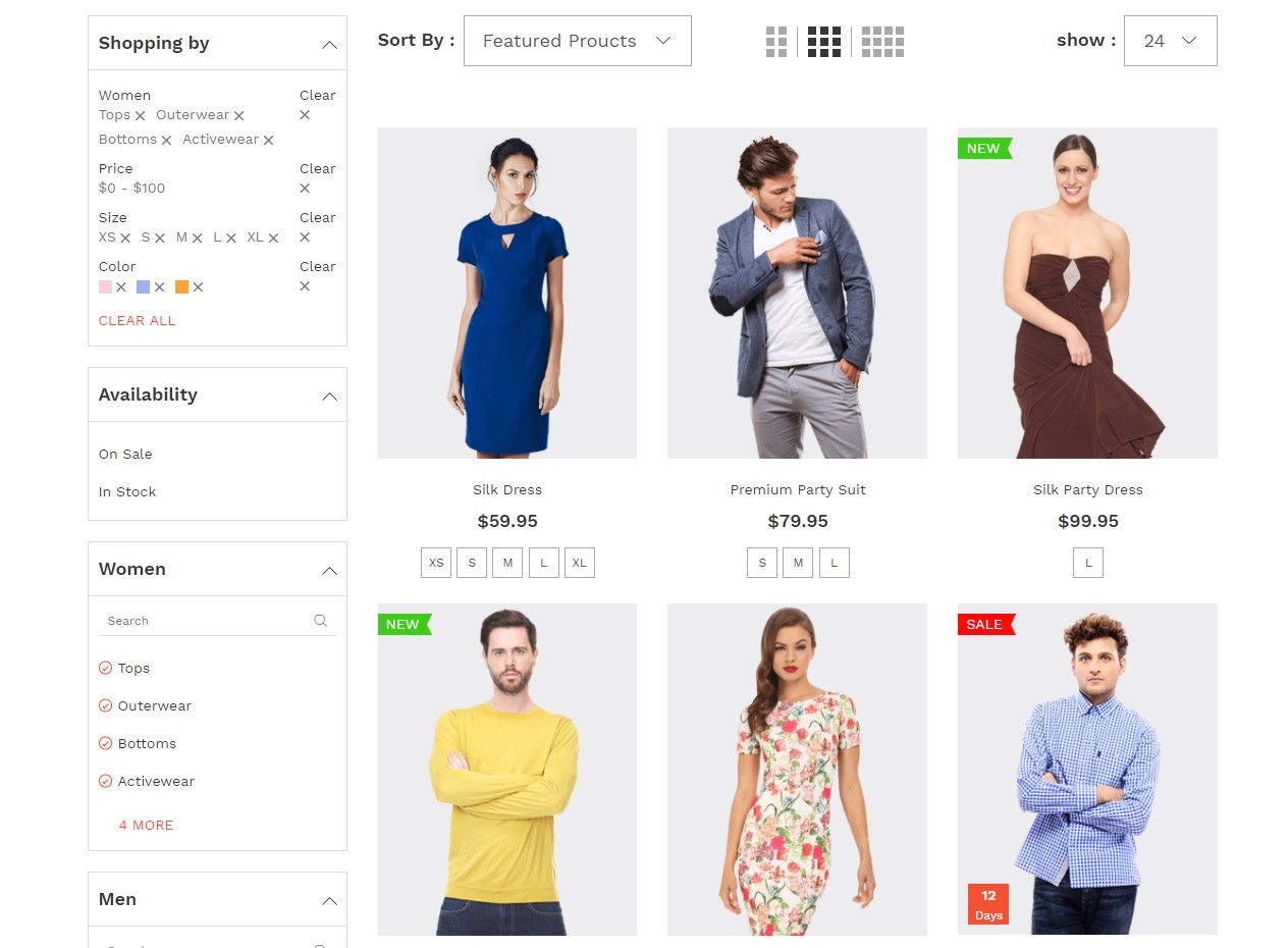
<!-- START Products List Section -->
<section class="padding-top-text-60 padding-bottom-60 featured_section product_list_section product_list_filter_section ">
	<div class="container">
		<div class="row">
			<div class="col-lg-3">
				<!-- START Collection Sidebar-->
				<div class="collection_sidebar">
					<div class="sidebar_title padding-bottom-60 hidden-lg">
						<h3 class="title_h3">Filter</h3>
						<a class="filter_colse" href="javascript:void(0);"><i class="flaticon-close"></i></a>
					</div>
					<div class="filter_content mCustomScrollbar">
						Add filter option here...
					</div>
				</div>
				<!-- START Collection Sidebar-->
			</div>
			<div class="col-lg-9">
				<!-- START Collection Sorting-->
				<div class="collection-sorting-row">
				   Sorting bar....
				</div>
				<!-- START Collection Sorting-->
				<!-- START Products -->
				<ul class=" category-products  wow fadeIn">
					<div class="row">
						<li class="col-lg-3 col-md-4 col-6 column3 product  wow fadeInLeft animated" data-wow-duration="1300ms" >
							Add Product Grid here
						</li>
						<li class="col-lg-3 col-md-4 col-6 column3 product  wow fadeInLeft animated" data-wow-duration="1300ms" data-wow-delay="0.2s">
							Add Product Grid here
						</li>
						<li class="col-lg-3 col-md-4 col-6 column3 product  wow fadeInLeft animated" data-wow-duration="1300ms" data-wow-delay="0.4s">
							Add Product Grid here
						</li>
						<li class="col-lg-3 col-md-4 col-6 column3 product  wow fadeInRight animated" data-wow-duration="1300ms">
							Add Product Grid here
						</li>
						<li class="col-lg-3 col-md-4 col-6 column3 product  wow fadeInRight animated" data-wow-duration="1300ms" data-wow-delay="0.2s">
							Add Product Grid here
						</li>
						<li class="col-lg-3 col-md-4 col-6 column3 product  wow fadeInRight animated" data-wow-duration="1300ms" data-wow-delay="0.4s">
							Add Product Grid here
						</li>
						<li class="col-lg-3 col-md-4 col-6 column3 product  wow fadeInLeft animated" data-wow-duration="1300ms">
							Add Product Grid here
						</li>
						<li class="col-lg-3 col-md-4 col-6 column3 product  wow fadeInLeft animated" data-wow-duration="1300ms" data-wow-delay="0.2s">
							Add Product Grid here
						</li>
						<li class="col-lg-3 col-md-4 col-6 column3 product  wow fadeInLeft animated" data-wow-duration="1300ms" data-wow-delay="0.4s">
							Add Product Grid here
						</li>
						...
					</div>
				</ul>
				<!-- END Products -->
				<!-- START Products Pagination -->
				<div class="align-self-center">
					Add Pagination here...
				</div>
				<!-- END Products Pagination -->
			</div>
		</div>
	</div>
</section>
<!-- END Products List Section -->
NoteFor demo, You can please check this in product_list_with_sidebar.html page.
Product Details Page
Earthyellow provides excellent layout of product detail page as mentioned below:
Blog
Blog Layout
Earthyellow includes different types of blog layout as mentioned below to setup your own blog listing as per your requirement:
Blog List with sidebar
										<!-- START Blog Section --">
<section class="blog_section  padding-top-60 padding-bottom-60"">
	<div class="blog_list2_section blog_list_section wow fadeIn"">
		<div class="container"">
			<div class="row"">
				<div class="col-md-8 col-xl-9 wow fadeInLeft" data-wow-duration="1300ms"">
					<div class="blog_content"">

					</div">
					<div class="blog_content"">

					</div">
					<div class="blog_content"">

					</div">
					<div class="blog_content"">

					</div">
					<div class="blog_content"">

					</div">
					<div class="blog_content"">

					</div">
				</div">
				<div class="col-xl-3 col-md-4 wow fadeInRight" data-wow-duration="1300ms"">
					<!-- Blog Post Navigation  --">
					<div class="featured_posts"">

						</div">
						<!--  Post Instagram  --">
						<div class="blog_instagram"">

						</div">
					</div">
				</div">
				<!-- Blog pagination  --">
				<div class="col-md-8 col-xl-9 align-self-center"">

				</div">
			</div">
		</div">
	</div">
</section">
<!-- END Blog Section --">
NoteFor demo, You can please check this in grid_blog_list_with_sidebar.html page.
Blog Grid
										<!-- START Blog Section --">
<section class="blog_section  padding-top-60 padding-bottom-60"">
	<div class="blog_list_section wow fadeIn"">
		<div class="container"">
			<div class="row"">
				<div class="col-md-6 wow fadeInLeft animated" data-wow-duration="1300ms"">

				</div">
				<div class="col-md-6 wow fadeInRight animated" data-wow-duration="1300ms"">

				</div">
				<div class="col-md-6 wow fadeInLeft animated" data-wow-duration="1300ms"">

				</div">
				<div class="col-md-6 wow fadeInRight animated" data-wow-duration="1300ms"">

				</div">
				<div class="col-md-6 wow fadeInLeft animated" data-wow-duration="1300ms"">

				</div">
				<div class="col-md-6 wow fadeInRight animated" data-wow-duration="1300ms"">

				</div">
				<div class="col-md-6 wow fadeInLeft animated" data-wow-duration="1300ms"">

				</div">
				<div class="col-md-6 wow fadeInRight animated" data-wow-duration="1300ms"">

				</div">
				<div class="col-md-6 wow fadeInLeft animated" data-wow-duration="1300ms"">

				</div">
				<div class="col-md-6 wow fadeInRight animated" data-wow-duration="1300ms"">

				</div">
				<div class="col-md-6 wow fadeInLeft animated" data-wow-duration="1300ms"">

				</div">
				<div class="col-md-6 wow fadeInRight animated" data-wow-duration="1300ms"">

				</div">
				<!-- Blog Pagination  --">
				<div class="col-md-12 align-self-center"">

				</div">
			</div">
		</div">
	</div">
</section">
<!-- END Blog Section --">
NoteFor demo, You can please check this in grids_blog_list.html page.
Blog Details
Earthyellow includes beautiful blog post page style as mentioned below.
Header Type 1

<!-- start Header -->
<header class="header_type1 d-block p-0 main_header">
            <div class="header_top container-fluid">
                <div class="row align-items-center">
                    <!-- Start Header Currency--> ;
                    <div class="col-lg-3">

                    </div>
                    <!-- End Header Currency--> ;
                    <!-- Start Header Promo--> ;
                    <div class="col-lg-6">

                    </div>
                    <!-- End Header Promo--> ;
                    <!-- Start Header Social Menu --> ;
                    <div class="col-md-3 text-right d-none d-lg-inline-block">

                    </div>
                    <!-- End Header Social Menu --> ;
                </div>
            </div>
            <div class="header_bottom container-fluid">
                <div class="row align-items-center">
                    <!-- Start Header Logo--> ;
                    <div class="col-2 d-lg-none">
                        Menu Button
                    </div>
                    <div class="col-lg-3 col-8">
                        logo
                    </div>
                    <!-- End Header Logo--> ;
                    <!-- Start Header Navigation--> ;
                    <div class="col-md-6 text-center position-static d-lg-block d-none">
                        <nav class="navbar-dark navbar-expand-lg navbar">
                            <!-- Navigation menu container --> ;
                            <div class="navbar-collapse collapse justify-content-center" id="collapseNavbar">
                                <!-- Navigation links --> ;
                                <ul class="navbar-nav">
                                    <li class="nav-item active">
                                        <a class="nav-link text-uppercase" href="earthyellow.html">menu item </a>
                                    </li>
                                </ul>
                            </div>
                        </nav>
                    </div>
                    <!-- End Header Navigation--> ;
                    <!-- Start Header Social Menu --> ;
                    <div class="col-lg-3 col-2 text-right">

                    </div>
                    <!-- End Header Social Menu --> ;
                </div>
            </div>
            <div class="header_mobile hidden-lg d-block">
                <nav class="navbar-dark navbar-expand-lg navbar">
                    <!-- Navigation menu container --> ;
                    <div class="navbar-collapse collapse ">
                        <!-- Navigation links --> ;
                        <div class="close_icon"><a class="menu_colse" href="javascript:void(0);"><i class="flaticon-close"></i></a></div>
                        <div class="social_icons">
                            <div class="search_form d-block position-relative">
                                <form>
                                    <input type="text"  placeholder="search" class="text-capitalize" />
                                    <button type="submit" class="vertical_middle"><i class="flaticon-magnifying-glass"></i></button>
                                </form>
                            </div>
                        </div>
                        <ul class="navbar-nav">
                            <li class="nav-item">
                                <a class="nav-link text-uppercase" href="earthyellow.html">Menu item </a>
                            </li>
                        </ul>
                    </div>
                </nav>
            </div>
        </header>
<!-- end Header -->
Header Type 2

<!-- start Header -->
<header class="header_type2 d-block p-0 main_header">
            <div class="container">
                <div class="header_top">
                    <div class="row align-items-center">
                        <div class="col-md-4 d-lg-block d-none">

                        </div>
                        <div class="col-lg-8 col-12 text-lg-right text-center">

                        </div>
                    </div>
                </div>
                <div class="header_bottom">
                    <div class="row align-items-center">
                        <div class="col-2 d-lg-none">

                        </div>
                        <div class="col-8  d-lg-none">

                        </div>
                        <div class="col-lg-8 position-static d-lg-block d-none">
                            <nav class="navbar-dark navbar-expand-lg navbar">
                                <!-- Navigation menu container -->
                                <div class="navbar-collapse collapse" id="collapseNavbar">
                                     <!-- Navigation links -->
                                    <ul class="navbar-nav">
                                        <li class="nav-item active">
                                            <a class="nav-link text-uppercase" href="earthyellow.html">menu item </a>
                                        </li>
                                    </ul>
                                </div>
                            </nav>
                        </div>
                        <div class="col-lg-4 col-2">

                        </div>
                    </div>
                </div>
            </div>
            <div class="header_mobile hidden-lg d-block">
                <nav class="navbar-dark navbar-expand-lg navbar">
                    <!-- Navigation menu container -->
                    <div class="navbar-collapse collapse ">
                        <!-- Navigation links -->
                        <div class="close_icon"><a class="menu_colse" href="javascript:void(0);"><i class="flaticon-close"></i></a></div>
                        <div class="social_icons">
                            <div class="search_form d-block position-relative">
                                <form>
                                    <input type="text"  placeholder="search" class="text-capitalize" />
                                    <button type="submit" class="vertical_middle"><i class="flaticon-magnifying-glass"></i></button>
                                </form>
                            </div>
                        </div>
                        <ul class="navbar-nav">
                            <li class="nav-item">
                                <a class="nav-link text-uppercase" href="earthyellow.html">menu item </a>
                            </li>
                        </ul>
                    </div>
                </nav>
            </div>
        </header>
<!-- end Header -->
Header Type 3

<!-- start Header -->
<header class="header_type3 d-block p-0 main_header">
            <div class="container">
                <div class="header_top">
                    <div class="row align-items-center">
                        <div class="col-lg-3">

                        </div>
                        <div class="col-lg-6 text-center">

                        </div>
                        <div class="col-lg-3 d-lg-block d-none">

                        </div>
                    </div>
                </div>
                <div class="header_bottom">
                    <div class="row align-items-center">
                        <div class="col-2 d-lg-none">

                        </div>
                        <div class="col-lg-4 col-8 ">

                        </div>
                        <div class="col-2 d-lg-none">

                        </div>
                        <div class="col-lg-8 position-static d-lg-block d-none">
                            <nav class="navbar-dark navbar-expand-lg navbar">
                                <!-- Navigation menu container -->
                                <div class="navbar-collapse collapse justify-content-flex-end" id="collapseNavbar">
                                    <!-- Navigation links -->
                                    <ul class="navbar-nav">
                                        <li class="nav-item">
                                            <a class="nav-link text-uppercase" href="earthyellow.html"> menu item </a>
                                        </li>
                                    </ul>
                            </nav>
                        </div>
                    </div>
                </div>
            </div>
            <div class="header_mobile hidden-lg d-block">
                <nav class="navbar-dark navbar-expand-lg navbar">
                    <!-- Navigation menu container -->
                    <div class="navbar-collapse collapse ">
                        <!-- Navigation links -->
                        <div class="close_icon"><a class="menu_colse" href="javascript:void(0);"><i class="flaticon-close"></i></a></div>
                        <div class="social_icons">
                            <div class="search_form d-block position-relative">
                                <form>
                                    <input type="text"  placeholder="search" class="text-capitalize" />
                                    <button type="submit" class="vertical_middle"><i class="flaticon-magnifying-glass"></i></button>
                                </form>
                            </div>
                        </div>
                        <ul class="navbar-nav">
                            <li class="nav-item">
                                <a class="nav-link text-uppercase" href="earthyellow.html"> menu item </a>
                            </li>
                        </ul>
                    </div>
                </nav>
            </div>
        </header>


<!-- end Header -->
Header Type 4

<!-- start Header -->
<header class="header_type4 d-block p-0 main_header">
            <div class="header_mobile_top text-center d-lg-none">

            </div>
            <div class="header_top container-fluid">
                <div class="row align-items-center">
                    <div class="col-2 d-lg-none">

                    </div>
                    <div class="col-lg-4 col-8">

                    </div>
                    <div class="col-lg-4 d-lg-block d-none">

                    </div>
                    <div class="col-lg-4 text-right col-2">

                    </div>
                </div>
            </div>
            <div class="header_bottom container-fluid d-lg-block d-none">
                <div class="row align-items-center">
                    <div class="col-lg-6 position-static">
                        <nav class="navbar-dark navbar-expand-lg navbar">
                            <!-- Navigation menu container -->
                            <div class="navbar-collapse collapse" id="collapseNavbar">
                                <!-- Navigation links -->
                                <ul class="navbar-nav">
                                    <li class="nav-item active">
                                        <a class="nav-link text-uppercase" href="earthyellow.html">menu item </a>
                                    </li>
                                </ul>
                            </div>
                        </nav>
                    </div>
                    <div class="col-lg-6">

                    </div>
                </div>
            </div>
            <div class="header_mobile hidden-lg d-block">
                <nav class="navbar-dark navbar-expand-lg navbar">
                    <!-- Navigation menu container -->
                    <div class="navbar-collapse collapse ">
                        <!-- Navigation links -->
                        <div class="close_icon"><a class="menu_colse" href="javascript:void(0);"><i class="flaticon-close"></i></a></div>
                        <div class="social_icons">
                            <div class="search_form d-block position-relative">
                                <form>
                                    <input type="text"  placeholder="search" class="text-capitalize" />
                                    <button type="submit" class="vertical_middle"><i class="flaticon-magnifying-glass"></i></button>
                                </form>
                            </div>
                        </div>
                        <ul class="navbar-nav">
                            <li class="nav-item">
                                <a class="nav-link text-uppercase" href="earthyellow.html">Menu item </a>
                            </li>
                        </ul>
                    </div>
                </nav>
            </div>
        </header>
<!-- end Header -->
Header Type 5

<!-- start Header -->
<header class="header_type5 d-block p-0 main_header">
            <div class="header_top position-relative">

            </div>
            <div class="header_bottom container-fluid">
                <div class="row">
                    <div class="col-lg-3 col-2">

                    </div>
                    <div class="col-lg-6 col-8  ">

                    </div>
                    <div class="col-lg-3 col-2">

                    </div>
                </div>
            </div>
            <div class="header_mobile  d-block">
                <nav class="navbar-dark navbar-expand-lg navbar">
                    <!-- Navigation menu container -->
                    <div class="navbar-collapse collapse ">
                        <!-- Navigation links -->
                        <div class="close_icon"><a class="menu_colse" href="javascript:void(0);"><i class="flaticon-close"></i></a></div>
                        <div class="social_icons d-lg-none">
                            <div class="search_form d-block position-relative">
                                <form>
                                    <input type="text"  placeholder="search" class="text-capitalize" />
                                    <button type="submit" class="vertical_middle"><i class="flaticon-magnifying-glass"></i></button>
                                </form>
                            </div>
                        </div>
                        <ul class="navbar-nav">
                            <li class="nav-item">
                                <a class="nav-link text-uppercase" href="earthyellow.html">menu item </a>
                            </li>
                        </ul>
                    </div>
                </nav>
            </div>
        </header>
<!-- end Header -->
Header Type 6

<!-- start Header -->
<header class="header_type6 d-block w-auto p-0 main_header">
            <div class="header_mobile_top text-center d-lg-none">

            </div>
            <div class="header_top container-fluid">
                <div class="row ">
                    <div class="col-2 d-lg-none">

                    </div>
                    <div class="col-lg-12 col-8">

                    </div>
                    <div class="col-2 d-lg-none text-right">

                    </div>
                </div>
            </div>
            <div class="header_bottom container-fluid d-none d-lg-block">
                <div class="row ">
                    <div class="col-lg-3">

                    </div>
                    <div class="col-lg-6 position-static">
                        <nav class="navbar-dark navbar-expand-lg navbar">
                            <!-- Navigation menu container -->
                            <div class="navbar-collapse collapse justify-content-center" id="collapseNavbar">
                                <!-- Navigation links -->
                                <ul class="navbar-nav">
                                    <li class="nav-item active">
                                        <a class="nav-link text-uppercase" href="earthyellow.html">menu item </a>
                                    </li>
                                    </li>
                                </ul>
                            </div>
                        </nav>
                    </div>
                    <div class="col-lg-3 d-lg-block d-none">

                    </div>
                </div>
            </div>
            <div class="header_mobile hidden-lg d-block">
                <nav class="navbar-dark navbar-expand-lg navbar">
                     <!-- Navigation menu container -->
                    <div class="navbar-collapse collapse ">
                        <!-- Navigation links -->
                        <div class="close_icon"><a class="menu_colse" href="javascript:void(0);"><i class="flaticon-close"></i></a></div>
                        <div class="social_icons">
                            <div class="search_form d-block position-relative">
                                <form>
                                    <input type="text"  placeholder="search" class="text-capitalize" />
                                    <button type="submit" class="vertical_middle"><i class="flaticon-magnifying-glass"></i></button>
                                </form>
                            </div>
                        </div>
                        <ul class="navbar-nav">
                            <li class="nav-item">
                                <a class="nav-link text-uppercase" href="earthyellow.html">menu item </a>
                            </li>
                        </ul>
                    </div>
                </nav>
            </div>
        </header>
<!-- end Header -->
Header Type 7

<!-- start Header -->
<header class="header_type7 d-block w-auto p-0 main_header">
            <div class="header_mobile_top text-center d-lg-none">

            </div>
            <div class="header_bottom container-fluid ">
                <div class="row align-items-center">
                    <div class="col-lg-2 d-lg-block d-none">

                    </div>
                    <div class="col-2 d-lg-none">

                    </div>
                    <div class="col-lg-3 col-8">

                    </div>
                    <div class="col-lg-5 position-static d-lg-block d-none">
                        <nav class="navbar-dark navbar-expand-lg navbar">
                            <!-- Navigation menu container -->
                            <div class="navbar-collapse collapse justify-content-center" id="collapseNavbar">
                                <!-- Navigation links -->
                                <ul class="navbar-nav">
                                    <li class="nav-item active">
                                        <a class="nav-link text-uppercase" href="earthyellow.html">menu item </a>
                                    </li>
                                </ul>
                            </div>
                        </nav>
                    </div>
                    <div class="col-lg-2 col-2 text-right">

                    </div>
                </div>
            </div>
            <div class="header_mobile hidden-lg d-block">
                <nav class="navbar-dark navbar-expand-lg navbar">
                    <!-- Navigation menu container -->
                    <div class="navbar-collapse collapse ">
                        <!-- Navigation links -->
                        <div class="close_icon"><a class="menu_colse" href="javascript:void(0);"><i class="flaticon-close"></i></a></div>
                        <div class="social_icons">
                            <div class="search_form d-block position-relative">
                                <form>
                                    <input type="text"  placeholder="search" class="text-capitalize" />
                                    <button type="submit" class="vertical_middle"><i class="flaticon-magnifying-glass"></i></button>
                                </form>
                            </div>
                        </div>
                        <ul class="navbar-nav">
                            <li class="nav-item">
                                <a class="nav-link text-uppercase" href="earthyellow.html">menu item </a>
                            </li>
                        </ul>
                    </div>
                </nav>
            </div>
        </header>
<!-- end Header -->
Header Type 8

<!-- start Header -->
 <header class="header_type8 d-block p-0 main_header">
            <div class="header_top container-fluid">
                <div class="row align-items-center">
                    <!-- Start Header Currency-->
                    <div class="col-lg-3">

                    </div>
                    <!-- End Header Currency-->
                    <!-- Start Header Promo-->
                    <div class="col-lg-6">

                    </div>
                    <!-- End Header Promo-->
                    <!-- Start Header Social Menu -->
                    <div class="col-md-3 text-right d-none d-lg-inline-block">

                    </div>
                    <!-- End Header Social Menu -->
                </div>
            </div>
            <div class="header_bottom container-fluid">
                <div class="row align-items-center">
                    <!-- Start Header Logo-->
                    <div class="col-2 d-lg-none">

                    </div>
                    <div class="col-lg-3 col-8">

                    </div>
                    <!-- End Header Logo-->
                    <!-- Start Header Navigation-->
                    <div class="col-md-6 text-center position-static d-lg-block d-none">
                        <nav class="navbar-dark navbar-expand-lg navbar">
                            <!-- Navigation menu container -->
                            <div class="navbar-collapse collapse justify-content-center" id="collapseNavbar">
                                <!-- Navigation links -->
                                <ul class="navbar-nav">
                                    <li class="nav-item active">
                                        <a class="nav-link text-uppercase" href="earthyellow.html">menu item </a>
                                    </li>
                                </ul>
                            </div>
                        </nav>
                    </div>
                     <!-- End Header Navigation-->
                     <!-- Start Header Social Menu -->
                    <div class="col-lg-3 col-2 text-right">

                    </div>
                    <!-- End Header Social Menu -->
                </div>
            </div>
            <div class="header_mobile hidden-lg d-block">
                <nav class="navbar-dark navbar-expand-lg navbar">
                     <!-- Navigation menu container -->
                    <div class="navbar-collapse collapse ">
                         <!-- Navigation links -->
                        <div class="close_icon"><a class="menu_colse" href="javascript:void(0);"><i class="flaticon-close"></i></a></div>
                        <div class="social_icons">
                            <div class="search_form d-block position-relative">
                                <form>
                                    <input type="text"  placeholder="search" class="text-capitalize" />
                                    <button type="submit" class="vertical_middle"><i class="flaticon-magnifying-glass"></i></button>
                                </form>
                            </div>
                        </div>
                        <ul class="navbar-nav">
                            <li class="nav-item">
                                <a class="nav-link text-uppercase" href="earthyellow.html">menu item </a>
                            </li>
                        </ul>
                    </div>
                </nav>
            </div>
        </header>
<!-- end Header -->
Header Type 9

<!-- start Header -->
<header class="header_type9">
            <div class="header_mobile_top text-center d-lg-none">

            </div>
            <div class="header_mobile_bottom container-fluid d-lg-none">
                <div class="row">
                    <div class="col-2 d-lg-none">

                    </div>
                </div>
            </div>
            <!-- Start Header Logo-->
            <div class="header_logo col_4 visible-lg d-none">
                <a href="earthyellow.html"><img src="src/images/logo.png" class="img-fluid" alt="logo" /></a>
            </div>
            <!-- End Header Logo-->
            <!-- Start Header Navigation-->
            <div class="col_6 visible-lg d-none">
                <nav class="navbar-dark navbar-expand-lg navbar">
                    <!-- Navigation menu container -->
                    <div class="navbar-collapse collapse" id="collapseNavbar">
                        <!-- Navigation links -->
                        <ul class="navbar-nav">
                            <li class="nav-item">
                                <a class="nav-link text-uppercase" href="earthyellow.html">menu item </a>
                            </li>
                        </ul>
                    </div>
                </nav>
            </div>
            <!-- End Header Navigation-->
            <!-- Start Header Social Menu -->
            <div class="col_3 visible-lg d-none">

            </div>
            <!-- End Header Social Menu -->
            <!-- Start Header Currency-->
            <div class="header_currency col_4 text-right visible-lg d-none">

            </div>
             <!-- End Header Currency-->

            <div class="header_mobile hidden-lg d-block">
                <nav class="navbar-dark navbar-expand-lg navbar">
                    <!-- Navigation menu container -->
                    <div class="navbar-collapse collapse ">
                        <!-- Navigation links -->
                        <div class="close_icon"><a class="menu_colse" href="javascript:void(0);"><i class="flaticon-close"></i></a></div>
                        <div class="social_icons">
                            <div class="search_form d-block position-relative">
                                <form>
                                    <input type="text"  placeholder="search" class="text-capitalize" />
                                    <button type="submit" class="vertical_middle"><i class="flaticon-magnifying-glass"></i></button>
                                </form>
                            </div>
                        </div>
                        <ul class="navbar-nav">
                            <li class="nav-item">
                                <a class="nav-link text-uppercase" href="earthyellow.html">menu item </a>
                            </li>
                        </ul>
                    </div>
                </nav>
            </div>
        </header>
<!-- end Header -->
Footer Type 1
<!-- start Footer -->
<footer class="footer_type1 wow fadeIn animated position-relative main_footer">
            <div class="container">
                <div class="footer_top">
                    <div class="row">
                        <div class="col-lg-3 col-sm-6  wow fadeInUp">
                            <div class="column">
                                logo
                            </div>
                        </div>
                        <div class="col-lg-3 col-sm-6  wow fadeInUp">
                            <div class="border-left column">
                                <h5 class="title_h5 text-capitalize">title</h5>
                                <ul>
                                    <li class="d-block"><a href="faq.html">menu item</a></li>
                                </ul>
                            </div>
                        </div>
                        <div class="col-lg-3 col-sm-6  wow fadeInUp">
                            <div class="border-left column">
                                <h5 class="title_h5 text-capitalize">title</h5>
                                <ul>
                                   <li class="d-block"><a href="faq.html">menu item</a></li>
                                </ul>
                            </div>
                        </div>
                        <div class="col-lg-3 col-sm-6  wow fadeInUp">
                            <div class="border-left column">
                                <h5 class="title_h5 text-capitalize">title</h5>
                                <ul>
                                    <li class="d-block"><a href="faq.html">menu item</a></li>
                                </ul>
                            </div>
                        </div>
                    </div>
                </div>
                <div class="footer_middle border-top">
                    <div class="row align-items-center">
                        <div class="col-md-8">
                            Newsletter
                        </div>
                        <div class="col-md-4 text-right">
                            Social icons
                        </div>
                    </div>
                </div>
                <div class="footer_bottom text-center container-fluid pt-0 wow fadeInUp">

                </div>
            </div>
            <!-- START Scroll Top Button -->
            <a href="javascript:void(0);" id="back-to-top" class="background-btn back_to_top ">
                <i class="flaticon-left-arrow"></i>
            </a>
            <!-- END Scroll Top Button -->
        </footer>
<!-- end Footer -->
Footer Type 2
<!-- start Footer -->
<footer class="footer_type2 main_footer position-relative">
            <div class="footer_top">
                <div class="container">
                    <div class="row align-items-center flex-row-reverse">
                        <div class="col-md-8 text-md-right">
                           Newsletter
                        </div>
                        <div class="col-md-4">
                           Social icons
                        </div>
                    </div>
                </div>
            </div>
            <div class="footer_middle">
                <div class="container">
                    <div class="row">
                        <div class="col-lg-3 col-sm-6  wow fadeInUp">
                            <h5 class="title_h5 text-capitalize">title</h5>
                                <ul>
                                    <li class="d-block"><a href="faq.html">menu item</a></li>
                                </ul>
                        </div>
                        <div class="col-lg-3 col-sm-6  wow fadeInUp footer_brand">
                            Brands
                        </div>
                    </div>
                </div>
            </div>
            <div class="footer_bottom text-center container-fluid pt-0 wow fadeInUp">

            </div>
            <!-- START Scroll Top Button -->
            <a href="javascript:void(0);" id="back-to-top" class="border_back_to_top back_to_top ">
                <i class="flaticon-down-arrow"></i>
            </a>
            <!-- END Scroll Top Button -->
        </footer>
<!-- end Footer -->
Footer Type 3
<!-- start Footer -->
<footer class="footer_type3 wow fadeIn animated position-relative main_footer">
            <div class="newsletter  wow fadeIn" >
                <div class="container">
                    <h3 class="title_h3  text-capitalize home_title_h3 text-center wow fadeInUp" >Sign Up Our Newsletter</h3>
                    <p class="text-center mb-0">Lorem ipsum dolor sit amet, consectetur adipiscing elit, sed do eiusmod tempor incididunt ut labore et dolore magna aliqua.</p>
                    <form class="form-inline justify-content-center">
                        <input type="email" class="form-control wow fadeInLeft ml-0" placeholder="Enter your email" name="email" >
                        <button type="submit" class="btn border-btn text-uppercase wow fadeInRight">SIGN UP <i class="flaticon-arrows-4"></i></button>
                    </form>
                </div>
            </div>
            <div class=" brand_logo_section pt-0">
                <div class="container">
                    <div class="row">
                        <div class="col-3 align-self-center wow fadeInUp" data-wow-duration="1300ms" >
                            <div class="brand_logo_img text-center">
                                <img src="src/images/brand_logo1.png" alt="brand_logo" class="img-fluid">
                            </div>
                        </div>
                        <div class="col-3 align-self-center wow fadeInUp" data-wow-duration="1300ms" >
                            <div class="brand_logo_img text-center">
                                <img src="src/images/brand_logo2.png" alt="brand_logo" class="img-fluid">
                            </div>
                        </div>
                        <div class="col-3 align-self-center wow fadeInUp" data-wow-duration="1300ms" >
                            <div class="brand_logo_img text-center">
                                <img src="src/images/brand_logo3.png" alt="brand_logo" class="img-fluid">
                            </div>
                        </div>
                        <div class="col-3 align-self-center wow fadeInUp" data-wow-duration="1300ms" >
                            <div class="brand_logo_img text-center">
                                <img src="src/images/brand_logo4.png" alt="brand_logo" class="img-fluid">
                            </div>
                        </div>
                    </div>
                </div>
            </div>
            <div class="footer_top">
                <div class="container">
                    <div class="row">
                        <div class="col-lg-3 col-sm-6  wow fadeInUp">
                            <a href="earthyellow.html"><img src="your image" alt="logo" class="img-fluid footer_logo"/></a>
                            <p>text</p>
                             Social icons
                        </div>
                        <div class="col-lg-3 col-sm-6  wow fadeInUp">
                            <h5 class="title_h5 text-capitalize">title</h5>
                                <ul>
                                    <li class="d-block"><a href="faq.html">menu item</a></li>
                                </ul>
                        </div>
                    </div>
                </div>
            </div>
            <div class="footer_bottom text-center container-fluid pt-0 wow fadeInUp">
                <div class="container">
                    <div class="row flex-row-reverse">
                        <div class="col-md-6 text-md-right text-center">
                            <img src="your image" alt="payments" class="img-fluid" />
                        </div>
                        <div class="col-md-6 text-md-left text-center">  </div>
                    </div>
                </div>
            </div>
            <!-- START Scroll Top Button -->
            <a href="javascript:void(0);" id="back-to-top" class="border_back_to_top back_to_top ">
                <i class="flaticon-left-arrow"></i>
            </a>
             <!-- END Scroll Top Button -->
        </footer>
<!-- end Footer -->
Footer Type 4
<!-- start Footer -->
<footer class="footer_type4 main_footer position-relative">
            <div class="brand_logo_section wow fadeIn" >
                <div class="container">
                    <h3 class="title_h3  home_title_h3 text-center wow fadeInDown" >Brands title</h3>
                    <div class="row">
                        <div class="col-3 align-self-center wow fadeInUp" data-wow-duration="1300ms" >
                            <div class="brand_logo_img text-center">
                                <img src="your iamge" alt="brand_logo" class="img-fluid">
                            </div>
                        </div>
                    </div>
                </div>
            </div>
                <div class="container">
                     <div class="footer_top">
                    <div class="row">
                        <div class="col-md-12  text-center">
                             Social icons
                            <ul>
                                    <li class="d-block"><a href="faq.html">menu item</a></li>
                                </ul>
                        </div>
                    </div>
                </div>
                    <div class="footer_bottom text-center container-fluid  wow fadeInUp">
                    <div class="row flex-row-reverse">
                        <div class="col-md-6 text-md-right text-center">
                            <img src="your image" alt="payments" class="img-fluid" />
                        </div>
                        <div class="col-md-6 text-md-left text-center">  </div>
                    </div>
            </div>
            </div>
            <!-- START Scroll Top Button -->
            <a href="javascript:void(0);" id="back-to-top" class="border_back_to_top back_to_top ">
                <i class="flaticon-left-arrow"></i>
            </a>
            <!-- END Scroll Top Button -->
        </footer>
<!-- end Footer -->
Footer Type 5
<!-- start Footer -->
<footer class="footer_type5 main_footer position-relative">
            <div class="brand_logo_section wow fadeIn" >
                <div class="container">
                    <h3 class="title_h3  home_title_h3 text-center wow fadeInDown" >title</h3>
                    <div class="row">
                        <div class="col-3 align-self-center wow fadeInUp" data-wow-duration="1300ms" >
                            <div class="brand_logo_img text-center">
                                <img src="your image" alt="" class="img-fluid">
                            </div>
                        </div>
                        </div>
                    </div>
                </div>
            </div>
            <div class="container">
                <div class="footer_top text-center">
                    <a href="earthyellow.html"><img src="your image" alt="logo" class="img-fluid footer_logo"/></a>
                   Newsletter
                </div>
                <div class="footer_bottom">
                    <div class="row">
                        <div class="col-md-3 text-md-left text-center">
                            <img src="your image" alt="payments" class="img-fluid" />
                        </div>
                        <div class="col-md-6 text-center">

                        </div>
                        <div class="col-md-3 text-md-right text-center">
                           Social icons
                        </div>
                    </div>
                </div>
            </div>
            <!-- START Scroll Top Button -->
            <a href="javascript:void(0);" id="back-to-top" class="border_back_to_top back_to_top ">
                <i class="flaticon-left-arrow"></i>
            </a>
            <!-- END Scroll Top Button -->
        </footer>
<!-- end Footer -->
Footer Type 6
<!-- start Footer -->
<footer class="footer_type6 main_footer position-relative wow fadeIn animated">
             <div class="newsletter  wow fadeIn" >
                 <div class="container">
                     <div class="row align-items-center">
                         <div class="col-lg-6">

                         </div>
                         <div class="col-lg-6">
                             Newsletter
                         </div>
                     </div>
                 </div>
            </div>
             <div class="container">
                        <!-- Start Footer Top-->
                        <div class="footer_top">
                            <div class="row">
                                <div class="col-lg-3 col-sm-6  wow fadeInUp ">
                                    <div class="border-left column">
                                        <a href="earthyellow.html"><img src="your image" alt="logo" class="img-fluid footer_logo"/></a>
                                        <p>text</p>
                                    </div>
                                </div>
                                <div class="col-lg-3 col-sm-6  wow fadeInUp">
                                    <div class="border-left column">
                                        <h5 class="title_h5 text-capitalize">title</h5>
                                <ul>
                                    <li class="d-block"><a href="faq.html">menu item</a></li>
                                </ul>
                                    </div>
                                </div>
                                <div class="col-lg-3 col-sm-6  wow fadeInUp">
                                    <div class="border-left column">
                                         <h5 class="title_h5 text-capitalize">title</h5>
                                <ul>
                                    <li class="d-block"><a href="faq.html">menu item</a></li>
                                </ul>
                                    </div>
                                </div>
                                <div class="col-lg-3 col-sm-6  wow fadeInUp">
                                    <div class="border-left column">
                                        <h5 class="title_h5 text-capitalize">title</h5>
                                <ul>
                                    <li class="d-block"><a href="faq.html">menu item</a></li>
                                </ul>
                                    </div>
                                </div>
                            </div>
                        </div>
                        <!-- End Footer Top-->
                        <!-- Start Footer Middle -->
                        <div class="footer_middle border-top">
                            <div class="row">
                                <div class="col-sm-12 col-md-4  wow fadeInUp">
                                    <h5 class="title_h5 text-capitalize">title</h5>
                                <ul>
                                   <li class="d-block"><a href="faq.html">menu item</a></li>
                                </ul>
                                </div>
                                <div class="col-sm-12 col-md-4  wow fadeInUp">
                                    Social icons
                                </div>
                            </div>
                        </div>
                        <!-- End Footer Middle -->
                    </div>
                    <!-- Start Footer Bottom -->
                    <div class="footer_bottom text-center container-fluid  wow fadeInUp">
                        <div class="container"> </div>
                    </div>
                     <!-- End Footer Bottom -->
                    <!-- START Scroll Top Button -->
            <a href="javascript:void(0);" id="back-to-top" class="background-btn border-0 border_back_to_top back_to_top ">
                <i class="flaticon-left-arrow"></i>
            </a>
            <!-- END Scroll Top Button -->
                </footer>
<!-- end Footer -->
Footer Type 7
<!-- start Footer -->
<footer class="footer_type7 main_footer position-relative">
            <div class="brand_logo_section wow fadeIn" >
                <div class="container">
                    <h3 class="title_h3  home_title_h3 text-center wow fadeInDown" >title</h3>
                    <div class="row">
                        <div class="col-3 align-self-center wow fadeInUp" data-wow-duration="1300ms" >
                            <div class="brand_logo_img text-center">
                                <img src="your image" alt="brand_logo" class="img-fluid">
                            </div>
                        </div>
                    </div>
                </div>
            </div>
            <div class="container">
                <div class="footer_top">
                            <div class="row">
                                <div class="col-md-6  wow fadeInUp" >
                                        <a href="earthyellow.html"><img src="your image" alt="logo" class="img-fluid footer_logo"></a>
                                        <p>Description</p>
                                </div>
                                <div class="col-md-6  wow fadeInUp" >
                                    <div class="row">
                                        <div class="col-lg-4 col-sm-6  wow fadeInUp" >
                                         <h5 class="title_h5 text-capitalize">title</h5>
                                        <ul>
                                            <li class="d-block"><a href="faq.html">menu item</a></li>
                                        </ul>
                                </div>
                                <div class="col-lg-4 col-sm-6  wow fadeInUp" >
                                         <h5 class="title_h5 text-capitalize">title</h5>
                                        <ul>
                                            <li class="d-block"><a href="faq.html">menu item</a></li>
                                        </ul>
                                </div>
                                    </div>
                                </div>
                                <div class="col-md-6  wow fadeInUp" >
                                    <div class="newsletter">
                                        Newsletter
                                    </div>
                                </div>
                                <div class="col-md-6  wow fadeInUp" >

                                </div>
                                <div class="col-md-6  wow fadeInUp" >
                                    Social icons
                                </div>
                            </div>
                        </div>
            <div class="footer_bottom text-center wow fadeInUp">

            </div>
            </div>
            <!-- START Scroll Top Button -->
            <a href="javascript:void(0);" id="back-to-top" class="border_back_to_top back_to_top">
                <i class="flaticon-left-arrow"></i>
            </a>
            <!-- END Scroll Top Button -->
        </footer>
<!-- end Footer -->
Footer Type 8
<!-- start Footer -->
<footer class="footer_type8 main_footer position-relative">
            <div class="brand_logo_section wow fadeIn" >
                <div class="container">
                    <h3 class="title_h3  home_title_h3 text-center wow fadeInDown" >Title</h3>
                    <div class="row">
                        <div class="col-3 align-self-center wow fadeInUp" data-wow-duration="1300ms" >
                            <div class="brand_logo_img text-center">
                                <img src="your image" alt="brand_logo" class="img-fluid">
                            </div>
                        </div>
                    </div>
                </div>
            </div>
                <div class="footer_top text-center">
                    <div class="container">
                    <a href="earthyellow.html"><img src="your image" alt="logo" class="img-fluid footer_logo"/></a>
                    <p></p>
                    Social icons
                    </div>
                </div>
                <div class="footer_middle">
                    <div class="container">
                    <div class="row">
                        <div class="col-lg-3 col-sm-6  wow fadeInUp" >
                            <h5 class="title_h5 text-capitalize">title</h5>
                                <ul>
                                    <li class="d-block"><a href="faq.html">menu item</a></li>
                                </ul>
                        </div>
                        <div class="col-lg-3 col-sm-6  wow fadeInUp">
                            <h5 class="title_h5 text-capitalize">title</h5>
                                <ul>
                                    <li class="d-block"><a href="faq.html">menu item</a></li>
                                </ul>
                        </div>
                        <div class="col-lg-3 col-sm-6 text-md-left text-center wow fadeInUp">
                            Newsletter
                        </div>
                    </div>
                    </div>
                </div>
                <div class="footer_bottom_bg">
                    <div class="container">
                        <div class="footer_bottom text-center container-fluid  wow fadeInUp">
                        <div class="row flex-row-reverse">
                        <div class="col-md-6 text-md-right text-center">
                            <img src="your image" alt="payments" class="img-fluid">
                        </div>
                        <div class="col-md-6 text-md-left text-center">  </div>
                    </div>
                        </div>
                    </div>
            </div>

             <!-- START Scroll Top Button -->
            <a href="javascript:void(0);" id="back-to-top" class="border_back_to_top back_to_top">
                <i class="flaticon-left-arrow"></i>
            </a>
             <!-- END Scroll Top Button -->
        </footer>
<!-- end Footer -->
Instagram Type 1
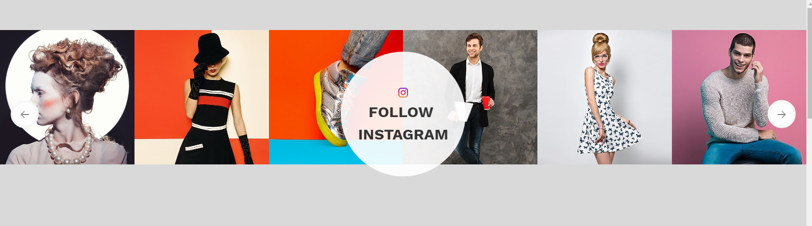
<!-- end Instagram -->
                                    <section class="padding-top-60 instagram_section instagram_type1   wow animated">
            <div class=" wow fadeInUp position-relative" data-wow-duration="1300ms" data-wow-delay="0.2s">
                <div class="owl-carousel owl-theme instagram_slider" id="watch_instafeed"></div>
                <div class="instagram_title text-center rounded-circle vertical_middle p-0 position-absolute">
                    <img src="src/images/ins_icon.png" alt="">
                    <h4 class="title_h4  text-uppercase mb-0">Instagram Title </h4>
                </div>
            </div>
        </section>
                         <!-- end Instagram -->
Instagram Type 2
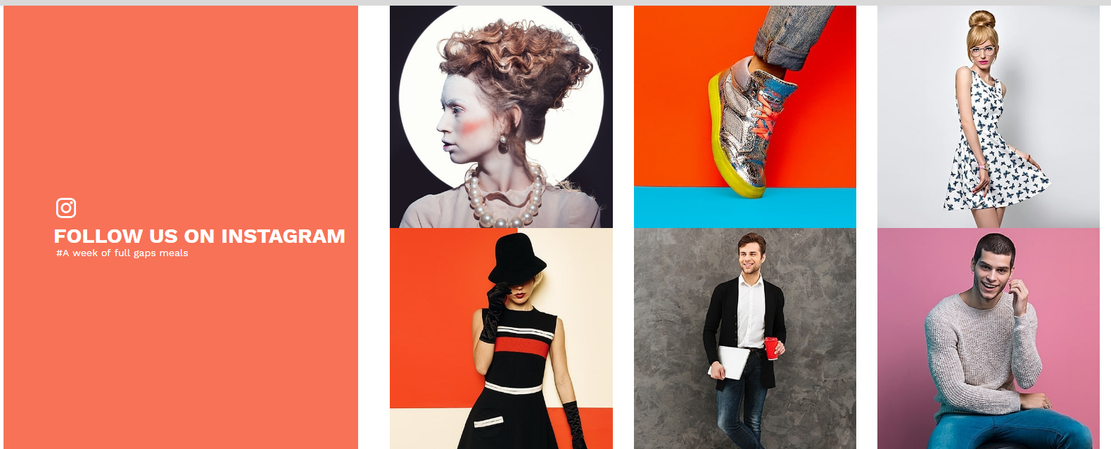
<!-- end Instagram -->
                                   <section class=" instagram_section instagram_type2  wow animated">
                <div class="container container-lg-fluid ">
                    <div class="row ">
                        <div class="col-lg-4 wow fadeInLeft" data-wow-duration="1300ms">
                            <div class="instagram_title  pt-0 pb-0 h-100 d-table w-100 position-relative ">
                                <div class="d-table-cell align-middle">
                                <i class="flaticon-instagram-logo text-white"></i>
                                <h3 class="title_h3 text-white text-uppercase   ">
                                    <span class="d-inline-block w-100">Instagram title</span>
                                </h3>
                               <p class="text-white mb-0"></p>
                                </div>
                            </div>
                        </div>
                        <div class="col-lg-8 wow fadeInRight" data-wow-duration="1300ms" data-wow-delay="0.2s">
                            <div class="owl-carousel owl-theme instafeed_silder_type2 w-auto d-flex h-100 position-relative" id="instafeed_type2"></div>
                        </div>
                    </div>
                </div>
            </section>
<!-- end Instagram -->
Instagram Type 3

<!-- end Instagram -->
                               <section class=" instagram_section instagram_type3  wow animated">
                <div class="container">
                    <div class="row no-gutters">
                        <div class="col-md-6 wow fadeInLeft" data-wow-duration="1300ms">
                            <div class="instagram_title  h-100 d-table w-100 p-0 ">
                                <h3 class="title_h3  text-uppercase text-center d-table m-auto vertical_middle position-absolute">
                                    <span class="d-inline-block w-100">Instagram title</span>
                                </h3>
                            </div>
                        </div>
                        <div class="col-md-6 wow fadeInRight" data-wow-duration="1300ms" data-wow-delay="0.2s">
                            <div class="owl-carousel owl-theme instafeed_silder_type3 w-auto row d-flex h-100" id="instafeed_type3"></div>
                        </div>
                    </div>
                </div>
            </section>
                         <!-- end Instagram -->
Instagram Type 4
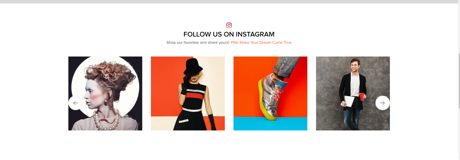
<!-- end Instagram -->
                              <section class="padding-top-60 padding-bottom-60 instagram_section instagram_type4  wow animated">
                <div class="container">
                    <div class="row">
                        <div class="col-md-12 wow fadeInLeft" data-wow-duration="1300ms">
                            <div class="instagram_title text-center p-0">
                                <img src="src/images/ins_icon.png" alt=""/>
                                <h4 class="title_h4  text-uppercase">Instagram title</h4>
                                <p></p>
                            </div>
                        </div>
                        <div class="col-md-12 wow fadeInRight" data-wow-duration="1300ms" data-wow-delay="0.2s">
                            <div class="owl-carousel owl-theme instagram_slider" id="shoes_instafeed"></div>
                        </div>
                    </div>
                </div>
            </section>
                         <!-- end Instagram -->
Instagram Type 5
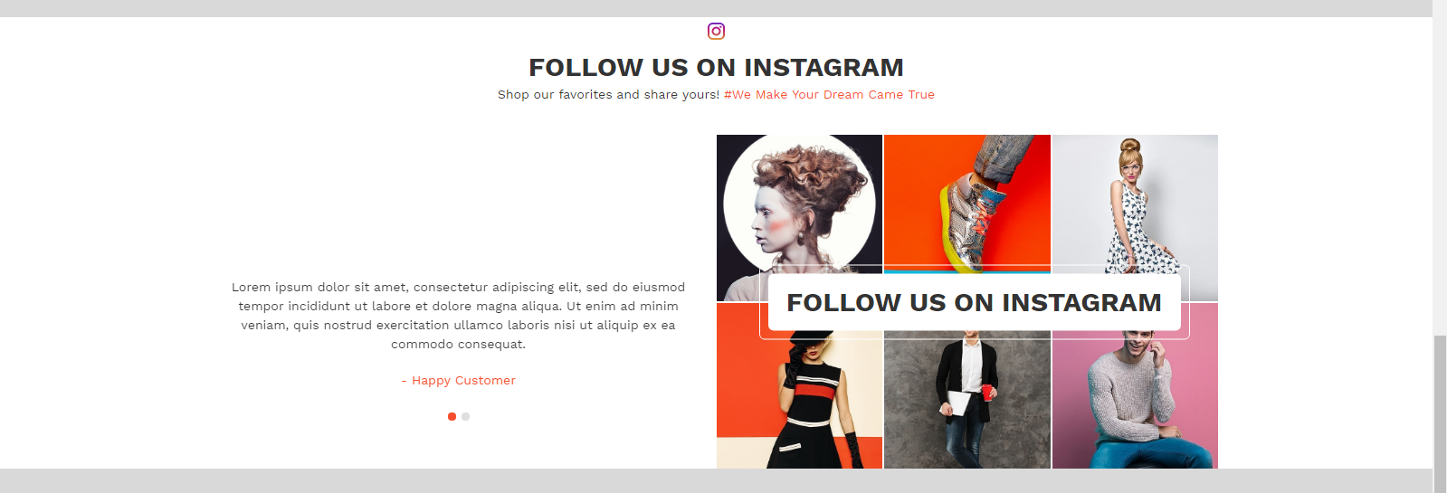
<!-- end Instagram -->
                               <section class=" instagram_section instagram_type5  wow animated">
                <div class="container">
                    <div class="row  align-items-center">
                        <div class="col-md-12 wow fadeInLeft" data-wow-duration="1300ms">
                            <div class="instagram_title text-center p-0">
                                <img src="src/images/ins_icon.png" alt=""/>
                                <h3 class="title_h3  text-uppercase">Instagram title</h3>
                                <p></p>
                            </div>
                        </div>
                        <div class="col-md-6 wow fadeInLeft" data-wow-duration="1300ms">
                            <div class="owl-carousel owl-theme banner_slider user_content">
                                <div>
                                    <div class="user_img position-relative d-table m-auto"><img src="your image" alt="" class="img-fluid vertical_middle"/></div>
                                <p>Lorem ipsum dolor sit amet, consectetur adipiscing elit, sed do eiusmod tempor incididunt ut labore et dolore magna aliqua. Ut enim ad minim veniam, quis nostrud exercitation ullamco laboris nisi ut aliquip ex ea commodo consequat.</p>
                                <span class="uesr_name"> - Happy Customer</span>
                                </div>
                            </div>
                        </div>
                        <div class="col-md-6 wow fadeInRight" data-wow-duration="1300ms" data-wow-delay="0.2s">
                            <div class="owl-carousel owl-theme instagram_slider w-auto row d-flex h-100" id="fur_instafeed"></div>
                            <div class="instagram_slider_title  h-100 d-table w-100 p-0 vertical_middle">
                                <h3 class="title_h3  text-uppercase text-center d-table m-auto ">
                                    <span class="d-inline-block w-100">Instagram title</span>
                                </h3>
                            </div>
                        </div>
                    </div>
                </div>
            </section>
                         <!-- end Instagram -->
Credits
We would really love to take this opportunity to appreciate guys whose items were helpful to us to make Earthyellow a really beautiful theme for our awesome users: